
5 High-Converting Weight Loss App Funnel Examples


Trusted by 3,000+ marketers

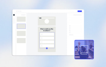
A high-converting weight loss Web2App funnel is an interactive, multi-step flow that personalizes the user journey based on goals, body type, and lifestyle. It replaces static landing pages with engaging experiences that convert more. This article breaks down 5 real high-converting weight loss app funnel examples and shows you how to build your own with Heyflow.
Key Facts
The web2app model drives subscription app growth. The most successful weight loss apps all follow the same playbook: paid ad to web-based quiz funnel, payment on web, then app download. Web funnels give growth teams full control over targeting, attribution, A/B testing, and pricing that the App Store simply doesn't offer.
Personalization drives conversions. Weight loss app funnels that adapt questions based on user answers consistently outperform static forms. By branching the flow around goals, body type, and lifestyle, top apps see significantly higher conversion rates than generic one-size-fits-all approaches.
Most funnels fail at the same spots. Asking for personal details too soon, relying on generic messaging and skipping emotional triggers cause most people to drop off long before they ever reach the paywall.
Heyflow is built for the full web2app stack. With native CAPI across Meta, TikTok, Google Ads, LinkedIn, and Bing, built-in lead quality gates including carrier-level phone validation and SMS OTP, Stripe and Solidgate payment integration, and A/B testing, Heyflow gives marketing teams everything they need to launch, optimize, and scale web2app funnels without developers.
Why Weight Loss Apps Use Web Funnels Instead of the App Store: The Web2App Model
Successful weight loss apps follow the same acquisition playbook: a paid ad leads to a web-based quiz funnel, users pay on the web, and only then do they download the app. This is the web2app model, and it's the dominant customer acquisition strategy for subscription health and fitness apps today.
The reason is simple: the App Store is a black box. When a user discovers your app through Apple Search Ads or a Google Play listing, you get almost no control over targeting, no meaningful attribution data, and zero ability to personalize the onboarding experience before someone installs. Apple and Google also take a 15–30% commission on every in-app purchase, which makes the unit economics of direct app store acquisition hard to justify at scale.
Web funnels change the equation entirely. Here's why growth teams at health and fitness apps route paid traffic through web funnels instead:
Full audience targeting and attribution. When you run traffic to a web funnel via Meta or TikTok, you have complete control over who sees your ad, what creative they see, and how their behavior gets tracked. Server-side tracking (CAPI) lets you send purchase events from the web funnel directly back to Meta or TikTok, so their algorithms can optimize for paying users, not just quiz starters or app installs.
No app store commissions. Payments processed on web via Stripe or Solidgate avoid the 15–30% cut that Apple and Google take on in-app transactions. For a subscription product at $40–$80 per month, this difference compounds quickly at scale.
A/B testing without review cycles. Every change to an App Store listing requires a review process that can take days. A web funnel can be tested, iterated, and optimized in real time. This is why the best-performing health apps run dozens of segment-specific web funnels simultaneously, each one tested and refined continuously.
Personalization before the paywall. A web quiz funnel lets you collect data about the user's goals, lifestyle, and health situation before they ever reach a payment screen. This allows you to show a personalized plan, relevant social proof, and a tailored offer, dramatically increasing the likelihood of conversion compared to a static app store listing.
Heyflow is built for exactly this model. Server-side tracking (CAPI) is the backbone of any web2app strategy. Without it, Meta and TikTok optimize for quiz starters, not paying subscribers. Heyflow sends purchase events directly from the web funnel back to your ad platforms, so their algorithms learn from the users who actually convert.
Ready to build your own high-converting web2app funnel?
Try Heyflow for freeWhy Most Weight Loss Funnels Fail
Most weight loss funnels make the same handful of mistakes that quietly kill engagement before users ever reach the offer.
Running a generic, one-size-fits-all flow: Someone who wants to lose weight has different needs than someone focused on fitness or improving their health. Without segmenting by goal, the funnel feels irrelevant.
No emotional anchoring: Skipping motivational interstitials, progress bars, and social proof leaves users without a sense that the experience is personalized or worth completing. Understanding the psychology of micro-commitments is key to keeping users engaged.
Asking for personal data too early: Requesting an email or phone number before delivering any value feels transactional. Users haven't built trust yet, so they bounce.
Unrefined checkout experience: Even when users complete the quiz and see their personalized plan, most weight loss funnels lose them at payment. Redirecting to external checkout pages breaks trust and context. The best funnels embed payment directly into the flow using integrations like Stripe and Solidgate.
Each of these mistakes has the same effect: users disengage before they ever see the offer. The good news is that every one of them is avoidable with the right funnel structure.
The brands we break down below avoid every one of these pitfalls, and their funnel structure turns cold ad traffic into paying subscribers.
5 Weight Loss App Funnel Examples
The quiz is not just a fun onboarding experience; it's the acquisition engine. Every element you'll see in the examples below, from conditional logic and social proof interstitials to embedded Stripe payments and server-side pixel events, exists to make that engine run as efficiently as possible.
Noom
Noom was one of the first brands to pioneer the web-to-app funnel model for weight loss. Their quiz funnel is long, detailed, and deeply rooted in behavioral psychology. Most users discover it through Meta ads that frame Noom as a science-based approach to losing weight.
From the very first question, the flow is designed to create emotional investment and guide users toward a personalized plan. Here's what makes their funnel structure so effective:
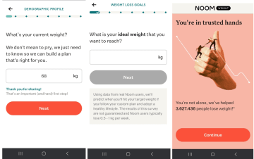
Emotionally anchored first question: The funnel opens with "What is your ideal weight that you want to reach?" This immediately primes commitment and gets users thinking about their desired outcome before anything else. This is a textbook example of the foot-in-the-door technique.
Dynamic branching with conditional logic: Every answer shapes the next screen. The flow adapts in real time based on user input, creating a journey that feels genuinely tailored rather than generic.
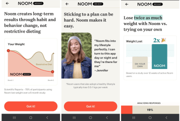
Social proof interstitials: Between quiz sections, Noom inserts screens with success stories, user stats, and charts that reinforce trust. These interstitials are critical for web funnels where users haven't yet built a relationship with the brand.
Behavioral psychology quiz section: Toward the end, Noom introduces questions that feel like a psychological assessment. This gamifies the experience, keeps engagement high, and differentiates the funnel from competitors.
Progress bars and loading animations: Between sections, animated loading screens create a sense that data is being analyzed. This simple UX pattern has been shown to boost conversion.
Noom's lengthy flow works because weight loss is a sensitive, high-motivation topic. Users are willing to invest time when the funnel feels like a personalized weight loss journey, not a sales pitch. Storytelling and emotional resonance drive buy-in at every step.
BetterMe
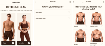
BetterMe takes a radically different approach: instead of one funnel for everyone, they run dozens of separate web funnels for the same app. Each funnel targets a specific persona, whether that's a women's diet plan, a walking program for seniors, Pilates for beginners, or a fitness plan for men. The "one app, many funnels" strategy lets BetterMe match every ad creative to a dedicated user flow.
Here's what makes their quiz funnel so effective:
Audience-matched funnels: Each funnel aligns with a specific audience segment, so messaging feels consistent from the first click to the last screen.
Targeted social proof upfront: At an early stage of the quiz funnel, BetterMe inserts a trust screen with social proof that match the user's exact demographic, for example, "Over 500,000 men in their 40s have already tried BetterMe." It makes the user feel they're in the right place before answering a single question.
Educational content: Informational slides about topics such as dietary approaches and the BMI index educate users without overwhelming them and help build trust through demonstrated expertise.

Personalized results: By asking about current activity, health issues, and fitness goals, BetterMe creates plans that feel realistic and achievable rather than one-size-fits-all.

This strategy is now considered baseline in the weight loss app category. But running dozens of segment-specific funnels at scale is only possible with a flexible funnel builder like Heyflow, that supports advanced conditional logic and rapid iteration.
SIMPLE
SIMPLE focuses on intermittent fasting and healthy habits, and the funnel reflects that with a calm, educational tone. Every design decision reduces friction and keeps users moving through a flow that could easily feel overwhelming. Here's what makes it work:
Visual, icon-based answer options: Instead of long text blocks, users tap on icons and illustrations. This speeds up decision-making and makes the quiz feel light.

Educational pop-ups with explanations and reassuring slides: Small informational overlays explain why certain questions matter. Users feel informed rather than interrogated, which builds trust and reduces drop-off. Between sections, screens like "Intermittent fasting restores your skin’s natural glow" tie the quiz to real-life emotional benefits. These moments keep users motivated to continue.

No payment friction: SIMPLE removes doubt at the critical moment by combining a 30-day money-back guarantee, clear security messaging, and multiple payment options on the checkout screen. Countdown timers add urgency, transparent auto-renewal terms build long-term trust.


SIMPLE's strength is making a long quiz feel intuitive and easy to follow. For any weight loss funnel, this is a critical lesson: length isn't the enemy. Friction is.
V Shred
V Shred takes a more product-focused approach with a supplement recommendation funnel. The flow is shorter, faster, and built around a clear value exchange: answer a few questions, get a tailored supplement bundle. It's a different structure than SIMPLE's deep storytelling, but equally effective for its purpose.

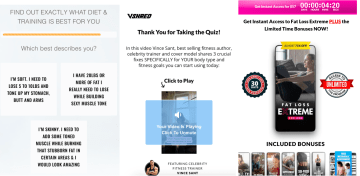
Quiz embedded directly on the landing page: The first question "What is your gender?" appears immediately on the landing page without any intro screen or CTA click. Zero friction to start.
Progress bar visible from the start: A prominent orange progress bar appears at the top from the very first question, setting clear expectations about the length of the flow.
Video-based results page: After completing the quiz, users are taken to a thank-you page featuring a personalized video from celebrity trainer Vince Sant. This is a strong authority signal and keeps users engaged after the quiz rather than dropping off at a static results page.
Celebrity trainer as trust signal: Vince Sant is positioned as a bestselling fitness author and celebrity trainer, lending personal credibility to the supplement recommendations that follow.
High-converting checkout design: Every element on the checkout page is designed to eliminate reasons not to buy. The product itself is fully segmented based on quiz answers, making the offer feel tailored rather than generic. A live countdown timer with the price displayed at the top creates immediate urgency, while an "Almost 75% off" discount badge anchors perceived value high. A 30-day money-back guarantee and a row of included bonuses remove risk and stack value.
V Shred proves that a focused, fast flow can convert just as well as a lengthy storytelling funnel, as long as every step, from the first question to the checkout screen, is built to eliminate friction and maximize urgency.
Juniper
Juniper operates in the telehealth space, offering medically supervised weight management programs. For health-adjacent products, the funnel must balance personalization with medical trust. Juniper does this well by combining the engagement patterns of a quiz funnel with the credibility markers users expect from a healthcare provider.

Trust signals throughout the flow: References to licensed practitioners and evidence-based treatments appear on multiple screens, reinforcing that this is a medically grounded program. Juniper showcases real practitioners with names, photos, and specializations. This goes far beyond generic trust badges and builds clinical credibility at a personal level.
Transparent process upfront: Before users even start the quiz, Juniper lays out exactly what to expect: eligibility check, treatment delivery, and continued care. This lowers the barrier to entry and sets clear expectations from the first click.
Risk elimination at the entry point: Rather than hiding the money-back guarantee at checkout, Juniper places "See results in 25 days or your money back" directly next to the CTA on the landing page, removing doubt before users even begin.
Clear funnel structure with progress steps: The funnel is divided into three clearly named sections (Weight Loss Profile, Medical History, Treatment Options), so users always know where they are in the flow.

For telehealth and medically supervised weight loss programs like Juniper, HIPAA compliance is non-negotiable. Heyflow is HIPAA-compliant with a Business Associate Agreement on all plans.
Weight Loss App Funnel Best Practices
The five funnel examples above share a set of proven patterns. The following best practices show you how to build a weight loss app funnel that consistently turns ad traffic into paying subscribers.
One question per screen: Reduces cognitive load and keeps users focused, which increases completion rates across longer flows.
Conditional logic branching: Personalizes the journey based on each answer, making the funnel feel relevant rather than generic.
Social proof interstitials: Builds trust between questions by showing success stories, user stats, and charts at key moments.
Segment-specific funnels: Matches ad creative to user intent so messaging stays consistent from the first click to the last screen.
Build trust and deliver value before payment: Show personalized quiz results before asking users to pay. Users who see the value of your offer first are significantly more likely to complete a purchase. Display testimonials, security badges, money-back guarantees, and compliance certifications directly at the payment step to reduce purchase anxiety at the critical conversion point.
Seamless payment integration: Keeping payment inside the funnel preserves the context, branding, and trust built throughout the quiz flow, making payment feel like a natural next step rather than a separate transaction.
Capture partial submits: Not every user who starts your funnel will complete it. Partial submit tracking lets you capture the data users have already entered (name, email, or phone number) even if they drop off before reaching the final screen. This turns incomplete sessions into actionable leads.
Build Your Own Weight Loss Quiz Funnel with Heyflow
With Heyflow, marketing teams can easily create high-converting quiz funnels without writing a single line of code. Here's how to go from idea to live funnel in eight steps:
Start from a template or blank canvas: Heyflow offers ready-made quiz funnel templates, so you can launch fast. Or start from scratch and build a fully custom design that matches your brand down to the last pixel.
Add conditional logic: Use Heyflow's advanced conditional logic and visual logic map to create personalized branching paths and maximize engagement. Route users based on their goals, body type, fitness level, and lifestyle so every flow feels tailored.
Insert trust-building elements: Drop in social proof screens, progress bars, and educational interstitials between questions using drag-and-drop blocks.
Connect your stack: Integrate with CRMs like HubSpot and Salesforce, analytics tools like Google Analytics, and 50+ further tools through native integrations. Every lead flows directly into your existing workflow.
Set up server-side ad tracking: Activate Heyflow's native Conversions API (CAPI) for Meta, TikTok, Google Ads, LinkedIn, and Bing. Heyflow's CAPI integration requires no Zapier, no GTM, and no custom code. Unlike client-side pixels, which lose data to iOS restrictions and ad blockers, server-side tracking sends purchase events directly from Heyflow's servers to your ad platforms. Your campaigns optimize for paying subscribers, not just quiz starters, and your reported ROAS reflects what's actually happening.
Enable in-funnel payments: Add a Stripe or Solidgate checkout block directly into your funnel. Keeping the transaction inside the funnel preserves the trust and personalization built throughout the quiz, and avoids the conversion drop that happens every time a user is sent elsewhere to pay.
Launch your funnel: Publish your funnel directly on a custom domain with SSL certificate, or embed it seamlessly into your existing landing page. Your funnel is live and ready to convert in minutes.
A/B test every step of your funnel: Test different question orders, answer formats, progress bar styles, and CTA copy to identify what drives the highest completion rates. Data-driven iteration across every screen compounds over time into significantly higher conversions.
What Makes Heyflow the Best Funnel Builder for Weight Loss Apps
Heyflow is the only funnel builder built for the full Web2App stack: personalization, server-side tracking, lead quality verification, and in-funnel payment in one place.
✅ Advanced conditional logic with a visual builder. Build complex branching paths based on multiple answers, route users by goal, body type, or lifestyle, and visualize every logic branch with the built-in Decision Tree. No other funnel builder offers this level of personalization out of the box.
✅ Mobile-first performance with a 90+ page speed score. Every funnel loads lightning-fast on any device and any connection, because slow load times are silent conversion killers, especially for mobile ad traffic.
✅ Native server-side ad tracking across five platforms. Heyflow's Conversions API (CAPI) connects natively to Meta, TikTok, Google Ads, LinkedIn, and Bing without Zapier, GTM, or custom code.
✅ Partial submit tracking. Heyflow captures the data users have already entered, even if they drop off before the final screen, and passes it directly to your CRM or email automation tool.
✅ Built-in lead quality. Carrier-level phone validation, SMS OTP verification, and email validation ensure every lead is real before it hits your CRM. Heyflow also integrates natively with TrustedForm and Jornaya for additional lead certification, giving high-volume weight loss funnels the verification layer they need. Only Heyflow offers these natively, without any third-party tools required.
✅ Seamless payment integration. Stripe and Solidgate checkout run directly inside the funnel, preserving the trust and context built throughout the quiz while bypassing the 15–30% commission Apple and Google take on in-app purchases.
✅ Instant lead engagement without Zapier. New leads trigger native WhatsApp messages, branded email autoresponders via custom SMTP, and Slack notifications automatically, all without additional automation tools.
✅ Native A/B testing. Test question orders, answer formats, progress bar styles, and CTA copy without app store review cycles or external tools. Every iteration is data-driven and compounds over time into significantly higher conversions.
✅ 50+ native integrations. Connect HubSpot, Salesforce, Google Analytics, Klaviyo, and dozens more, all natively and without middleware.
✅ Enterprise-grade compliance. SOC 2 Type II, ISO 27001, GDPR, and HIPAA compliant with BAA, so health and fitness brands can collect sensitive data with full confidence.
Launch your first weight loss funnel todayConclusion: Build Your High-Converting Weight Loss Funnel
The best weight loss app funnels share one thing in common: they treat acquisition as a personalized conversation, not a static form. Noom, BetterMe, SIMPLE, V Shred, and Juniper each prove that the Web2App model, built on interactive quiz funnels, dramatically outperforms sending paid traffic directly to the App Store.
The patterns are clear and replicable: one question per screen, conditional branching, social proof interstitials, segment-specific flows, server-side ad tracking, lead quality verification, and seamless in-funnel payment. Each element exists for a reason, and together they form an acquisition engine that turns cold ad traffic into paying subscribers at a fraction of the cost of app store acquisition.
With Heyflow, you can replicate every one of them without writing a single line of code. Native CAPI across five ad platforms, built-in phone validation and OTP, Stripe and Solidgate payment integration, and a visual conditional logic builder give your team everything needed to launch, optimize, and scale a Web2App funnel independently.
FAQ
Can I build a weight loss quiz funnel without coding?
Yes, with Heyflow you can create a weight loss funnel without coding or technical skills. The drag-and-drop interface, pre-built templates, and visual logic builder eliminate the need for developers. Most teams launch their first weight loss quiz funnel within a few hours using conversion-optimized templates that can be customized for any weight loss program or fitness approach.
How many questions should a weight loss quiz funnel have?
There is no universal answer: the funnel length should match the complexity of the offer. A supplement recommendation needs fewer steps than a medically supervised program. What matters is that every screen earns its place and moves the user closer to a decision.
Does Heyflow integrate with Stripe for payments?
Yes, Heyflow offers native Stripe integration, enabling direct payment processing within your funnel. Users can sign up for subscriptions without being redirected to external payment pages, which significantly improves conversion rates by eliminating friction at the critical payment step.
Does Heyflow work with Meta Pixel and Google Analytics?
Yes, Heyflow integrates natively with Meta Pixel, Google Analytics and Google Ads. This ensures you can track the complete user journey from ad click through quiz completion to payment, enabling accurate campaign optimization and ROI measurement across all your paid acquisition channels.
Recommended articles
The Best Sales Funnel Software 2026
Compare the 7 best sales funnel software tools of 2026 by features, pricing & use case. See how Heyflow, Perspective, ClickFunnels & more turn clicks into leads.
Read more
How to Use Heyflow for Successful TikTok Ads Campaigns
Most TikTok ad spend is lost after the click, not before it. See how Heyflow solves the the root causes before your next campaign goes live.
Read more
The Best Google Forms Alternatives in 2026
Looking for a tool similar to Google Forms but with more features and flexibility? Check out our top form builders for your lead generation strategy.
Read more