Guides & best practices
View all articlesBest practices for building high-converting B2B landing pages

B2B landing pages have one job – turn visitors into leads. But not all landing pages get the job done. Some grab attention, build trust, and keep potential customers engaged, while others… well, let’s just say they could use a little help.
So, what makes a high-converting B2B landing page? It’s not about stuffing in form fields or throwing in a hero image just because it looks good. The best pages speak directly to the target audience, showcase a crystal-clear value proposition, and make it effortless for visitors to take action.
This guide covers best practices to help you drive more conversions, capture more leads, and create a landing page your sales team will love.
B2B Landing page best practices
A great B2B landing page guides visitors toward action with clear messaging and smart design. Here’s what it takes to capture leads, build trust, and drive conversions.
1. Add a clear and compelling value proposition
A value proposition is the highlight reel of your business – the part that hooks the audience, gives them a reason to care, and convinces them to stick around for the full experience. If your landing page were a sales pitch, the value proposition would be the one-liner that seals the deal.
A strong value proposition should answer three simple questions:
✅ What do you offer? Keep it simple.
✅ Who is it for? Speak directly to your audience. No “one-size-fits-all” messaging.
✅ Why should they care? How will it make their life easier, their job better, or their boss happier?
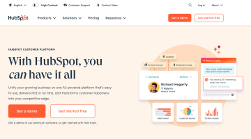
HubSpot nails its landing page value proposition by making it clear, engaging, and outcome-driven. Instead of throwing a bunch of technical jargon at visitors, they get straight to the point:
✅ Simple? Yes
✅ Speaks to the audience? Absolutely
✅ Makes you want to read more? You bet
At the end of the day, a great value proposition sells the outcome. And when done right, it’s the difference between visitors bouncing and businesses buying – a weak or vague value proposition can be just as harmful as having none at all.
Phrases like “We’re the best solution for your business” or “Revolutionizing the industry” are generic and meaningless without context. Your value proposition should be laser-focused on the unique benefit your product delivers.
❌ Bad Example: “Our AI-powered tool helps businesses grow.”
✅ Better Example: “Boost your B2B conversion rates by 40% with AI-driven insights.”
When crafting your value proposition, consider A/B testing different variations. A slight wording change – like shifting from "increase your efficiency" to "cut admin work in half" – can significantly impact conversions. We’ll talk more about A/B testing later, though.
2. Write strategic copy
B2B buyers aren’t here for a casual browse. They’re on a mission to find a solution that makes their job easier, their numbers better, and their boss happier. And if your landing page copy doesn’t get that across fast? They’re out.
That’s why strategic copy matters. For example, you’re not selling “AI-powered analytics”; you’re selling smarter decisions, higher conversions, and more time to enjoy a coffee before the next Zoom call.
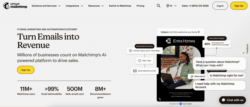
Mailchimp gets this. Their landing page messaging speaks to logic and results while adding a little personality to the mix. Instead of dry list of features, they turn key benefits into a compelling story. Their copy isn’t screaming “we have automation!” – it’s showing how automation drives revenue, personalizes marketing, and makes work feel less like work.
B2B decision-makers are busy. They don’t have time to sift through fluff or vague marketing speak. Every word on your landing page should serve a purpose – either guiding the visitor toward conversion or reinforcing trust.
Here’s how to make your copy more effective:
✅ Use numbers and data: Instead of saying "boosts sales," say "increases sales by 37% on average."
✅ Keep sentences short: Long-winded explanations lose attention. Get to the point fast.
✅ Write for scanning: Use bullet points, bold text, and subheadings to make key points easy to digest.
✅ Start with the problem: Address a specific pain point in the headline or subheading.
✅ Use second-person language ("you" and "your") to make the copy feel personal.
✅ Eliminate filler words: Keep sentences concise and impactful.
✅ Highlight benefits, not features: Instead of “advanced CRM integration,” say “seamlessly sync customer data across all your tools.”
Don’t be afraid to infuse personality into your copy, either. While B2B messaging should be professional, it doesn’t have to be boring. A conversational tone keeps things engaging while still delivering value.
3. Leverage social proof to build trust and credibility
B2B buyers don’t just take your word for it – they want evidence that your product works. Social proof is that evidence. It builds trust, reduces hesitation, and reassures potential customers that they’re making the right choice.
Think about it – when did you last buy something without checking reviews? Exactly.
Social proof is even more critical in the B2B world, where decisions involve budgets, approvals, and long-term commitments. That’s why testimonials, case studies, customer logos, and real-world results are landing page gold. A well-placed testimonial with a name, face, and measurable impact does more than any marketing claim ever could.
Social proof isn’t just a “nice-to-have” on a landing page – it’s a must-have in a world where decision-makers rely on peer recommendations and case studies before making a purchase.
Ways to maximize the impact of social proof:
✅ Feature testimonials with real names, job titles, and company logos. A generic quote from “John D.” isn’t convincing, but a testimonial from “Sarah Klein, VP of Marketing at HubSpot” carries real credibility.
✅ Show before-and-after results. Did your solution help a company increase conversion rates by 50%? Reduce churn? Highlight those specific results.
✅ Include recognizable client logos. If well-known brands use your product, displaying their logos on your landing page builds instant credibility.
❌ Bad example: "Our customers love using our platform. It’s helped them grow!"
✅ Better example: "Since integrating our platform, Acme Corp. has seen a 37% increase in qualified leads and a 25% reduction in churn."
By making your testimonials data-driven and results-oriented, you turn them into persuasive proof points instead of just generic praise.
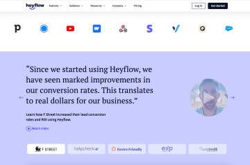
At Heyflow, we understand this. That’s why we let our customers do the talking.
Our landing page features:
✅ Big-name client logos: Instantly establishes credibility. If Forbes, Doordash and Allianz trust Heyflow, we must be doing something right.
✅ Video testimonials: Real customers, real voices. Seeing someone talk about how Heyflow improved their conversion rates makes us far more believable.
✅ Impact-driven quotes: These are hard proof that Heyflow delivers.
The message? “Others have seen success – so will you.” And that’s exactly the kind of trust factor that turns visitors into buyers.
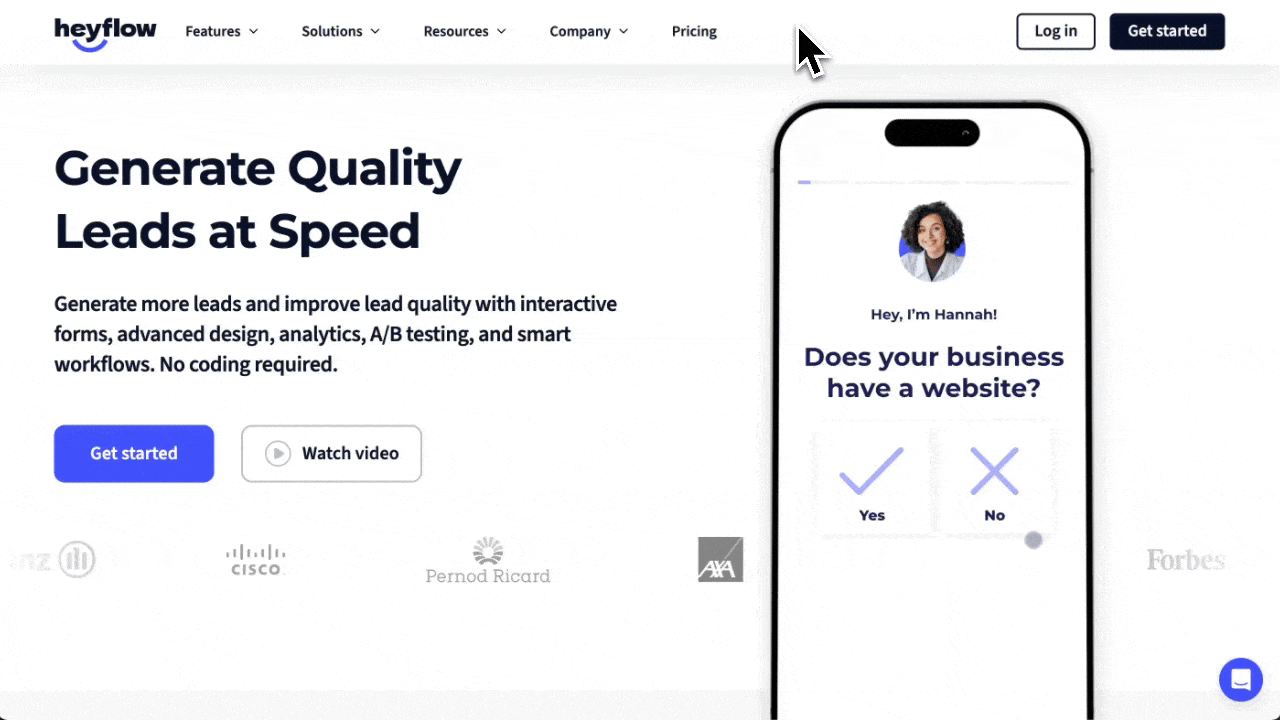
4. Focus on a single goal: Conversions
Visitors shouldn’t have to pick between five different CTAs, an explainer video, a newsletter signup, and a “contact sales” form. When you give people too many choices, they freeze. And when they freeze, they leave.
Your landing page has one job: getting visitors to convert. Whether that means signing up for a demo, downloading a resource, or starting a free trial, every single element should keep visitors focused on that one action.
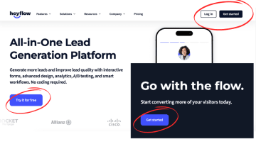
Heyflow’s landing page design executes this perfectly. The CTA is impossible to miss. It’s placed strategically and prominently displayed in multiple spots, reinforcing the action without overwhelming the visitor. Every section builds toward the same goal, keeping the focus razor-sharp.
5. Use visuals like images or short videos
B2B buyers don’t want to read about what your product does – they want to see it in action. That’s why strong visuals on web pages are a conversion booster. Short videos, GIFs, and product screenshots make your landing page more engaging while helping visitors quickly understand your platform’s value.
Heyflow does this brilliantly, too. Instead of dumping a list of key features, we use GIFs to showcase functionality in real time. Visitors can instantly see how to build interactive forms, landing pages, and lead funnels. This makes the product feel intuitive, easy to use, and ready to go.
Another great example is Biteable. Their website and B2B emails use GIFs to grab the visitor’s attention and instantly demonstrate their service. Instead of telling you how easy it is to create videos, they show you – making their value clear in seconds.
6. A/B test page elements to see what works
If you’re not testing, you’re guessing. And in B2B, guesses don’t convert – data does. That’s why A/B testing is essential. It helps you compare two versions of a landing page element – like headlines, CTAs, or layouts – to see which one drives more conversions.
Most businesses stick to a 50/50 traffic split when running A/B tests, but that’s not always ideal. If you’re testing a major redesign or a bold new CTA, directing all traffic evenly might be risky. Sometimes, you need a gradual rollout to reduce friction and collect meaningful data without tanking conversions.
Heyflow makes A/B testing easier. You can adjust traffic distribution instead of just splitting it down the middle. Whether you’re testing a small tweak or a radical change, you can control how much traffic each variant gets – minimizing risk while maximizing insights. The result? Landing pages that continuously improve based on real visitor behavior.
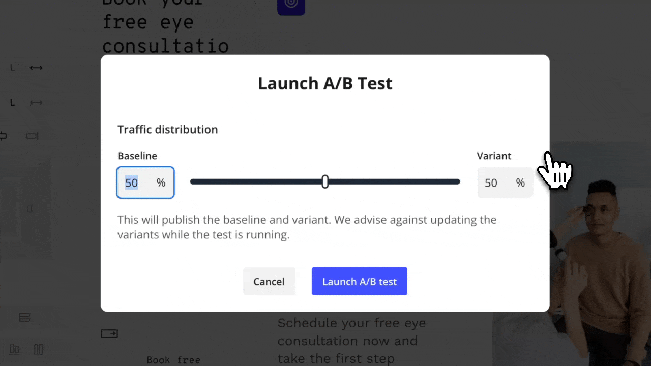
Remember: A/B testing isn’t just for major design overhauls – it can improve even the smallest details.
Key elements to test:
✅ CTA button text: “Get Started” vs. “Start Your Free Trial” can have different impacts.
✅ Form length: Removing one unnecessary field can increase form submissions by 10% or more.
✅ Headline variations: Does a pain-point-focused headline work better than a benefit-driven one?
✅ Your value proposition: A slight wording change can significantly impact conversions.
👉 Pro Tip: Don’t just look at conversion rates. Track engagement metrics like time on page, bounce rate, and heatmap interactions to understand user behavior.
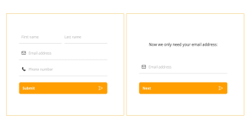
7. Optimize forms for lead generation
Your landing page might have a winning headline and compelling copy, but if your lead capture form is clunky, visitors won’t stick around to fill it out. The mistake many businesses make is asking for too much, too soon.
If your form looks like a tax return, don’t be surprised when people bounce. Keep it short and focused – only ask for the essential information you need to start the conversation.
How to make forms convert better:
✅ Keep it short: The fewer fields, the higher the completion rate.
✅ Use smart defaults: Auto-filling known details makes it easier to submit.
✅ Make it mobile-friendly: If it’s hard to tap, type, or scroll on mobile devices, you’re losing leads.
✅ Break it into steps: Multi-step forms feel easier to complete than one big wall of fields.
This is exactly how Heyflow’s templates lead to conversions. Instead of forcing visitors through static, one-size-fits-all forms, Heyflow lets you create dynamic, interactive forms that keep engagement high. Multi-step flows, conditional logic, and a clean, mobile-friendly design make it easier for leads to complete your form – without hesitation.
Like these templates? Try Heyflow now
Tips to optimize a B2B landing page
Here’s how to fine-tune your landing page for higher conversions, stronger engagement, and better lead quality:
Prioritize clarity over cleverness: Your headline should tell visitors exactly what you offer in seconds. If they have to figure it out, they won’t.
Stick to one primary CTA: Too many options create decision fatigue. Make it obvious what you want visitors to do.
Position social proof strategically: Place testimonials, case studies, and logos near CTAs to reinforce trust right before the conversion point.
Make forms effortless: Reduce unnecessary fields, break long forms into multi-step flows, and ensure everything is mobile-friendly.
Use visuals to explain: GIFs, short videos, and product demos should make your offer clearer, not just make the page look nice.
A/B test everything: Headlines, CTAs, images, layouts – if you’re not testing, you’re guessing. Let data drive your decisions.
Keep the page focused: Remove unnecessary navigation, outbound links, and competing CTAs that pull attention away from the goal.
Speed matters: A slow page kills conversions. Optimize images, scripts, and hosting to keep load times lightning-fast.
Your B2B landing page: Build to sell
A high-converting B2B landing page is all about clarity, trust, and guiding visitors toward a clear call to action. When every element works together, conversion becomes effortless.
Now that you have the best practices, it’s time to put them into action. Test, refine, and optimize every detail to ensure your page keeps visitors engaged and leads flowing in.
Want a tool that makes the process easier? Heyflow gives you everything you need to build landing pages that convert – customizable templates, interactive design tools, A/B testing, and built-in analytics to track and improve performance. No code, no hassle – just high-performing landing pages built for results.
-------------------
Take control of your lead generation
Create sleek, no-code flows that captivate and convert. With Heyflow, building and optimizing your lead funnel is effortless. Start engaging your audience and driving conversions like never before