
Contact forms can make or break your lead generation efforts. Nail the form design, and you're on your way to increased conversion rates, more qualified leads, and an improved user experience.
What happens if your contact form isn’t optimized for conversion? You lose potential customers.
Make your form too long, and your website visitors will lose interest and abandon the process. Don’t make it responsive, and you’ll lose mobile traffic. Forget about branding, and your users might label your form as untrustworthy.
To help you avoid these consequences, we’ve compiled nine of the best strategies to optimally build and implement your contact forms. Let’s hop to it! 🐇
7 Strategies for building high-converting contact forms
Some of our strategies include optimizing design, using multi-step forms where appropriate, A/B testing, and more. Let’s run through each strategy.
1. Use a modern form builder

Creating an effective website contact form involves more than just designing the basics. You’ll need to ensure your form integrates well with your landing page and offers a user-friendly experience. A form-building tool can help you do exactly this.
Essential features for a top-form builder:
No code needed: Easily create forms without extensive coding knowledge.
Customizable templates: Choose from a variety of pre-designed templates to get started quickly.
Mobile optimization: Ensure your forms look and function flawlessly on all devices.
Fast page speeds: Avoid frustrating users with slow-loading forms.
Data analysis tools: Track form submissions, conversion rates, and other key metrics.
Before committing to a form builder, try a demo or free trial to see if it meets your specific needs and preferences.
We’ll leave Heyflow’s free trial right here.
2. Optimize the design

When designing contact forms, ensure they effortlessly integrate with your website's overall design and branding. Maintaining consistent colors, fonts, and styles creates a user experience that builds trust, and convinces someone they’re in good hands.
Your form's structure should also align with the page's layout that it’s on. While it doesn't need to be identical, it should complement the overall design and flow of your website or landing page.
If your contact form is coming directly from a social media platform, then consider building the experience to match the platform the browser is coming from. This UX muscle memory trick will help them navigate your form easier, and help build trust.
3. Use multi-step forms
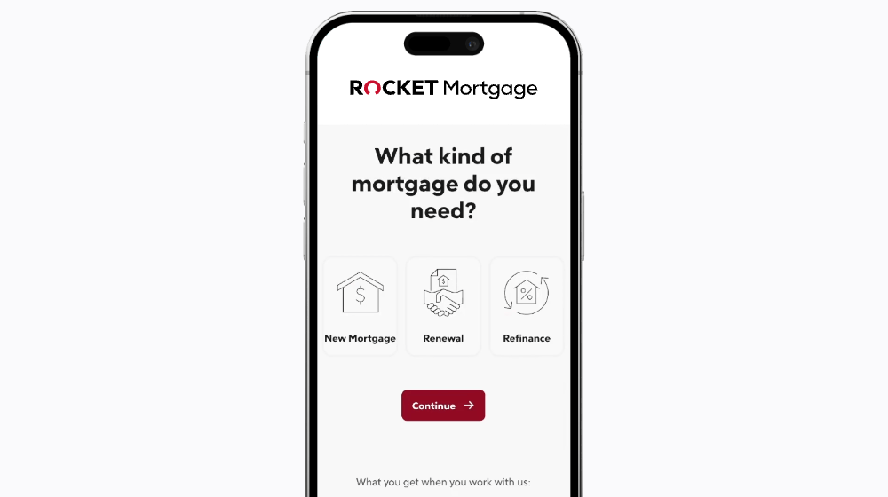
Reduce friction for potential customers by simplifying your contact form into smaller steps. Eliminate unnecessary steps, such as excessive form fields to create a smooth and enjoyable experience.
Key considerations:
Minimize form fields: Only include essential information.
Avoid captchas: Consider alternative verification methods if necessary.
Simplify the process: Streamline the steps required to complete your form.
By reducing the number of steps, you'll also be minimizing the risk of overwhelming those filling out your contact form. One page with one question helps them know where to look and makes their task seemingly easier to complete.
Heyflow top tip: when running a multi-step form, ensure you manage expectations by complimenting the form with a completion bar.
4. Consider contact form placement
The placement of your contact form can significantly impact its effectiveness. While there's no one-size-fits-all answer, consider these factors:
User Intent: If you expect most visitors to be interested in contacting you, placing the form at the top of the page might be suitable.
Page Structure: If there’s information someone needs to read before contacting you, ensure you’ve got your form under that information. This will help you qualify candidates and save everyone time.
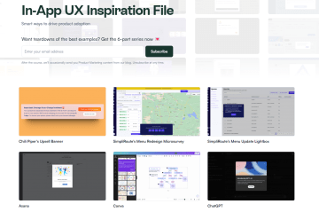
Chameleon does this well. The team has identified that someone visiting their in-app UX inspiration page has a high interest in being inspired. They don’t need any more qualification as they’ve already visited the page. So, the team has placed their contact form for more inspiration at the top of the page—before the actual UX examples.
If you’re not familiar with Gestalt’s Grouping Principles, then now’s the time! Two of Gestalt’s principles that particularly stand out for placing your contact forms are:
Proximity principle: people associate knowledge that’s visually closer together as more relevant to each other. So, whatever information you think a user needs to complete your contact form, put it as close to the contact form as possible. For example, social proof!
Continuity principle: the mind will follow the simplest line pattern. If you want your page visitor to absorb certain information in a particular order before they come to your contact form, map their pathway through that information visually.
5. A/B Test your form to assess performance
Once you've identified underperforming contact forms, it's time to optimize them for better results. If you haven’t identified an underperforming form, then consider how you can make a top-performing form even better.
A/B testing is a powerful tool for experimenting with different form elements and measuring their impact.
Consider testing:
Visual changes: Experiment with different imagery, colors, and layouts.
Copy variations: Try different calls to action, headlines, and form descriptions.
Form placement: Test different locations on your webpage to see what works best.
Form types: Experiment with different form types, such as multi-step forms or single-page forms.
A/B testing can be a never-ending experiment. As the market changes, they’ll be looking for different elements on their form completion journey. Stay ahead of the curve and continuously optimize your contact form.
6. Opt for transparency
Transparency in terms of contact forms entails making sure the user is aware of all that will result from them sharing their information. It’s a great way to boost your brand image, give potential customers more reason to trust your company, and avoid some disgruntled new contacts in the future.
For example, you could preface the form with details regarding what they’ll get from sharing their information, such as a follow-up email or a monthly newsletter. This is what the team at dslx does, managing newsletter sign-up expectations by explaining they won’t be spamming someone’s inbox with irrelevant information.

7. Use data effectively
Once you've ensured compliance with local data regulations, effectively managing the data collected through your contact form is crucial. Heyflow automatically organizes and analyzes this information for you. This will provide valuable insights into demographics, customer types, and other key metrics to help you segment your contacts and send more relevant information their way in the future.
If you’re looking to build out contact forms with Heyflow, read on. We’re guiding you through how to easily design a website contact form in five steps.
How to design a website contact form with Heyflow
Heyflow is a powerful form-building tool that simplifies the process of creating and implementing contact forms on your website. With a simple interface and customizable features, you can design contact form templates that are both visually appealing and highly effective.
Here are 5 steps to creating a contact form with Heyflow:
1. Sign up for a free trial and create a heyflow: There are so many templates to choose from to get your journey started, or you can build your own from scratch.

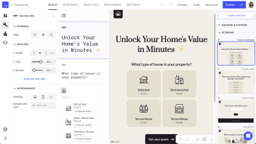
2. Design your form: Use Heyflow's no-code drag-and-drop builder to create a visually appealing form. Customize the layout, colors, and fonts to match your website's branding.
3. Integrate your form: Once you’re done creating the aesthetics for your contact form, integrate it to your email, Google Sheets, Hubspot, Salesforce or other CRMs to store lead data.
4. Hit publish: Now that your form is integrated into your CRM, you’re good to go live and start collecting that contact information.
5. Test and iterate: Probably the most important step in a form-building process is what you do once your form is live. Test your form to ensure it functions correctly and is easy to use. Collect feedback from users, and start making necessary adjustments to improve performance.
Start building high-converting website contact forms with Heyflow
Ready to boost your website's conversions and generate more leads? Heyflow makes it easy to create stunning contact forms that capture attention and drive completions. With an intuitive drag-and-drop builder, customizable templates, and one-click integrations, you can design contact forms that are on-brand, engaging, and don’t require you to work through your lunch break!
Sign up for Heyflow today and start experiencing the difference!
Recommended articles

Signup forms: 7 strategies to maximize your leads
Turn your signup forms into lead-generating machines. Discover seven powerful tactics to drive conversions and grow your business.
Read more
Multi-step vs single-step forms: which should you choose and why
Discover the key distinctions between multi-step and single-step forms, explore their practical applications, and determine the ideal choice for your needs.
Read more
A complete guide to modern website form design (with examples)
Create interactive flows, multi-step forms, lead funnels and customized landing pages that drive conversions and engage your website visitors — without writing any code.
Read more