Marketing fundamentals
View all articlesHow to create converting ad content and creatives for Meta and Google Ads

Digital advertising is a battlefield for capturing attention. To stand out and get results from your campaigns, you need to arm yourself with ad content and creatives that don't just grab eyeballs, but also hold them long enough to engage them and make the users take action.
In this article, we’ll explore the art and science of crafting compelling ad content and creatives for the two principal advertising platforms Meta and Google Ads. Whether you're new to the world of ads or an experienced online marketeer looking for a refresh, read on to supercharge your next campaign.
(And if you’re new to ad campaigns, be sure to check out our guide with best practices to get started.)
The power of compelling ads
Before we dive into the 'how-to' of creating compelling ad content and creatives, it's essential to understand the 'why'. Why should you care about your ad's content and creative delivery? The answer is simple: your ad is often the first touchpoint a potential customer has with your brand. It's your best — and sometimes only — chance to peak their curiosity and get them on your website. A compelling ad distinguishes your brand from the hundreds of others that users see every day, entices action, and ultimately drives results.
But what makes an ad truly compelling? It needs to be the perfect combination of persuasive language, captivating visuals, and a unique offer that addresses the user's needs or problems. This combo ignites a spark in the viewer's mind, compelling them to click, shop, or engage further with your product or service. Your goal is not just to be noticed but to be remembered and chosen in that critical moment of decision-making.
Crafting compelling ad content and copy
When it comes to ad content, every word you choose matters. Clarity, relevance, and appeal must be reiterated across Meta and Google Ads, but each channel has their own intricacies to pay attention to. Here's how you can tailor your copy for each:
Meta Ads: stories over sell
Meta Ads (formerly Facebook Ads) allows for a more narrative and creative approach to your ad content. People visit the platform to connect and interact, not necessarily to make immediate purchases. Your Meta ad should be entertaining, engaging, memorable and yet informative.
Tell a story: People love stories, and they are more likely to engage with ads that feel like personal anecdotes rather than blatant promotions. A typical storyline would be: start with a problem your audience faces, introduce your business as the solution, then conclude with a clear call to action (CTA).

Keep it conversational: Social media is about being social. Use a lighthearted and conversational tone. Imagine you're telling a friend about your product.
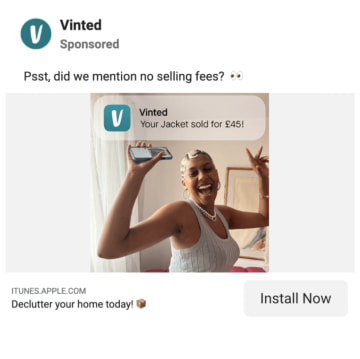
Bonus points if you manage to bring humor into your ad copy, e.g. through a pun. However, if you can’t think of a good way of doing it, don’t force it – we don’t want our audience to cringe over our trying-hard / not-funny-at-all attempt of a joke, right?
Include numbers: If you do decide to address the more conversion-ready part of your target audience, make sure to include numbers to back up your claims with data. This will give you more credibility and increase the likelihood users will convert.
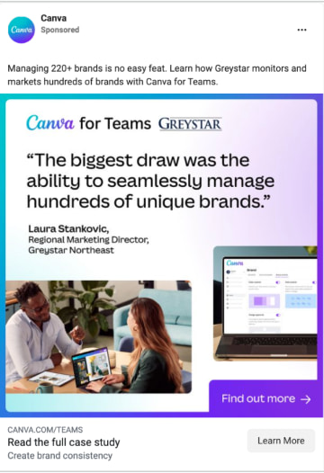
Try out emojis: There is an easy way to make your ad stand out visually not only through the creative, but also through the ad copy. Using emojis instead of bullet points, or inserting them elsewhere in the beginning of your ad copy, immediately gives the black-and-white copy a dash of color and draws users’ attention to your ad.
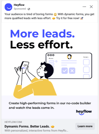
Google Ads: precision, directness and USPs
Users searching something in Google are on a mission. They want to find information quickly, so your ad needs to be highly informative and discoverable. Note also that usually users on Google are already further in their decision process and buyer journey: they have identified their problem, they know what the solution is (in many cases), and now they just need to find the right provider.
Keywords are key: Google's system decides based on the keywords and match types you set, which search queries your ad will be shown for. Consider carefully what search queries and keyword combinations users might use to search for your product or service. Also, integrate your keywords into your ad copy, as this will make Google assign a higher Quality Score to your ads, which in turn positively affects your ranking position. (Google’s free keyword planner tool can help you with this.)
Outline the solution: Google Ads need to cut to the chase. Include the value proposition and the problem you're solving right at the beginning of your ad copy to grab those who are ready to act. Keep in mind that your ad copy should be short and concise, because you have a very limited amount of characters available.
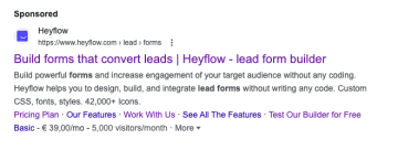
Highlight USPs: Remember that your competitors are all bidding on the same keywords as you to rank on high positions, so their Google ads will appear right above or below yours. Therefore, make sure to highlight the unique selling points of your product or service. What can it do better than your competitors? What can you offer that they don’t?

The universal rules:
Address pain points: Your ad should resonate with the user's needs and pain points. Speak directly to what their problem is, and offer a compelling solution.
Feature benefits over features: Don't just talk about what your product does; explain why that matters to the customer. It’s more about the benefits, not the features.
Use compelling language: Play with strong verbs and emotive language. Invoke curiosity, desire, or a sense of urgency when appropriate.
Include a CTA: Always tell your audience what to do next. Whether that's to 'Learn More', 'Shop Now', 'Sign Up', or 'Book a Demo', your CTA should be clear and compelling.
Designing compelling ad creatives
While ad copy does the talking, creatives like images, videos and GIFs grab the attention and provide a visual hook to make your ad leave a lasting impression. Here's how to design your creative to make users stop scrolling and convey your offer and message effectively.
Meta Ads: emotional connections
Images and videos on Meta are seen as users scroll through their personal feed. To make your ad memorable, it needs to evoke emotion. Here are some best practices and approaches you can try for your next Meta creatives:
Use high-quality visuals: Nothing turns a user away faster than a grainy or unprofessional photo. Ensure your visuals are crisp and on-brand.
Use colorful illustrations: With illustrations that are original and use bright colors, you can grab users’ attention and make them stop scrolling. This is a crucial moment because only if your ad creative stands out and piques curiosity will users actually start reading the copy around it.

Include real people: Faces and expressions can create relatability and emotional connection, especially positive expressions like a smiling face. You can try using images where people are enjoying the benefits of your product or service.

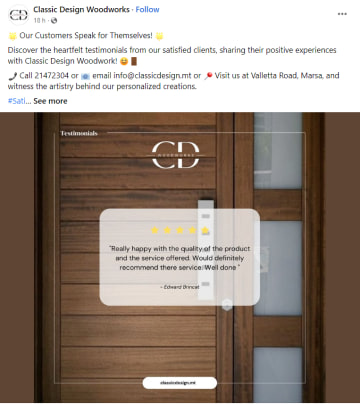
Testimonials or social proof: If relevant, incorporate snippets of customer testimonials or usage data to build trust and validation, and lend some authenticity to your ads. If you don’t have any video testimonials to take snippets from, you can simply use a customer quote as an overlay in your creative.
Google Ads: clarity and relevance
If you’re only working with Google Search Ads for now, feel free to skip this paragraph, since the search ads are not accompanied by any visuals. However, if you’re using Google’s display ads through GDN, these tips can be helpful to you.
Be clear and relevant: Your visual should complement your ad's intent. If there’s a promo code, make sure the code is visible. If it’s a product, the image should be of that product in action.
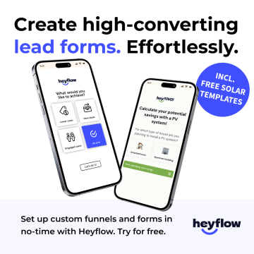
Keep it clutter-free: You have a limited space to make your point. No need for unnecessary elements that distract from your message.
The universal rules:
Consistency with your brand's visual identity is a must. Whether it's color schemes, logo placement, or overall aesthetic, your ad should look and feel like a natural extension of your brand.
Less is often more. Don't try to fit too much into your ad creative, otherwise, it can become a visual mess from which users won’t be able to discern anything. Focus on the single most compelling element and make that the hero of your visual.
Ensure visibility across devices. With mobile traffic surpassing desktop, your design must be both desktop- and mobile-friendly. It should be easy to comprehend at a glance.
Conclusion
Creating compelling ad content and creatives is not a one-size-fits-all endeavor and can sometimes be tricky. The key is to understand where you're advertising and who you're showing your ads to. Navigating the realms of Meta and Google Ads may initially appear overwhelming, but at its core, it’s about identifying and addressing customer pain points, highlighting benefits, and providing a solution.
Ultimately, experimentation, A/B testing, and a relentless focus on improving your ad creatives and content are your most effective tools in understanding what resonates best with your audience and leads to good results. Track your performance metrics closely, and be ready to refine your approach based on what gets you results. Try also to stay up-to-date with digital trends to potentially adapt your ad approach accordingly.
Are you ready to build ads that stand out and drive conversions? Then consider this your call-to-action. Start experimenting with different types of ad concepts today and find out which ones deliver the best results.


