Guides & best practices
View all articlesA how-to guide on growth-driven design for better website performance

After a few coffee-ridden months of optimizing your homepage, you can finally see the finish line. Or, so you thought…
POV: It’s Friday. You're sitting in your homepage check-in meeting that's been eating up your mornings for the last six weeks. You're set to launch on Monday. You are tired, but happy.
Head of Marketing: “I feel like we should try dynamic testimonials.”
Graphic Designer: “I was looking at our personas, let's try adaptive logos that change based on the browser.”
**Sigh 😮💨 **
Your launch date gets pushed out of sight once again.
“There has to be another way” you mutter, as you send a calendar invite for next Friday.
There is. It’s growth-driven design—and it’s used by all types of businesses that need to generate leads. From real estate to insurance, financial services to legal—all are using a growth-driven design methodology to avoid scope creep, budget bleeds, and publishing roadblocks. At the same time, the framework is helping them achieve successful website performance metrics worthy of writing home about.
In this article, you’ll discover how growth-driven design works, its benefits, and the tools you’ll need to implement this growth framework in your business for a successful conversion website.
To help provide an understanding of how both service-led and product-led businesses are learning and winning from growth-driven design strategies, we sat down with:
Ray Slater Berry, Founder and Director at content agency dslx
Kirsty Finlayson, Director of Product Marketing at Chameleon
Karina Papalezova, Creative Director & Brand Strategist for multiple businesses
Let’s get growing. 🌱
What is growth-driven design?
Growth-driven design (GDD) is a data-powered web design methodology that involves looking at user behavior analytics to iterate and optimize website design.
The term growth-driven design was first coined by Luke Summerfield, the Director of Product Strategy at HubSpot. In 2015, Luke framed GDD as a client retention strategy for web design agencies.
With this new growth-driven design approach, design agencies could put clients on retainer by adding post-launch updates, based on real user data, to their website design services. Essentially, increasing a client's website’s performance and everyone’s bottom line.
Since then, it’s evolved into an in-house, continuous improvement strategy for many businesses and their websites. It spans across industries—from marketing and advertising to energy sectors and even recruitment agencies.
Let’s see what makes growth-driven design different from the traditional website redesign or creation approach.
Growth-driven design vs. traditional web design
Luke Summerfield’s growth-driven design method has some distinct qualities that set it apart from traditional web design and existing website optimization. Here’s what makes growth-driven design stand out from the traditional web-building pathway.
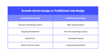
Growth-driven design views websites as dynamic & continuous design projects
“The central hub for marketers today is their website. In the past, marketing teams rarely made changes to their website due to limited support from the product team. Digital tools have come a long way, giving marketing and sales teams more autonomy and agility over their website content and the metrics they track.” — Karina Papalezova.
Traditional web design workflow views website creation like a jigsaw puzzle: a one-time process of fitting pieces together to form a pretty—but static—picture. In this ‘set-it-and-forget-it’ design approach, a website redesign is expensive and takes a long time to complete as it doesn’t happen regularly.
When it does happen, businesses often have a lot of aesthetic trends and user experience (UX) research to catch up with.
GDD steps away from the traditional static view on websites. It treats website design projects or a website optimization roadmap like a Tamagotchi: needing constant attention (and cleaning!) to grow.
When using GDD principles, designers start collecting user data from day dot. They continuously strategize micro updates with this user feedback in-hand, optimizing the website’s performance for business-critical goals (drive conversions, capture leads, etc.).
Growth-driven design is data-driven, not assumption-based
When going the traditional route, the design process is powered by assumptions and idealistic views on how to reach a peak-performing website. That’s not to say that this way of doing things doesn’t involve UX research. It does! It’s just that the research data is not personalized, leaving room for stakeholders to slide in with: “I just feel like…”. 🥶
We spoke to Ray Slater Berry from dslx, who recently re-designed the content agency’s website with web developer, Karina Papalezova. He shares one of the most important user-centric factors dslx considered:
“Too many businesses exchange accessibility for aesthetics. dslx stands to empower minority writers to write, specifically dyslexics. Who would we be if we chased pretty over people?
The dslx website had to be built with our users in mind. We ran focus groups with dyslexics to help ensure we were employing dyslexic-friendly (DX) fonts, colors, and navigation throughout.”
Growth-driven website design accounts for user behavior during the build and continues to do so once the site is live. It takes into consideration how you can continue to deliver user value in a way that’s accessible and makes sense for your ICP’s pain points and specific needs. Ray tells us more.
“Your research data doesn’t always need to be quantitative, gather qualitative feedback too. It also shouldn’t always be a one-and-done research step. With Karina at our side, we’re continuously looking for ways we can better our web presence while championing browsers that we’re passionate about. And the safest way of doing this is hearing directly from them—kick those assumptions to the curb!”
Growth-driven design has a shorter time to market
GDD focuses on creating an MVP as fast as possible using lean and agile principles. After going live, the website undergoes regular optimization to achieve business goals.
Traditional design has an inherently longer project timeline due to its philosophy of it has to be perfect before it’s live. Usually, there are no major changes made to the site after launch. Changes are made in bulk when the website owner decides it’s time for a redesign, which usually happens approximately every two years.
Overall, GDD has a more methodical, big-picture approach to web building. And it requires a commitment.
So, is it worth the effort?
Growth-driven design benefits: How GDD impacts agencies & business owners
Following the GDD method benefits everyone – from web design agencies to business owners developing their websites in-house.
Growth-driven design benefits for web development agencies
This is where GDD shines! Emerging as an agency strategy for repeat business in its early days, it still carries over those perks today when stability is shaken (overnight AI uprising anyone?). If you’re an agency owner, here’s how growth-driven web design can benefit your business:
Longer customer tenure: after finishing the MVP, you have your clients on retainer for months or even years to come with a continuously evolving website-specific strategy. This translates into opportunities for you to upsell additional services by strengthening relationships with your clients.
Consistent cash flow: switching to a retainer model gets you a predictable monthly recurring revenue (MRR). This allows you to scale your business and expand your in-house team, knowing the resources you’ll need and can afford.
Increased average revenue per customer (ARPC): instead of charging an eyebrow-raising up-front sum, you design a monthly pricing plan that adds up over time. This increases the long-term revenue generated by each client and improves your chances of someone saying yes by eliminating the daunting one-off price tag of a new website.
5 Growth-driven design benefits for business owners
Now, if you’re on the other side of the fence and you’re the business owner developing a GDD website in-house, you can expect:
Accelerated time-to-market: prioritizing core features helps you have a live website faster. GDD projects ship out 45% quicker than traditional ones. You can have a site up and running in as little as 60 days—instead of the typical 100.
Better return on investment (ROI): a Hubspot survey reports that businesses who employed GDD got 11.2% more revenue over six months when compared to those who used traditional web design.
More leads: the same survey uncovered that GDD yields 16.9% more leads.
Ongoing personalization: the continuous improvement stage helps you keep up with ever-changing customer expectations and preferences. By staying connected to your audience and tailoring your design according to their needs, your website will always keep its relevance and stay ahead of the competition.
Fewer major redesigns needed: with GDD, you’re not launching darts in the dark. Instead, you optimize your design with intentional, factually-based decisions to hit your business goals. The result? An always up-to-date site.
We sat down with Kirsty Finlayson, Director of Product Marketing + Content at Chameleon, to see how she’s coupling GDD principles with Chameleon’s user engagement data to evolve their website experience and double down on lead generation.
Chameleon’s in-house, growth-driven design insights
TL;DR:
Can’t watch the video now? No problem. Here’s what Kirsty and the team are doing, how they’re doing it, and what they’re achieving because of it:
Chameleon’s focussing on personalization: Kirsty’s team is building out dynamic, personalization based on company size and visitor frequency. This includes changing the home page based on the visitor’s brand colors, name, logo, and team size.
Chameleon’s learning from user feedback: the good and the bad! Initially, users found the personalization “creepy”, especially when their logos appeared on the homepage without prior knowledge or explanation. To combat this negative sentiment Chameleon included a disclaimer on their homepage:
“This page uses personalization, your brand is not shown to others.”
After implementing this disclaimer, Chameleon hasn’t received a single complaint
Chameleon’s increased CTRs by 11% when using geographic targeting: geographic-based personalization is helping increase attendance at real-life Chameleon-hosted events in cities such as New York, Seattle, and Denver.
Personalization efforts are helping Chameleon double their leads: personalization is working! Kirsty’s seen an average of 2x in lead generation since implementing continuous optimization strategies around personalization.
Copy Chameleon’s tech stack if you want to achieve the same:
Clearbit: identifies company information of website visitors to tailor the website experience and use the company’s logo and main logo color for the on-page experience. Chameleon also uses Clearbit to target specific company sizes with relevant pop-ups.
Mutiny: assists in creating personalized web experiences to geographic locations using side popups.
In-house web development: helps the team implement code changes based on positive website experiment results. Nothing is ever coded on a hunch.
Chameleon’s growth-driven design principles highlight the importance of personalization, data-driven decisions, and lean testing to enhance user engagement and conversion rates on their website.
“I think this [strategy] works because instead of telling people how on-brand Chameleon can look, we’re straight up showing them. We can be on brand. We’re Chameleon; we blend in, but we stand out.” — Kirsty.
How does Growth-Driven Design work? The three stages of growth-driven design
Today, GDD is a fully developed three-stage process, where website building is sandwiched between strategy and iterations.
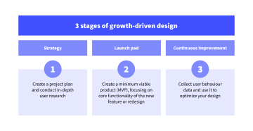
Let’s have a closer look at what each step entails.
1. Create a strategy based on user research
The strategy phase of growth-driven design is crucial for defining your redesign roadmap. It’s where you’ll follow some of the more traditional website design research practices and strategy building. Now's the time to:
Set a clear vision for your business
Karina weighs in on the importance of starting your GDD journey with a clear business vision.
“Before you dive into any kind of transformation, it’s crucial to set a clear vision for your business. It’s not just about dreaming big, but understanding the scale you’re comfortable growing into and setting realistic goals that align with your business objectives. I like to think of this approach as growing by design.”
Karina goes on to specify how a business can set their vision and pathway to success:
“You want to align your growth plans with what your team does best. For example, a digital marketing agency strong in copywriting might excel at growing through organic content, while an advertising agency could thrive by developing a YouTube channel, leveraging their existing team’s expertise in storytelling and video production.
When you align your vision, goals, and team strengths, you're not just growing—you're setting yourself up for success that's both sustainable and effective.”
This is exactly what Karina guided dslx through as they started their rebrand.
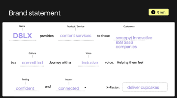
Do thorough user research
The father of GDD tells you to “Know thy customer!”
The way your audience perceives your website when interacting with it is the bread and butter of GDD. Or rather: it's the broccoli of GDD. It’s the healthy food that fuels your site. Brand-new, shiny aesthetic trends are just (eye) candy. To help your website drive conversions, you need to strike a healthy balance between the two while keeping in mind the sweet things can be a treat but never a full course.
You need to understand your customer’s needs, wants, feelings, and pain points.
Dive deep, create buyer personas, outline “jobs to be done”, work on journey mapping, and sketch out ideal customer profiles (ICPs) so you can visualize who you’re building a website for.
Being thorough with this step will help you position your products or services in a way that’s relevant to your audience.
Create a site map and user flow
With your user research in place, the next step is mapping out the most important pages of your website. This gives you an overview of the entire site and enables you to map out the user flow through your web pages. Understanding how users navigate your website helps you focus on specific areas to improve your user’s journey and maximize engagement one flow at a time.
Focus on core pages and functionality first and ignore any nice-to-have features (for now).
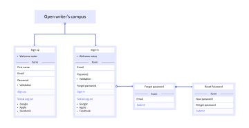
2. Get the launch pad website ready for take-off
In the context of redesigns, the launch pad site is an improved version of your website that focuses on getting high-priority updates live, fast. Additional features and nice-to-haves that are not crucial to reaching your number one objective are pushed to the post-launch phase of regular iterations. In short, it’s a project acceleration method.
Remember: the goal is to create a minimum viable product (MVP). So, try not to get sidetracked by ideas, whether they’re yours or someone else's, that can lead your project down the rabbit hole – sorry, Alice, you’ll have to wait! 🎩 🕳️ 🐇
3. Start continuous improvement informed by real-time user data
The last stage of GDD is about iterations, iterations, and more iterations!
After successfully launching your MVP site or new feature, look at it as if it’s a living, breathing thing. It will need upkeep, attention, and a whole lotta TLC (testing, learning, and crafting).
Data collection is crucial for this ongoing process of improvement. Every change you make—be it copy edits or design alterations—needs to be based on an objective source of truth: data.
Karina shares her experience in continuous development when working with the Oliva Health team.
“When I joined the Oliva Health team, the product was initially geared towards a B2C market. As we gathered insights and learned from the market, the company shifted its focus to B2B and eventually to enterprise clients.
At each stage, we adapted the brand and visual assets to better speak to our target audience. For B2C, the visuals were lighter and the tone softer to attract individuals seeking mental health support. When rebranding for B2B, we opted for bolder color choices and a more thought-provoking tone of voice to stand out amongst competitors and get on the radar of people within the HR community.
By continuously iterating and adapting our design based on market feedback and business needs, we were able to scale brand consistency and, in turn, website optimization efforts while remaining a small team.”
Let’s wrap up by looking at some of our favorite tools for collecting user behavior data.
3 Tools to add to your growth-driven web design tech stack
Switching to growth-driven design may mean switching to new tools, or rekindling the flame with some forgotten loves. Let’s take a look:
1. Collect user behavior data with Google Analytics
Use Google Analytics to monitor website traffic and performance.
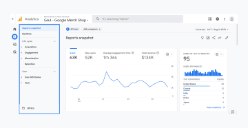
With this tool, you can track metrics like:
Website visitor demographics and behavior: get to know your people! Monitor users’ location, interests, and how they interact with your site.
User acquisition: see what channel drives people to your website and what role your paid advertising, SEO efforts, and social media marketing play in driving traffic.
Page-level performance: identify your top-performing pages.
Conversion rates: track how many visitors perform a desired action (complete a purchase, sign up for your newsletter, or download resources).
Google Analytics helps you understand how users interact with your site and how effective your marketing efforts are in driving traffic to your website, for free.
2. Record user sessions and generate heatmaps with Hotjar
Hotjar is a more advanced user behavior analytics tool that enables you to dig deeper into your customers’ journeys. You can use this tool to track user interactions across your web pages and get granular insights into exactly how visitors are engaging with your website design.
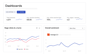
With Hotjar you get:
Heatmaps: see which user interface (UI) elements get attention and which get ignored.
Full recordings of users' visits: You can see what they click on, their mouse movements, and even frustration-born clicks (rage clicks).
Get contextual UX feedback: Hotjar enables you to record your audience’s website sessions and experiences every step of the way. This offers you a granular view of areas of improvement.
If you're just getting started with analytics, you can opt for the free Hotjar pricing plan which allows you to track 35 user sessions per day and comes with unlimited heatmaps.
3. Build interactive content elements with Heyflow
You can use no-code, drag-and-drop tools like Heyflow to build forms and surveys quickly. This can help you add customized flows to your MVP site without extending your project timeline. The insights from these forms then help you optimize your website flows, enabling the quick and easy deployment of data-driven changes and faster iterations with Heyflow’s intuitive builder.
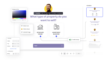
With Heyflow, you can speed up your growth-driven design and create on-brand, interactive content using templates optimized for conversions:
Multi-step forms: a simplified, less intimidating form grouping questions to not overwhelm the visitors and increase their chance of completion.
Landing pages: with interactive features that improve users' experience while guiding them to conversion.
Personalized funnels: The collection of key interactions between a prospect and a brand to help tailor their journey to becoming a customer faster.
Once all that’s done, you can easily embed your Heyflow content as inline web components or pop-ups on popular websites like Wix, Squarespace, WordPress, Webflow, and more.
(Want to know how it's done? Check out this video:
After your MVP is live, your Heyflows will start providing funnel-level analytics for you to keep track of your respondents’ behavior. Heyflow’s built-in analytics enable you to:
Track the devices your visitors are using
Monitor the evolution of your conversion rate
Understand the time of day users interact with your flows with daytime heat maps
With access to this information, you can see exactly what stage of your funnel is a breaking point and identify any downtrend in conversions so you know what and when to optimize and prioritize.
Plus, for more in-depth user behavior tracking, Heyflow natively integrates with Google Analytics 4. 🤩
Get one step closer to design-powered growth with Heyflow
Growth-driven design is all for agile web project completion and web design edits based on real-time user behavior insights. Heyflow can help you launch an MVP site faster without giving up on interactive content elements or quality we all know converts.
Start building custom designs in a snap, use tried and true templates to capture leads, keep your feedback loop looping, and your business flowing.
Try Heyflow for free today, and start building user-centered designs in clicks.


