
How to Create an Advertorial Landing Page That Sells (With Examples)







Trusted by 3,000+ marketers





What it is, how to build one, real examples by vertical, and what makes one perform once it's live.
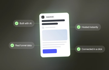
Every advertorial landing page starts as the same idea: a page built to read like something worth clicking into, not something to click away from. What's changed is how fast that idea can become a real, connected page rather than a week of separate writing, design, and development work. This guide covers what an advertorial landing page is, how to build one, what good ones look like across different industries, and how Pages, Heyflow's page builder for advertorials, listicles and other presell pages, turns the process, whether it starts with a prompt or an import from another AI tool, into a page that's hosted the moment it's built and connected in a click.
Key Takeaways
An advertorial landing page reads like editorial content, a story, an article or a review, rather than a pitch, and it's built to warm up cold traffic before asking for anything.
Pages, Heyflow's page builder for advertorials, listicles and other presell pages, generates a fully structured advertorial from a single prompt, in the order operators write them, from the headline to the guarantee, in minutes rather than the days a traditional copywriter-plus-designer-plus-dev handoff usually takes.
Every page starts from a research step and a data layer: Brand Hub builds your buyer's pains, desires, objections and proof from your site, and the structure draws on patterns across 150,000+ real funnels and $2 billion in tracked ad spend, so it isn't a guess.
If a page already exists somewhere else, in Claude Design, or drafted inside a Claude conversation, Heyflow takes it over from there: import it 1:1, or send it directly through the Heyflow MCP connection. It's hosted the moment it lands, connected in a click to the funnel, tracking, domain and analytics your account already runs.
What Is an Advertorial Landing Page?
An advertorial landing page is a page built to sit between an ad and a form, quiz, checkout or product page (PDP), formatted like an editorial article, story or review rather than a direct sales pitch. It's one type of presell page, the umbrella term for any page between the ad and the offer; its closest sibling is the listicle, which makes the same case as a numbered list. Some marketers use "advertorial" loosely for both, or call the hybrid a "listicle advertorial". The name describes exactly what it borrows from each half: the editorial read of a print advertorial, the kind of sponsored content that's always run in magazines and newspapers, combined with the mechanics of a landing page, its own destination, its own CTA, built to convert rather than just to be read.
That combination has a measurable effect when it replaces a page that skips the editorial step entirely. Apexure reports a 76% drop in cost per lead (from $2,300 to $550) for its client DOOR3 after adding an advertorial in front of the landing page. The number is specific to that campaign, not a universal guarantee, but it illustrates the gap this format is built to close: the difference between a page that asks for a decision immediately and one that earns it first.
The reason the format works is specific to how a cold visitor experiences it. Someone who clicks an ad and lands on something that reads like a pitch is primed to leave immediately. Someone who lands on something that reads like a helpful article keeps reading, which is the only thing an advertorial landing page needs before its case can be made.
On length and effort, for context before the next section: Apexure's guide puts a typical advertorial in the 800 to 2,000 word range, with more complex offers needing 1,500 to 2,000 words to properly address objections, and reports average engagement times of two to four minutes on ones that are well built. That's a meaningful amount of writing, structuring, and design work for a single page, which is exactly the part a prompt can now do in one pass.
Advertorial vs Standard Landing Page vs Product Page
The confusion between these three is common enough to address directly, since they get used interchangeably even though they do different jobs at different points in a funnel.
Advertorial landing page | Standard landing page | Product page | |
|---|---|---|---|
Reads like | An article, story, or review | A sales offer | A product listing |
Best for | Cold traffic with no context yet | Warm traffic that already knows the brand | Traffic that already intends to buy |
Main job | Build trust and belief before the ask | Convert an already-warm visitor | Complete a transaction |
Typical length | 800 to 2,000 words | Short, scannable | As short as the product needs |
CTA style | Soft handoff to the next step | Direct, benefit-led | Add to cart / buy now |
The practical implication: an advertorial isn't a replacement for a standard landing page or a product page, it's what runs before either one when the traffic hitting it is cold. Sending warm or hot traffic through an advertorial it doesn't need adds friction the same way skipping it for genuinely cold traffic loses trust that was never built.
How to Make an Advertorial
An advertorial is written in a fixed order, and each part earns the reader's attention for the next one. The structure below follows how operators who run advertorials at scale describe it (Carl Weische's Sept 2026 breakdown is the most detailed public version); why a page belongs between the ad and the offer at all is in our guide to presell pages for cold traffic.
Step 0: research. Before the hook, write down what your buyer is trying to avoid and what they want instead, the alternatives they've tried by name, their objections, and which proof they trust. Brand Hub does the first pass from your website, your competitors and your testimonials, and you can feed it what your site doesn't know: paste review mining, survey answers or a Reddit thread, and it builds the pains and desires into the brand every page draws on.
Headline: attack a belief and hint at a mechanism. "The real reason your shoulder won't heal (it isn't wear and tear), and the 12-minute fix." It has to read like an article. Check the Meta Ad Library for what your category already claims and go one level further.
Open on one small, recognizable moment. Not "my shoulder hurts": a specific scene the reader has lived.
Mirror their life back to them. Walk the problem from a hobby to daily tasks to sleep to work to relationships, in concrete detail. End on an open loop ("I had no idea that three weeks later...").
Why nothing else worked. Name every alternative they've tried and explain why each failed, then why doing nothing is worse. The narrator has tried all of it.
The root cause nobody else names. If the reader accepts your root cause, every alternative was solving the wrong problem.
The product as the fix for that root cause. Feature by feature, short.
The proof story. First person, skeptical at first, surprised by how fast it worked. It must read like a real customer. First CTA here, never "buy now".
The five biggest objections, one testimonial each. Big objections get their own section; the FAQ is for small ones. CTA.
Price against an anchor. List what the alternatives from step 4 cost, then your price. Real scarcity only. CTA.
Guarantee and the two options. Keep doing what kept you stuck, or try it risk-free. Final CTA.
This is the process Heyflow's AI runs. The point of the steps above isn't that you write them by hand; it's that the AI behind Pages was built to do what an operator does, from data:
What a pro does | What Heyflow's AI does |
|---|---|
Writes down the buyer's pains, desires, objections, alternatives tried, proof they trust | Brand Hub researches it from your site, competitors and testimonials, and every page inherits it |
Picks the format and structure that fits the offer and the awareness level | Agents choose the format (advertorial, listicle, comparison page) and sequence from patterns across 150,000+ funnels and $2bn in tracked spend |
Writes the ten sections in order, in the brand's voice | Pages generates them in that order, in the Brand Hub voice, from one prompt |
Builds one advertorial per angle, congruent with the ad | Duplicate the winner with integrations intact and rewrite for the new angle; from Claude, "build the page that continues my best-performing ad" (Heyflow MCP next to the Meta Ads MCP) |
Waits for significance before killing a variant | Native A/B testing with statistical significance; the Optimize Agent proposes the fix and launches the test (on the funnel behind the page today) |
Keeps the CTA and the "Sponsored" label in view on mobile; hands off to the offer | Sticky Bar; the CTA opens a quiz or the product page in the same stack, tracking carried through |
Advertorial Examples by Vertical
What a good advertorial (or its listicle sibling) looks like changes by industry, since the hook, the story angle, and the objection it needs to clear are all specific to what the reader is being asked to believe.
Vertical | Hook | Story angle | Proof needed before the CTA |
|---|---|---|---|
Insurance | "Most people overpay for the same coverage" | Editorial breakdown of common coverage mistakes | "Is this actually going to save me money?" |
Solar / energy | "Your roof could be paying your electric bill" | Payback period and incentives, told through a local example | "Is my house even a good fit?" |
Financial services | "The fee you didn't know you were paying" | Explainer on fee structures, told as a discovery | "Is switching worth the hassle?" |
DTC supplements | "The 3 things your multivitamin is missing" | Listicle: five reasons, the product as the fifth, ingredient proof | "Is this different from what I already take?" |
DTC skincare | "Why your routine stops working at 35" | Story-led, one routine change, before/after | "Which one is for my skin?" |
Telehealth / GLP-1 | "What nobody tells you before month three" | First-person 90-day story or a comparison page against the big two, into the eligibility quiz; no medical claims in the hook | "Am I eligible, and is this legit?" |
Legal | "What most people don't know before they sign" | Case-style walkthrough of a common mistake and its cost | "Do I actually need a lawyer for this?" |
The pattern across all of them: the hook names a specific, narrow belief the reader already holds, the story spends most of its length earning the right to challenge that belief, and the proof arrives exactly where the reader would otherwise stop reading. That structure is what Pages is built to replicate per vertical, not a single generic template stretched across every one. In Heyflow, the CTA can open a product-finder quiz or eligibility flow in the same stack, so the page and the funnel share tracking and analytics.
Running the Funnel: One Page per Angle
The ad starts the story and the advertorial continues it, so a perfect page behind the wrong ad converts badly. Everything should match from ad to page to offer: angle, pain, avatar, colors, product variant, the people in the photos. That means one advertorial per angle (a listicle can absorb several angles; an advertorial can't), and scaling is volume of angles: copy the winner and change only the content per angle.
Continue the winning ad. With Heyflow MCP next to the Meta Ads MCP in Claude: "Build the advertorial that continues my best-performing ad."
One page per angle, same skeleton. Duplicate the winner, integration settings intact, and rewrite the content for the new angle in the same Brand Hub voice.
Keep it congruent. URL parameters carry the ad's angle and variant into the funnel behind the page, where variables and conditional visibility swap the hook and the product shown.
Measure it properly. Native A/B testing with statistical significance runs on the funnel behind the page, so “did the advertorial beat the PDP” is answered at significance, not at 100 visitors. On the page itself, heatmaps show which parts of the story hold readers and where they stop reading.
Hand off the offer. The CTA carries the price anchor and the variant into the PDP or a product-finder quiz with live Shopify product data.
Built Fast: Prompt to Live Page
The traditional path to an advertorial like the ones above usually involves a copywriter for the story, a designer for the layout, and a developer for the build, a multi-person, multi-day process for a single page. Pages condenses that into one prompt: describe the offer and the audience, and the output is a fully structured advertorial landing page in your Brand Hub voice, not a draft that still needs the story, layout, and build done separately afterward.
Speed matters here for a reason beyond convenience. A single offer or vertical rarely gets one advertorial. It gets several, with different hooks and angles: run two hooks as two pages behind two ads and read them side by side in analytics. A process that takes days per page makes that kind of testing expensive to run. A process that takes minutes makes it routine.
Built on Data: The Intelligence Layer Behind Every Advertorial
The part of this that's easy to undervalue is what decides the structure in the first place. A hook, a story angle, and a proof placement aren't guesses. Heyflow's AI reads the brief's description of the audience, the pains, and the offer, and selects the format and structure that tends to convert for that specific vertical, drawing on patterns across more than 150,000 real funnels and over $2 billion in tracked ad spend. The research step feeds it: the data knows what converts, and Brand Hub knows who you're selling to.
The same data shapes the funnel behind the page once it's live: per-screen drop-off, AI Insights and the Optimize Agent, which proposes the fix and launches the A/B test with it. The page isn't AI-generated once and then static. The same data-informed approach that shaped the first draft continues to inform how it gets improved.
Already Started in Claude?
Built it in Claude Design or a Claude chat? Import it 1:1 or send it through MCP; from another tool, a screenshot or URL is enough for Pages to match the brand. How that works, and what a prototype is missing before it can run a campaign, is in how to create a landing page using AI.
If there's an advertorial to build, start for free with Heyflow and prompt one directly, or bring in a design that's already underway.
Common Advertorial Mistakes to Avoid
A few failure points show up repeatedly enough to call out directly, since they're easy to miss even with the right structure in place.
Breaking message match. The single most common mistake: the ad promises one thing and the page opens with something else. If the ad hooks on a specific pain point or story, the page needs to open with that same thread, not a generic headline. Any gap between the two is where a cold visitor leaves before the advertorial gets a chance to work.
Skipping platform disclosure. Native ad platforms like Taboola and Outbrain require a visible disclosure, "Sponsored," "Advertisement," or similar, at the top of the page. According to Apexure's guide, this isn't optional: reputable publishers and platforms require clear labeling to comply with FTC guidelines and maintain reader trust, and a page that omits it risks rejection from the platform before it ever runs. It's a compliance requirement specific to the format, not a general design convention, and it's easy to miss if the page was designed without native distribution in mind from the start. Heyflow reports conversions server-side to Meta, TikTok, Microsoft Ads, Taboola, Outbrain and OpenAI Ads (ChatGPT Ads); on native, that means Taboola and Outbrain get the advertorial's leads or sales natively, with optional conversion value, without a middleware setup. The Sticky Bar block carries the disclosure label or the CTA in the mobile thumb zone.
Writing a health hook the platform won’t run. “Why your symptoms haven’t improved” is a personal-attributes violation on Meta and a health-claim flag on Taboola. Write the belief, not the diagnosis: “Why the standard advice stops working after 40”. For telehealth, the page runs on a HIPAA-ready platform.
Writing to a fixed length regardless of the offer. An 800-word advertorial can undersell a complex, considered purchase, and a 2,000-word one can lose a reader on a genuinely simple offer. Length should follow how much belief the offer requires, not a template default.
Hard-selling in the CTA. An advertorial that spends its whole length building trust and then closes with an aggressive, high-pressure CTA undercuts its own structure. The handoff should feel like a natural next step, not a tonal U-turn.
Treating it as a one-time asset. A single offer usually needs several advertorials, different hooks and angles tested against each other, not one page reused indefinitely. A page that never gets iterated on is a missed opportunity to find out what earns the click-through.
Killing a page on 100 visitors. Operators who run advertorials at scale wait for roughly 1,000 orders, 20,000 to 50,000 users, 90 to 95% significance, or two to four weeks before calling a winner. A variant judged on 100 visitors is noise.
FAQ
What is an advertorial landing page?
A page built to sit between an ad and a form, quiz, checkout or product page (PDP), formatted like editorial content, a story, article or review, rather than a direct pitch. It's one type of presell page; the listicle is its numbered-list sibling. Its job is to build trust and address objections before asking a cold visitor to convert.
How do I make an advertorial?
Start with research: your buyer's pains, desires, objections, the alternatives they've tried and the proof they trust. Then write it in order: a headline that attacks a belief, one recognizable opening moment, the reader's life mirrored back, why nothing else worked, the root cause, the product as the fix, a proof story, the biggest objections answered, the price against an anchor, and a guarantee. Pages generates this structure from a prompt, in your Brand Hub voice, rather than requiring it to be written and designed by hand.
What do good advertorial examples look like across different industries?
The hook, story angle, and proof needed all change by vertical. An insurance advertorial typically opens with a cost-related pain point and closes an "is this worth it" objection; a DTC supplement page often runs as a listicle instead with the product as the fifth reason and closes an "is this different from what I already take" objection. The consistent pattern is that the hook names a specific belief, the story earns the right to challenge it, and the proof arrives exactly where the reader would otherwise stop.
Can I bring in an advertorial I already started building somewhere else?
Yes. A Claude Design file imports 1:1, fonts, layout, and mobile behavior included. A page drafted inside a Claude conversation can be sent directly through the Heyflow MCP connection. For anything built in another AI tool, a screenshot or URL is enough for Pages to match the brand, or prompt the same concept directly.
Why does it matter that this is a page builder and not just a design generator?
A design generator produces something that looks like a finished advertorial. A page builder produces one that can run: hosted the moment it's built and connected in a click to a production domain, ad tracking, a CRM, and analytics, rather than sitting as a preview that still needs each piece built before it can accept traffic.
Does an advertorial built in Heyflow work with Taboola and Outbrain?
Yes. Native is the channel the advertorial format was built for, and Heyflow reports conversions to both Taboola and Outbrain server-side, natively, with optional conversion value. The Sticky Bar block keeps the "Sponsored" label or the CTA in view on mobile.
How long should an advertorial landing page be?
Typically 800 to 2,000 words, depending on how much belief the offer requires. Simpler, lower-consideration offers tend to work at the shorter end; more complex or higher-cost offers, common across insurance, financial services, and similar verticals, usually need 1,500 to 2,000 words to properly address objections before the CTA.
Recommended articles
MCP: The Easiest Way to Create a Sales Funnel With AI
Prompt a sales funnel through MCP and it's hosted the moment it's built, connected in a click. That's what makes it the easiest way to build one with AI.
Read more
Heyflow MCP vs Typeform MCP vs Jotform MCP Compared
A feature-by-feature comparison of Heyflow MCP, Typeform MCP, and Jotform MCP, and which one connects to your ad platforms and CRM.
Read more
From MCP to Funnel: How to Prompt for Leads With Heyflow
Go from an MCP connection to a live lead funnel: connect Claude, prompt for what you want, and get a funnel that’s hosted the moment it’s built.
Read more