
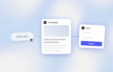
How to Make a Cold Traffic Campaign Work With Presell Pages







Trusted by 3,000+ marketers





A step-by-step guide to building the presell page that turns a cold click into a warm, ready-to-convert lead.
Cold paid social traffic often converts at 0.5% to 1.5%, according to ClickMinded's 2026 CRO benchmark roundup, while email and referral traffic converts at roughly 5% on the same offer. The difference isn't the offer: a cold click is being asked for a decision it hasn't made yet. A presell page, such as an advertorial or a listicle between the ad and the offer, is the step most cold campaigns skip. This guide covers what it does, how to structure it, and how to build one without adding a tool to your stack.
Key Takeaways
Cold traffic converts well below warm traffic on the same offer. According to ClickMinded's 2026 CRO benchmark roundup, cold paid social prospecting often lands between 0.5% and 1.5%, against roughly 5% for email and referral traffic.
Sending a cold click straight to a form or product page skips a step most funnels are missing. A presell page, such as an advertorial, listicle or comparison page, sits between the ad and the offer to build trust before asking for anything.
The funnel has three distinct jobs: the ad earns the click, the presell page earns the trust, and the form, quiz, checkout or product page (PDP) captures the conversion. Each stage needs a different kind of page.
Pages, Heyflow's page builder for landing pages, advertorials, listicles and presell pages, builds that page from a prompt, imports one 1:1 from Claude Design, or receives one sent directly from a Claude conversation through the Heyflow MCP connection. It's hosted the moment it's built, connected in a click to the funnel, tracking, and domain you already run.
Why Cold Traffic Doesn't Convert on the First Click
Traffic source changes what a page is capable of, before a single word of copy gets tested. According to Visionary Marketing's 2026 Conversion Benchmark Report, based on 2.4 million landing page sessions collected between March 2025 and February 2026, paid social converted at 2.84% on average, against 7.42% for direct traffic and 6.94% for email on comparable page types. ClickMinded's own 2026 CRO benchmark roundup narrows the picture further for prospecting specifically: cold paid social traffic, meaning visitors with no prior relationship to the brand, often converts between 0.5% and 1.5%, and pure cold prospecting can run as low as 0.3% to 0.8%. Native ads (Taboola, Outbrain, MediaGo) are the extreme case: the click comes from an editorial context, so the page has to read like one. The advertorial format exists because of native. Both sources agree on the ordering even where the exact figures differ: warm channels like email and direct traffic are reaching people who already trust the brand, while cold social is reaching someone mid-scroll who hasn't made any commitment yet.
The instinct is to blame the offer, the price, or the creative when a cold campaign underperforms. Often the real cause is structural. The funnel asks a cold stranger to make a warm-audience decision in one click. A visitor who has never heard of a company needs a reason to believe before they need a form to fill out. Skip that step and even a strong offer converts like a weak one.
Closing that gap is what a presell page is built to do.
What Is a Presell Page?
A presell page is any page between the ad and the offer (a form, quiz, checkout or product page) whose job is to warm a cold visitor rather than convert them. Advertorials (editorial story format), listicles ("5 reasons"), comparison pages and quiz funnels are the common types; affiliate marketers call the same thing a bridge page.
According to Apexure's 2026 guide to advertorial landing pages, an advertorial is a paid advertisement that looks and reads like editorial content, combining storytelling with subtle promotion to warm up cold traffic before sending visitors to a sales page. It's built to read like an article, a story, a review, or a listicle rather than a direct pitch, and its only job is to build enough trust and handle enough objections that the visitor wants to take the next step.
The format matters because of how a cold visitor experiences it. Someone who clicks a native or social ad and lands on something that reads like a hard sell is primed to leave immediately. Landing on something that reads like a helpful article buys the attention span needed to make a case. The scale of that gap shows up in native ad performance data: according to native advertising statistics compiled by MarketingLTB and cited in Apexure's guide, native ads generate 53% more engagement than traditional banner ads and see click-through rates reported as high as 8.8 times higher. That advantage only holds if the page a click lands on keeps the editorial tone intact instead of breaking it with an immediate pitch.
A presell page is not the same thing as a landing page in the traditional sense. A landing page usually asks for the conversion directly, with a single CTA and minimal reading required. A presell page's only job is to get the visitor to want the next step, and the conversion happens on the page after it.
On length: Apexure's guide puts the typical advertorial in the 800 to 2,000 word range, with simpler consumer products needing closer to 800 words and more complex B2B offers, the kind common across Heyflow's own customer base in insurance, financial services, and energy, needing 1,500 to 2,000 words to address objections properly. The same source reports average engagement times of two to four minutes on well-built advertorials, with CTA click-through rates in the 3% to 8% range, both useful benchmarks once your own page is live.
How the Funnel Works: Cold, Warm, Conversion
A cold traffic campaign that converts is three pages doing three different jobs in sequence. Treating them as one undifferentiated experience is a common reason cold campaigns underperform even when the individual pages are well made.
Funnel stage | Page | Job to be done | What good looks like |
|---|---|---|---|
Top of funnel | The ad | Capture attention from someone with no prior intent | A hook, curiosity gap, or specific pain point strong enough to interrupt the scroll |
Middle of funnel | The presell page (advertorial, listicle or comparison page) | Bridge the cold click and the offer without a hard sell | Editorial storytelling, social proof, and objection handling that build trust before the ask |
Bottom of funnel | The form, quiz funnel, checkout or PDP | Convert a now-primed visitor into a lead, an applicant or a buyer | A short, direct ask, backed by trust already built upstream |
The top of the funnel is the ad. Its one job is to get the click. It doesn't need to explain the full offer, and trying to usually costs it the click. A specific hook or pain point is enough to interrupt the scroll.
The middle of the funnel is where most cold campaigns fall short, mainly because most funnels skip it entirely. This is the presell page's job. Instead of sending a cold visitor straight into a pitch, it uses editorial storytelling, social proof, and educational framing to work through objections and build the trust a single ad can't establish on its own.
The bottom of the funnel is the form, quiz, checkout or product page (PDP). By the time a visitor reaches it, they should already be primed. They've read something, seen evidence it works for people like them, and the last step is capturing intent that already exists rather than trying to create it cold. For ecom, the presell page sits before the PDP, not instead of it. For telehealth, the bottom stage is the pre-qualification and intake quiz.
Skip the middle stage and the form has to do the ad's job, the presell page's job, and its own job at once. That's a lot to ask of a name and email field.
Cold Traffic vs Warm Traffic: Why They Need Different Pages
Not every visitor needs the full bridge. Someone clicking a branded search ad, a retargeting ad, or an email link already has context, and a long editorial presell page adds friction they don't need. The mismatch runs both ways: warm traffic sent through an unnecessary bridge drops off from impatience, and cold traffic sent straight to a form drops off from lack of trust.
Cold traffic | Warm traffic | Hot traffic | |
|---|---|---|---|
Example source | Cold Meta or TikTok prospecting, native ads (Taboola, Outbrain) | Retargeting, email list, branded search | Direct visitors, existing customers |
Mindset | No prior awareness of the brand | Some familiarity, hasn't committed yet | Ready to act, just needs the path |
Main objection | "Why should I trust this?" | "Is this still the right fit for me?" | Usually none, or purely logistical |
Right page type | Presell page (advertorial, listicle) | Shorter landing page, light proof | Direct form, checkout or PDP |
CTA style | Soft handoff to more content | Clear, benefit-led CTA | Direct, one-step CTA |
Match the page to the traffic temperature rather than pointing every channel at the same asset. Building one page and running every source into it is one of the more common reasons a cold campaign underperforms while the same offer converts fine from email.
Building the Bridge: How to Structure a Presell Page That Converts
A presell page that works follows a specific internal structure. Each part earns the reader's attention for the one that follows.
The hook and the message match
The headline and opening lines need to match the promise of the ad closely. A visitor who clicked because of a specific pain point or curiosity gap should land on a page opening with that same pain point or gap, not a generic welcome. Message match between ad and page is one of the strongest levers on whether a cold visitor keeps reading past the first few seconds.
Editorial storytelling, not a pitch
The body should read like something the visitor would choose to read on its own merits: a story, a case, a listicle. This is where narrative and educational framing do work a bulleted features list can't. A reader who's engaged in a story is more forgiving of a mention of your product than a reader who landed on something that's obviously an ad.
Social proof, placed at the objection
Testimonials, review scores, or specific results work best placed where a skeptical reader would naturally hesitate, not bundled into one block at the bottom. If the page just made a claim, that's where the proof for it belongs.
Objection handling, before the ask
By the time a cold reader reaches the CTA, the obvious doubts (cost, effort, whether it applies to their specific situation) should already be addressed. A presell page that saves objection handling for the sales page has spent the trust it just built without using it.
The soft handoff to the form
The presell page's CTA doesn't need to close the sale. It needs to move a now-warmer visitor to the form, quiz, checkout or product page with momentum intact, a lower-friction ask than the one a cold click can handle.
In Heyflow the handoff is a funnel, not a form: the presell page's CTA opens a short qualifying flow (own or rent, roof type, skin type), and the contact ask comes after the visitor has invested three answers. Page and funnel share tracking, domain and analytics, so the attribution never breaks at the handoff.
How this plays out changes by vertical, from lead-gen categories with real explanation needs to DTC and telehealth, where the presell page is the default format:
Vertical | Cold hook | Presell page angle | Objection it clears before the form |
|---|---|---|---|
Insurance | "Most people overpay for the same coverage" | Editorial breakdown of common coverage mistakes, with a quiz-style comparison | "Is this actually going to save me money?" |
Solar / energy | "Your roof could be paying your electric bill" | Story-led piece on payback period and incentives, local case examples | "Is my house even a good fit?" |
Financial services | "The fee you didn't know you were paying" | Explainer on fee structures with a comparison table | "Is switching worth the hassle?" |
Real estate | "What your listing photos are costing you" | Before/after story format with agent proof points | "Will this actually work for my property?" |
Home improvement | "Why this repair keeps coming back" | Problem/cause/fix narrative with before-and-after photos | "Is this a real fix or a sales tactic?" |
DTC supplements | "The 3 things your multivitamin is missing" | Listicle: five reasons, product as the fifth, ingredient proof | "Is this different from what I already take?" |
DTC skincare | "Why your routine stops working at 35" | Story-led advertorial into a product-finder quiz | "Which one is for my skin?" |
Telehealth / GLP-1 | "What nobody tells you before month three" | First-person advertorial or comparison page (vs. the big two) into a pre-qualification quiz; HIPAA-ready, no medical claims in the hook | "Am I eligible, and is this legit?" |
Prompt It, Import It, or Ship It From Claude
Building a page like this from scratch for every campaign, vertical, and offer is exactly the bottleneck Pages is built to remove, and it's designed to fit however your team already works, including teams already deep into AI-assisted, prompt-first design workflows.
Start from a prompt. Describe the offer and the audience, or point it at your site: Brand Hub builds your voice, audience, pains and proof points from a URL, and the page is written in it. Pick the format the hook wants: advertorial (story), listicle (five reasons, product as the fifth) or comparison page. Pages generates it already structured the way this guide describes: hook, story, proof, and CTA, shaped by patterns pulled from more than 150,000 real funnels and over $2 billion in tracked ad spend. The output isn't a blank template that still needs the structural thinking done by hand. It arrives already organized around what tends to convert for the vertical and audience described in the prompt.
Or bring in a page you already designed. If your team, an agency, or a freelancer already built something in Claude Design, Heyflow imports it 1:1, matching fonts, layout, and mobile behavior, and it's editable the moment it lands. This matters for teams that have already invested in a Claude Design workflow for the visual side: nothing gets rebuilt or approximated, and from that point it behaves like any other Heyflow page, fully editable, ready to connect.
Or send it straight from a Claude conversation. Through the Heyflow MCP connection, a page built or refined inside a Claude chat can go directly into Heyflow without an export-import step in between. This is built for exactly this kind of workflow. It picks up right where prompt-driven design tools leave off. Tools like Claude are genuinely strong at fast, prompt-driven prototyping: describing a page and getting a working design back in minutes. What they don't include natively is what happens after the design is done: hosting on a production domain, connecting to a CRM, wiring up a Meta pixel and Conversions API, setting up funnel analytics, or getting the page in front of paid traffic with tracking that survives the trip. That's usually the point where a fast prototype turns into a week of engineering work before it can accept a single click from an ad. This is the gap Heyflow closes: the design work happens wherever your team already does it well, including inside Claude, and on the Heyflow side the page is hosted the moment it lands and connected in a click to the production infrastructure, the part that's harder to prototype your way around.
What that means day to day: a page that started as a prompt or a Claude Design file ends up connected to the same tracking, domain, and funnel as everything else your team runs, without a separate build process for each entry point. The full design-to-live path, including what a prototype is still missing, is in how to create a landing page using AI.
Keep the Page Connected to Everything Downstream
A presell page that converts but doesn't talk to the rest of the stack still leaves value on the table. Every visitor who reads the page and clicks through needs to carry their tracking data and attribution with them, and every conversion needs to flow back to the platform that paid for the click.
This is easy to underestimate when a presell page gets built as a one-off in a separate tool. A well-designed advertorial hosted outside the funnel stack means rebuilding tracking, re-wiring the CRM handoff, and hoping the domain and pixel setup survive the move between tools. Built inside Heyflow, a presell page is hosted the moment it's built, connected in a click to the funnel, custom domain, analytics and heatmaps, and to server-side tracking for Meta, TikTok, Microsoft Ads, Taboola, Outbrain and OpenAI Ads (ChatGPT Ads). There's no second stack to maintain and no attribution gap between the page that built the trust and the form that captured the lead. Taboola and Outbrain report server-side natively, with no middleware, which matters on the channel the advertorial format was built for.
Pages built this way also load fast by default, scoring 90 or higher on Google PageSpeed. That matters more for cold traffic than for almost any other segment. A slow page gives a visitor with zero investment yet an easy reason to leave before reading a word.
Cold Ad Traffic Conversion Strategies Beyond the Page
A presell page is the single most effective of the cold ad traffic conversion strategies available, but a few other things compound with it:
Match the creative to the page, closely. If the ad promises a specific result or story, the page needs to open with that same promise. Any gap between what was promised and what's delivered is where cold visitors leave.
Design mobile-first. Native and social ad clicks skew heavily mobile. A page not built mobile-first is losing a meaningful share of the traffic it paid for before anyone reads a word. In Heyflow, the Sticky Bar block keeps the CTA fixed in the thumb zone, and templates are built mobile-first.
Capture partial engagement, not just completed forms. A visitor who reads most of the page and clicks through but doesn't finish the form isn't necessarily a lost lead. Heyflow's partial submits capture every answer given before the drop, merge them per session and send them to Slack, Sheets or your CRM, so you can retarget them around the specific angle they were already engaging with.
Keep the page fast. Every additional second of load time works against a visitor who hasn't yet decided you're worth the patience.
Test the bridge, not just the offer. Different hooks, different proof placement, and different story angles can move conversion rate more than a price change or a new CTA color.
Quick-Start Checklist
Pick one ad and one offer where cold traffic currently goes straight to a form.
Write or prompt a presell page that opens with the same hook as the ad.
Add social proof next to the specific claim it supports, not at the bottom.
Handle the two or three most common objections before the CTA.
Connect the page to your existing funnel, tracking, and CRM instead of hosting it separately.
Ship it and compare conversion rate and cost per lead against the direct-to-form version.
If you want to build the presell page instead of just planning it, start for free with Heyflow and prompt your first advertorial, listicle, or presell page from a description of your offer and audience.
FAQ
What is a presell page?
A presell page is any page between a paid ad and the offer (a form, quiz, checkout or product page) whose job is to warm a cold visitor rather than convert them. Advertorials, listicles, comparison pages and quiz funnels are the common types; affiliate marketers call the same thing a bridge page. It reads like editorial content rather than a direct pitch, and its job is to build trust and handle objections before asking a cold visitor to convert.
How do I turn cold ad traffic into sales?
Add a presell page between the ad and the form or product page instead of sending cold clicks straight to a conversion point. The page should match the hook from the ad, use editorial storytelling and social proof to build trust, and hand the visitor off once the main objections are already addressed. Cold traffic sent directly to a form skips the trust-building step it needs most.
Cold traffic vs warm traffic: what's the difference?
Cold traffic has no prior awareness of the brand and generally needs a presell page to build trust before converting. Warm traffic, like retargeting or email, already has some familiarity and can usually go to a shorter landing page with lighter proof. Hot traffic, like returning customers, can typically skip the bridge and go straight to the form.
Do I need a developer to build a presell page?
No. Pages generates a structured advertorial, listicle, or presell page from a text prompt describing your offer and audience, with no code involved. If you already have a design from Claude Design, it imports 1:1 and is editable immediately.
Can I use a page I already built in Claude?
Yes, two ways. Import a Claude Design file directly and it lands as a 1:1, fully editable Heyflow page. Or, if the page was built inside a Claude conversation, send it straight to Heyflow through the Heyflow MCP connection without an export step in between.
Does this work for Taboola and Outbrain traffic?
Yes. Native is the channel the advertorial format was built for, and both Taboola and Outbrain receive conversions server-side from Heyflow, natively, with no middleware.
Will a presell page slow down my funnel?
Pages built in Heyflow are designed to load fast by default, typically scoring 90 or higher on Google PageSpeed, which matters more for cold traffic than almost any other segment, since a slow page gives an uncommitted visitor an easy reason to leave.
Recommended articles
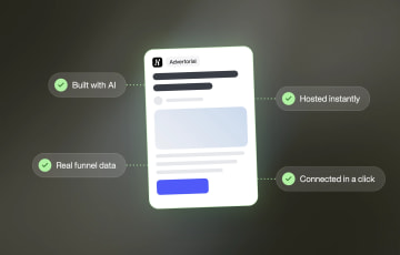
How to Create an Advertorial Landing Page That Sells (With Examples)
Learn how to create an advertorial landing page that sells, with examples by vertical, built by Heyflow’s AI and connected to your funnel in a click.
Read more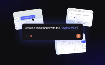
MCP: The Easiest Way to Create a Sales Funnel With AI
Prompt a sales funnel through MCP and it's hosted the moment it's built, connected in a click. That's what makes it the easiest way to build one with AI.
Read more
Heyflow MCP vs Typeform MCP vs Jotform MCP Compared
A feature-by-feature comparison of Heyflow MCP, Typeform MCP, and Jotform MCP, and which one connects to your ad platforms and CRM.
Read more