
What makes a great interactive landing page: 16 examples and a how-to guide


Trusted by 3,000+ marketers

Your landing page has one job: turn visitors into customers.
But most people click away in seconds if nothing grabs their attention. So, what makes some pages stick while others get ghosted faster than a bad Tinder date?
The answer: Interactivity. Think clickable quizzes, image sliders, calculators, or even chatbots that say, “Hey, need help? I got you.” It’s about getting visitors to do more than just scroll — they need to explore, click, and engage.
When done right, interactivity keeps people hooked and nudges them toward action, whether subscribing, booking, or buying.
In this guide, we break down how to build an effective landing page that converts — with real-world examples of brands that get it right. By the end of the read, you’ll have all the tools (and inspiration) to create a landing page visitors can’t resist. 😍
Let’s get to interacting!
What is an interactive landing page?
An interactive landing page is a page on your website that is specifically designed to pull visitors into the experience of your brand through dynamic visuals, forms, videos, or gamified elements.
It’s a page that says, "Hey, click this!" or "See what happens next!" — keeping visitors engaged and guiding them to actions like signing up or booking a demo.
Each user interaction gives you insights into what your audience cares about. The more they engage, the more tailored their experience becomes. Plus, with analytics and A/B testing, you can refine and optimize your landing page to increase conversions and hit your business goals faster.
15 Examples of interactive landing pages
Let’s check out some interactive landing page examples that work extremely well.
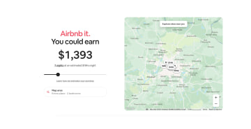
1. Airbnb: Income calculator for potential hosts
Airbnb simplifies the hosting process with an interactive income calculator. This tool allows potential hosts to enter their location, property type, and bedroom count, instantly showing how much they could earn by listing their space.
What makes this tool so effective is its noncommittal nature. Visitors can explore the platform’s benefits without giving away personal data or making any commitments upfront. This low-pressure approach encourages more people to engage with the tool and consider hosting. It’s great for building trust, too!
2. Buff Motion: Animated portfolio video
Buff Motion showcases its expertise with an animated video that explains who they are and what they do. The video combines motion graphics, smooth transitions, and engaging visuals to give visitors a quick overview of their services.

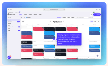
3. Sendible: Interactive product tour
Sendible’s landing page offers a self-guided product tour that’s packed with tooltips and hotspots. Visitors get to see exactly how Sendible works and how each feature fits into their workflow. The beauty of this product tour is that it puts users in control. They can click through at their own pace, discovering the tools that matter most to them.
Visitors leave with a clear understanding of how Sendible can fit into their day-to-day, making it easier for them to take the next step.
4. Mirrows: Horizontal scrolling micro-interactions
Mirrows takes user engagement to a new level with its horizontal scrolling experience. Instead of a traditional vertical scroll, the page layout moves side-to-side, keeping users curious about what comes next.
Along the way, micro-interactions — like subtle animations and interactive content — respond to user actions, making the browsing experience feel dynamic and immersive.

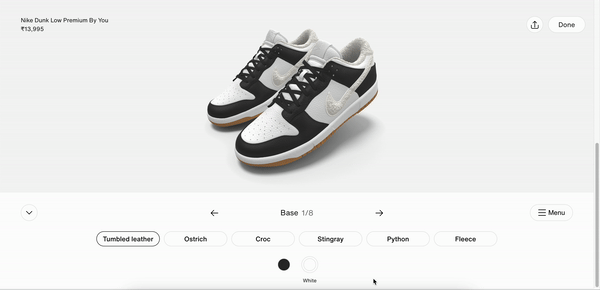
5. Nike by you: Customized product builder
Nike by You (formerly NIKEiD) brings customization to life by allowing users to design their own shoes directly on the landing page. You can choose colors, materials, patterns, and even add personal texts to create one-of-a-kind product. *Adds to wishlist* 🎁
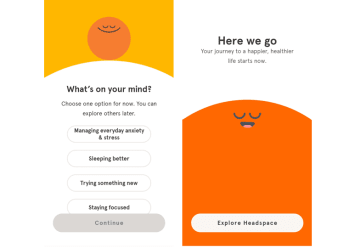
6. Headspace: Interactive meditation quiz
Headspace uses an interactive landing page to onboard users with a personalized quiz. Instead of pushing a one-size-fits-all message, the quiz asks about stress levels, goals, and daily habits and then tailors a meditation plan based on the answers. It’s a classic example of how interactive content like quizzes can boost user engagement, demonstrate the product’s benefits, and collect qualified leads early in the funnel.
This approach grabs the visitor’s attention and aligns with the brand’s value proposition — showing users exactly how Headspace can help them, before they even sign up. It’s built for mobile users, includes a clean hero section, and makes the sign-up process feel like a conversation.
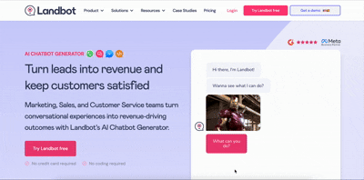
7. Landbot: Conversational chatbot builder
Landbot’s interactive landing page features a live chatbot that does more than just answer questions — it shows how the product works in real time. As soon as you land on the page, a chat-based demo kicks off, guiding you through a personalized interaction that mimics how the platform builds interactive content for clients.
It’s a clever way to blend product education with user engagement. Instead of reading about features, visitors experience them firsthand, making the product’s benefits obvious from the start. The hero section sets expectations with a clear value proposition, while the interactive conversational element keeps bounce rates low and conversion rates high.
8. Freshworks Happy Sales: Interactive content & quiz
Freshworks’ “Happy Sales” landing page is a masterclass in using interactive content to keep visitors engaged from start to finish. The page layers short-form video interviews with sales leaders and ends with a personalized quiz, creating a dynamic experience that’s both educational and interactive.
The videos offer social proof and highlight the brand’s value proposition, while the quiz captures user insights and boosts lead generation.
9. Breather: Location-based workspace finder
Breather’s interactive landing page gets straight to the point. It opens with a simple, location-based prompt: Where do you need a workspace? From there, it dynamically loads available options, creating a real-time, personalized experience that showcases the platform’s utility from the very first click.
This is a classic example of how interactive elements — even something as simple as a smart search — can immediately demonstrate the product’s benefits. The page features a clean hero section, minimal supporting text, and a lightning-fast sign-up process, making it easy for prospective customers to engage without friction.

10. Tapcart: Auto-play videos & GIF animations
Tapcart’s interactive landing page makes every scroll count. Instead of static screenshots, it uses auto-play videos and GIF animations to showcase the app in action, giving potential customers an instant, high-impact look at its key features.
The result is a dynamic, visual appeal that doesn’t rely on long paragraphs or guesswork. Users can see the product’s benefits in real time, from onboarding flows to checkout functionality. Combined with a bold hero section, engaging visuals, and a clear call to action, the page captures the visitor’s attention immediately.

11. Wise (formerly TransferWise): Real-time fee calculator
Wise’s interactive landing page is built around transparency. It features a real-time fee calculator that updates instantly based on user input, helping prospective customers understand exactly what they’ll pay and receive when sending money internationally.
This kind of interactive element does two things brilliantly: it builds trust and demonstrates the product’s benefits upfront. Paired with short video demos that explain how transfers work, the page offers both clarity and confidence.

12. Option5: Interactive design that responds to you
Option5’s interactive landing page feels more like a playground than a portfolio. As a web development studio, they lean all the way into micro-interactions — think animated cursors, hover states, and expandable client details — so every element responds to the user in real time.

13. Adobe x Bowie: Creative legacy meets interactive design
The Adobe x Bowie landing page was part of an interactive campaign in 2022 celebrating the life, art, and legacy of David Bowie — one of music’s most iconic boundary-pushers. Adobe, the software giant behind tools like Photoshop, Illustrator, and After Effects, partnered with Bowie’s estate to inspire a new generation of creators to channel their inner Ziggy Stardust.
The interactive landing page was a love letter to creative freedom. Clickable graphics, layered content, and responsive animations brought Bowie’s world to life — all while encouraging visitors to explore, remix, and design using Adobe tools.
Every element was responsive to user input — from hover-triggered effects to animated transitions — turning a simple campaign page into a fully immersive experience. It’s a classic example of how interactive content can deepen user engagement, communicate a strong brand personality, and showcase key features in a way that’s memorable and moving.

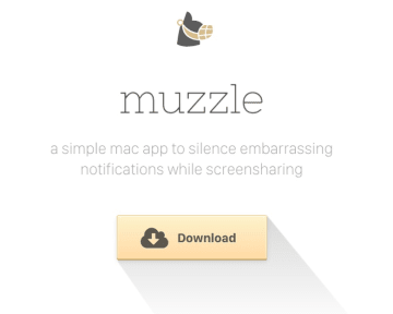
14. Muzzle: Chaos that proves a point
Muzzle, a macOS app that blocks embarrassing on-screen notifications, turned its landing page into a hilarious — and effective — demo. Instead of explaining the problem with paragraphs of supporting text, it shows it.
The interactive landing page floods the screen with fake notifications, all clickable and animated, mimicking real-life distractions.
15. Cognosys: AI in action
Cognosys uses a dynamic landing page to showcase its AI-driven solutions — but instead of listing features, it invites users to explore them through customizable, animated interfaces. As visitors scroll, the page responds with sleek transitions, hover effects, and interactive elements that bring the tech to life.

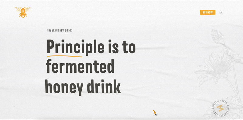
16. Meadlight: Product storytelling
Meadlight’s interactive landing page is a visual treat — and a strategic one. It showcases a single product, a fermented honey drink, but does so through smooth, scroll-triggered animations that turn the bottle itself into the main character of the experience. As users move down the page, the bottle moves with them — guiding the journey and reinforcing the product’s unique selling proposition.
How do I make an interactive landing page?
Whether you’re starting from scratch or optimizing an existing page, there are a few essential steps to follow. Let’s take a look!
1. Plan your landing page layout and structure
Creating an interactive landing page starts with a solid plan. Think of the page layout as your blueprint — it needs to be clear, easy to follow, and designed to guide potential customers toward a specific goal. Every element should have a place and purpose.
Start by defining what action you want visitors to take. Once you know the goal, map out key sections:
Interactive forms that are easy to complete
A hero section with an engaging headline and primary call to action
Interactive content, like dynamic testimonials or social proof, to reinforce trust
Visual elements that support your value proposition (more on this in the next section)
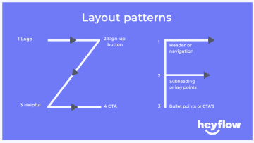
Use a Z-pattern or F-pattern layout (based on how users scan web pages) to position CTAs where they’ll naturally grab attention. For example, place your primary CTA near the top and repeat it at logical points, like after product demos or video testimonials.
Did you know? 79% of landing page visits come from mobile. If your landing pages aren’t mobile-first, you could be missing out on qualified leads, conversions, and revenue. So keep mobile users in mind. Use collapsible menus, responsive images, and tap-friendly buttons to ensure your page looks and feels great on mobile devices.
2. Add engaging media elements
If a picture is worth a thousand words, then a well-placed video on your new landing page is worth a thousand conversions. Keep in mind the cognitive load theory: the easier it is for users to process information, the more likely they are to engage and convert. So keep your videos just as simple as your expertly crafted copy.
Consider media elements like:
Animations to guide visitors’ attention toward CTAs
Explainer videos to show off your product’s benefits in under 30 seconds
Image sliders or galleries that support visual appeal and give users multiple links to explore
But here’s the catch: media needs to load fast. Keep things lightweight and ensure everything looks sharp on mobile devices.
3. Incorporate interactive features
We’ve already covered how interactive quizzes, multi-step forms, real-time updates, and product demo features boost user engagement. Now, let’s bring it all together with strategic placement:
Hero image or slider at the top
Progress bars and interactive elements mid-page to build momentum
Purchase counters or limited-time offers at checkout to drive urgency
Remember, it’s not about using every feature — it’s about using the right feature at the right moment. Interactive landing pages should feel natural, not overwhelming.
For example, interactive quiz experiences work great at the top of the funnel for lead generation, while forms are ideal during the sign-up process or to collect email addresses at key conversion points.
💡 Need help getting started? Tools like Heyflow make it easy to create landing pages with interactive content — even if you’ve never touched code. You can also compare and find the perfect fit for your needs in our best landing page builder guide.
4. Optimize for SEO and conversion
Your interactive landing page won’t matter if nobody can find it.
First, focus on page speed — interactive pages loaded with media can drag download times. Use compressed images and caching to keep things snappy. Google takes speed seriously, and a faster page means better rankings and lower bounce rates. As of 2024, the average page load time is 2.5 seconds on desktop and 8.6 seconds on mobile.
Content hierarchy is your next priority. Structure your content so search engines and visitors can scan it easily. Use H1s for your primary headline and H2s and H3s for sub-sections. Keep the user journey smooth with logical CTA placements throughout the page, aligned with natural stopping points.
Meta titles and descriptions should be unique and persuasive. They’re your landing page’s first impression in search results, so make them click-worthy while staying relevant to the content inside.
Optimizing for conversion means reducing friction. Make sure users can flow effortlessly from one interaction to the next, whether it's through an intuitive navigation structure or subtle visual cues like animations. A simple checkout process or form can make the difference between a conversion and a lost lead.
Remember: SEO is about balancing user experience and search engine requirements — the better your page serves both, the more likely it is to attract visitors and convert them.
5. Test and launch
Before going live, walk through your interactive landing page like a first-time visitor. Double-check your lead management tools, CTAs, popups, and email marketing integrations.
Here’s your pre-launch checklist:
✅ Check all interactive elements and links
✅ Optimize for mobile users and desktop
✅ Validate SEO readiness: meta tags, alt text, structure
✅ Review analytics tools setup
✅ Scan for broken links and confirm accessibility compliance
✅ Preview across devices and browsers
Once everything’s in place, hit publish — but keep watching performance. A good landing page is never really “done.” Keep testing, iterating, and improving based on real feedback and data.
Heyflow’s landing page builder helps you create interactive landing pages that seamlessly integrate with your CRM, capture qualified leads, and maximize impact from every visit.
What are the elements of a high-converting interactive landing page?
Elements of high-converting interactive landing pages include engaging visuals, interactive forms, dynamic calls-to-action, and more. Although these may vary from case to case, here are the features and interactive elements we’ve found to be most effective.
1. Engaging visuals
Engaging visuals are images, videos, animations, or interactive elements designed to capture attention, evoke emotion, and encourage interaction. The goal is to help visitors quickly understand complex information.
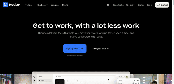
Dropbox understands that magic lies in motion. Need to show off a drag-and-drop feature? Dropbox uses a GIF — short, sweet, and effective. Want to explain how collaboration works? They roll out a quick video demo that covers everything faster than you can hit the back button.
Hover effects highlight CTAs, scroll-triggered animations guide attention exactly where it’s needed, and the layout stays light and breathable with plenty of white space. It’s like their visuals say, “Look here — click here,” without shouting about it.
2. Interactive forms
Interactive forms engage users through features like real-time feedback, auto-complete, or input validation. For example, it can be a multi-step form that breaks tasks into smaller parts, increasing the chances that a user will participate.
Book More Showings, a Canadian real estate lead generation agency, uses interactive forms effectively. They wanted to boost conversions, lower lead costs, and save time — all without having to play notifications ‘tag’ with developers every time they wanted to tweak a form.
The team used Heyflow to create interactive forms with features like auto-complete for addresses and phone number validation. These small changes made a huge difference — prospects could fill out forms faster, without having to manually enter every detail.
The results:
+150% increase in lead conversion rates
50% faster lead customer funnel setup
A 57% reduction in cost per qualified lead
Convert visitors into conversions like Book More Showings! Try Heyflow for free!
3. Dynamic content
Dynamic content changes based on the user’s actions, preferences, or data. Think custom recommendations, location-based suggestions, or interactive quizzes with changing questions.
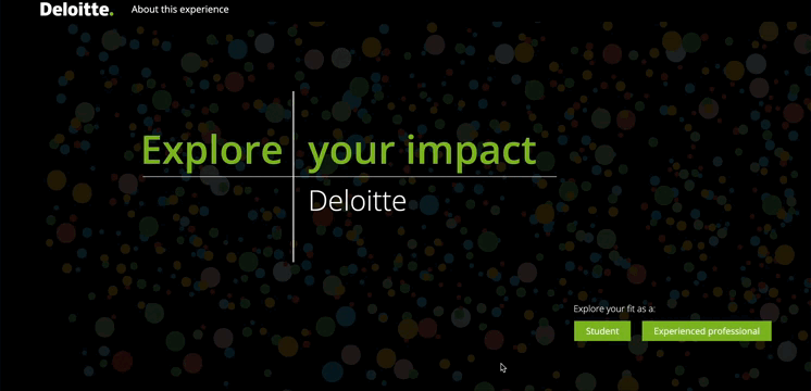
Deloitte's “Explore Your Fit” is a classic example of dynamic content in action. This tool lets job seekers explore career opportunities based on their background, preferences, and working style. Users complete a short, interactive quiz, and based on their inputs, the tool delivers a customized career guide with roles that align with their skills and interests.
Dynamic content like this can reduce drop-offs by making users feel understood and catered to, ultimately driving higher conversions.
4. Clear call-to-actions (CTAs)
Clear CTAs tell visitors exactly what to do next. Whether it’s “Book a demo,” “Start your free trial,” or “Get started now,” a good CTA makes it obvious what action to take, guiding users seamlessly toward the next step. But where and when you show the CTA matters just as much as what it says.
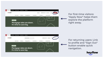
Rocket Mortgage, an online mortgage lender, changes its CTA based on user behavior and customer journey placement.
When a visitor lands on the website for the first time, the primary CTA at the top corner says, “Apply Now” — encouraging new visitors to explore the platform and get started. For returning users who are already signed in, the CTA changes to "Sign out," creating a frictionless, intuitive experience for account holders.
This small tweak provides a frictionless experience, making it easier for returning users to log in and pick up where they left off.
5. Social proof
Social proof builds trust. It shows that others have used your product and gotten results, which makes new visitors more likely to believe you can deliver. These can be customer logos, star ratings, testimonials, or short quotes from case studies. Place them near CTAs or decision points on the page.
Product Hunt leverages social proof with its upvote system, providing a public display of how many users have endorsed a product. This reinforces trust and creates credibility and urgency. The more upvotes a product gains, the higher it ranks, increasing visibility and reinforcing social proof.
How do interactive landing pages improve conversions?
A plain, static landing page can feel like a dead end, giving visitors no reason to stick around or engage. But when your landing page invites interaction, visitors stay longer, explore further, and feel more connected to your brand.
That connection can make all the difference in turning clicks into conversions. Let’s take a look at some more interactive landing page benefits:
Speak directly to your target personas: Each visitor is different, and tailoring interactions for specific personas ensures your message resonates. A product demo may appeal to one persona, while a cost calculator or case study might seal the deal for another. Offering users content that matches their stage in the buyer’s journey — whether at the top, middle, or bottom of the funnel — builds trust and nudges them toward conversion.
Capture top-funnel leads effortlessly: Visitors early in the funnel aren’t ready to buy yet, but interactive quizzes or surveys spark curiosity and provide value. In exchange for their participation, you collect email addresses or vital lead information, enabling you to move someone into your nurturing pipeline with a tailored pathway. This gives you high-intent leads that guide you through their funnel with targeted follow-ups.
Build trust through transparency: Interactive elements like real-time calculators or dynamic testimonials show visitors exactly what they can expect — whether it’s pricing, savings, or other customer experiences. Features like live counters (“100 people bought this today”) add urgency and boost credibility, driving quicker decisions.
Heyflow – the easy solution for interactive landing pages
Heyflow is a no-code platform designed to help businesses generate leads and increase conversions. It empowers users to create interactive forms, landing pages, and workflows that are visually engaging and easy to manage.
Here’s how:
Customization flexibility: You can align every detail with your brand — tweak colors, fonts, and layouts, and choose from over 40,000 icons. If you like to get hands-on, custom CSS is available, too.
Analytics and A/B testing: Track user behavior with built-in analytics, and use A/B testing to identify the most effective flow structures and content, continuously optimizing for improved results.
Integrations: Connect effortlessly with tools like Salesforce, HubSpot, or Zapier to automate workflows, manage data, and simplify operations without manual effort.
Mobile-optimized design: Your landing pages and flows will look and function perfectly across all devices, thanks to responsive landing page design.
Lead management tools: Simplify follow-ups with automated emails, score leads with interactive forms, and collect e-signatures — all without disrupting the user experience.
Jesse Thompson
Senior Product Designer
I could build a new lead form in just a few days. Normally, this would require a team of engineers and would take much more time and money to do.

Create impactful interactive landing pages with Heyflow
With Heyflow, you can design interactive forms, workflows, and lead funnels tailored to your goals — no coding needed!
Recommended articles

5 Steps to optimize your landing page conversion rate
Discover actionable strategies to boost your landing page conversion rates. Learn tips to optimize your pages and turn visitors into leads effortlessly
Read more
Best Landing Page Builders in 2026: Top Tools Compared
Discover 6 top landing page builders and compare the best options for creating high-converting landing pages. Evaluate features, pricing, and use cases.
Read more
Lead Generation Form Builder: How to Choose, Build & Convert (2026)
Master lead generation form builders: compare top tools, explore must-have features, and learn how to build high-converting forms without code.
Read more