Marketing fundamentals
View all articles5 Steps to optimize your landing page conversion rate

Clicks are great. Conversions? Even better. If your landing page gets traffic but doesn’t turn website visitors into leads, it’s time to fix that.
So, how do you turn a “just looking” visitor into a “take my email” lead? You tweak what matters – landing page design, messaging and call-to-action buttons (CTAs) – until clicking that button feels like the obvious next step.
This guide breaks down five proven steps to optimize landing pages, increase landing page conversion rates, and keep visitors from bouncing. Whether your page needs a quick fix or a full makeover, these landing page optimization practices help turn more browsers into buyers.
Let’s get optimizing. 🚀
What is conversion rate optimization (CRO) for landing pages?
Conversion rate optimization (CRO) for landing pages is the process of improving your web page to increase the percentage of visitors who take action – whether that’s filling out a landing page form, signing up, or making a purchase.
It’s not about getting more traffic but making the most of the traffic you already have. CRO focuses on refining page elements like landing page message, visual data reports, and page speed to guide visitors toward conversion.
Why is conversion rate optimization for landing pages important?
A well-optimized landing page works hard to turn visitors into leads or customers. Without CRO, even the best marketing efforts can fall flat.
Here’s why optimizing your landing page conversion rate matters:
Maximizes your traffic: Getting visitors to your landing page isn’t cheap. Search engine optimization (SEO) and paid ads like Google Ads cost money. CRO helps you convert more potential customers without increasing spend.
Lowers customer acquisition costs: A low landing page conversion rate means wasted ad spend. A high-converting landing page improves return on investment (ROI) by reducing cost per lead.
Reduces bounce rates: Slow-loading pages, unclear messaging, or a weak CTA drive visitors away. CRO helps keep your target audience engaged.
Improves user behavior and experience: A smooth, mobile-friendly landing page reduces friction and keeps visitors moving toward conversion.
Increases revenue opportunities: More converting leads means higher revenue without additional marketing costs.
What is a good landing page conversion rate?
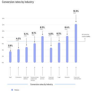
A “good” conversion rate isn’t a fixed number–it depends on your industry, audience, and marketing strategy. The Unbounce 2024 Conversion Benchmark Report found that the median landing page conversion rate across industries is 6.6%.
Here’s a quick look at their analysis across industries:

So, if your page is under 3%, it’s time for serious optimization. Aiming for 10% or higher puts you in the top tier of landing pages. The key? Stop settling for small tweaks and start focusing on high-impact changes that actually drive conversions.
5 steps to optimize your landing page conversion rates
Whether your conversion rate needs a boost or a complete overhaul, these five steps will help you maximize every click and get more results from the traffic you already have.
1. Analyze your landing page’s performance
If visitors aren’t converting, you need to find out why. Tracking and analyzing user behavior helps you see where people drop off, what’s grabbing attention, and what’s getting ignored.
Here’s how to get a clear picture of your landing page’s performance:
Check your conversion rate: Compare against industry benchmarks to know where you stand. If your rate is below 3%, it’s time to optimize.
Identify drop-off points: Are visitors leaving before they even reach your CTA? Are they abandoning halfway through a form? Spotting where users exit helps you fix what’s causing friction.
Track bounce and exit rates: A high bounce rate means visitors aren’t sticking around. Maybe your message isn’t clear, or the page loads too slowly. Either way, it’s costing you conversions.
Test what works (and what doesn’t): A/B testing different headlines, layouts, and CTAs helps you figure out what actually drives conversions instead of making random guesses.
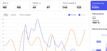
🚀 A no-code platform like Heyflow gives you built-in analytics, drop-off tracking, and A/B testing – without extra setup. See where visitors lose interest, test different variations, and optimize conversions all in one place.

2. Use the landing page performance insights to make impactful tweaks
Big changes aren’t always the answer. Sometimes, small adjustments – a sharper headline, a clearer CTA, a better form layout – can have the biggest impact on conversions. Now that you’ve analyzed your landing page, it’s time to fine-tune it.
Here’s where to start:
Refine your CTA: If your button says “Submit”, it’s time for an upgrade. A strong CTA tells users exactly what they’re getting – think “Get My Free Quote” or “Start My Trial.” Placement matters too. Make sure it’s impossible to miss.
Simplify your forms: Long, clunky forms scare people away. Reduce the number of fields, break them into steps, or make them more engaging. And if you’re using Heyflow, you can skip the headache with pre-built templates and multi-step forms that feel effortless to complete.
Improve page flow: Think of your landing page like a guided tour. Key information should be front and center, distractions should be gone, and the next step should be crystal clear. If visitors don’t know what to do next, they won’t do anything.
Make it interactive: A static landing page is easy to ignore. Adding interactive elements, like progress bars, conditional questions, or animations, keeps visitors engaged and moving forward. An interactive landing page converts better.
Fix speed and mobile issues: If your page loads like it’s stuck in dial-up days, visitors will leave. Check that your landing page is fast, smooth, and works perfectly on every device.
If you’re using Heyflow, you can create interactive landing pages that are 100% on-brand – with complete design flexibility. Customize fonts, colors, and layouts to match your brand identity, or add eye-catching design elements like emojis, icons, and animations to make your page stand out.

3. A/B test different versions of your landing page
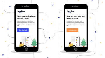
Even the best landing page can do better. A/B testing helps you find out what actually works – not just what you think works. By testing two (or more) versions of your page, you can see which layout, CTA, or design choices lead to higher conversions.
Here’s how to run effective A/B tests:
Start with one element at a time: Changing everything at once won’t tell you what’s working. Test one thing at a time – like the headline, CTA text, or form length – so you can pinpoint what drives more conversions.
Test different CTAs: Does “Get Started” work better than “Try for Free”? Small wording changes can make a big difference.
Experiment with layouts: Try a shorter vs. longer page, a single-step vs. multi-step form, or different placements for key elements. A more intuitive layout can remove friction and boost conversions.
Optimize for mobile vs. desktop: Some designs perform well on desktops but lose engagement on mobile. Make sure you’re testing how your landing page works across different devices.
Track results over time: Don’t declare a winner too soon. Run tests long enough to collect meaningful data so you’re not optimizing based on short-term fluctuations.

4. Analyze the results
Once your tests run long enough to gather reliable data, dive into the results. Which version performed better? Did conversions increase, or did a new change cause more drop-offs?
Look beyond just the final conversion rate. Analyze user behavior, form completions, and engagement patterns to understand why one version outperformed the other. If something worked, double down on it. If it didn’t, take the insights and refine your approach.
5. Rinse and repeat!
Conversion rate optimization isn’t a one-and-done task – it’s a continuous process. What works today might not work tomorrow, and there’s always room to improve. After analyzing your results, take what you’ve learned and test again. Refine, tweak, and optimize based on real user behavior.
Next, let’s break down the real impact of an optimized landing page and why it’s worth the effort. 🚀
Benefits of optimizing a landing page
Optimizing your landing page improves the entire user experience and makes your marketing efforts more effective. Here’s why it’s worth your time:
Higher conversion rates: More people clicking, signing up, or buying means you’re getting results. It’s the difference between a packed store and a checkout line that never moves.
Lower customer acquisition costs: Why pay for more traffic when you can do more with what you have? A higher conversion rate means your ad spend stretches further, making every lead cost less.
Better user experience: No one wants to wrestle with a slow or confusing page. Smooth navigation, fast load times, and clear messaging keep visitors engaged instead of bouncing.
Improved lead quality: Capture leads that actually convert. A well-optimized page filters out the tire kickers and attracts people who are actually ready to convert. No more leads that disappear faster than a free sample tray.
Stronger brand trust: A clunky landing page doesn’t inspire confidence. A polished, high-converting page reassures visitors that they’re in the right place – and that you mean business.
Smarter marketing decisions: Testing and optimizing show you what actually works. Instead of guessing, you’re making data-backed improvements that pay off across all your campaigns.
Clicks are nice – conversions are better
Optimization is what turns clicks into conversions, visitors into leads, and interest into revenue. And if you want to test, tweak, and optimize without the hassle, Heyflow has you covered.
Beyond building high-converting landing pages, Heyflow lets you create interactive forms, multi-step lead funnels, and branded experiences – all without writing a single line of code.
You can A/B test, track performance, and integrate with your marketing stack while keeping everything 100% on-brand with customizable design elements. Plus, with built-in analytics and secure data handling, you’re not just optimizing – you’re scaling smart.
Now go turn that landing page into a conversion machine. 🚀
----------------------------
Boost your conversion rates effortlessly
Unlock the power of Heyflow to create interactive, high-performing forms and landing pages. Simplify your conversion rate optimization process with no-code tools designed to captivate and convert.


