Best practices for designing high-converting landing pages


Trusted by 3,000+ marketers

Designing a landing page that actually converts is about more than just throwing on some flashy colors and crossing your fingers. If you want to reel in email sign-ups, generate leads, and close those all-important sales, you've got to do it right –by following the best practices for designing high-converting landing pages.
It’s about crafting seamless, intuitive, and emotionally engaging experiences that gently guide visitors toward that sweet "yes, I want in!" moment.
Read on to learn how proper design can turn those curious clicks into committed customers.
Best practices for landing page design with examples
You want your landing page to stand out without overwhelming visitors. Here are some landing page design best practices on how to find the sweet spot between creativity and visual chaos.
Use the KISS principle to avoid a cluttered design
Ever feel like you’ve got so much to show off that you end up cramming it all onto one page, making it look like a messy junk drawer?
KISS (“Keep It Simple, Stupid;” not the hard rock band 🤘) can help you build clean and focused landing pages. It’s a design principle that tells us to focus on the essentials and let the design breathe. If something doesn’t add value to the goal of the web page, cut it out.
For example, if you're pushing a subscription service, don’t clutter the page with irrelevant product features. Instead, highlight the benefits and make your CTA the star of the show.
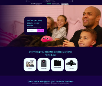
In the example below, Octopus Energy KISSed its benefits, value prop, and CTA without complicating the landing page design.
Boost clarity with a strong value proposition upfront
If your visitors don’t know what you’re offering within the first few seconds of landing on your page, you’ve lost them. That’s why your landing page needs a strong value proposition that’s front and center.
Think of your landing page content like an elevator pitch – it should quickly and concisely answer your target customer’s question, “What’s in it for me?” A clear value proposition will give them a reason to stick around.
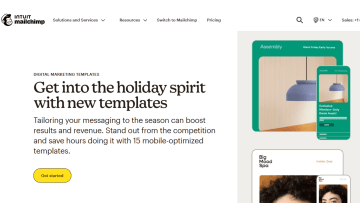
Have a look at how Mailchimp does it in the example below.
Minimize distractions with the 80/20 rule
The 80/20 rule, or Pareto Principle, tells us that 80% of results come from 20% of efforts. You can apply this to your design by focusing on the elements that are most likely to impact your landing page performance.
Keep distractions to a minimum – no random links to your blog or social media here. Instead, make sure everything on the page leads to your goal. This could mean removing navigation bars, keeping landing page copy minimal, and having a clear call-to-action above the fold.
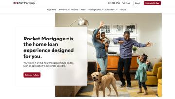
Rocket Mortgage does this well with minimal yet impactful copy, a relevant image, and a clear call to action:
Mobile-first design optimized for every device
An important best practice for landing pages is designing with mobile devices in mind. A landing page that doesn’t look and perform well on mobile is a deal-breaker. More than 50% of website visitors abandon their session if the mobile site doesn't load faster than or within 3 seconds.
Mobile-first design means thinking about the visitors who are using mobile devices to access your website, and ensuring that every element scales smoothly for them.
This isn’t just about shrinking the page to fit; it's about adapting the page layout for touch, not clicks. You can start by making buttons large enough to tap and optimizing your load speed. If you get your mobile site design right, 79% of your visitors will likely come back for more and even share your website with their networks.
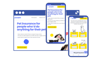
In the example below, Pumpkin Care nailed mobile optimization by stacking landing page elements instead of shrinking them to fit the screen. Their mobile website stays true to their brand's visual identity, is easy to navigate, and doesn’t sacrifice accessibility.
Landing page structure
With the basics of design out of the way, let's focus on landing page best practices for structuring elements to maximize conversions.
From the AIDA framework to design techniques that make your CTAs impossible to miss, we cover strategies that take your landing page from drab to fab. ✨
Use the AIDA framework to guide the user journey
AIDA (Attention, Interest, Desire, and Action) is a timeless framework because it taps into the natural way people make decisions. It doesn’t just dump info on your visitors – it takes them on a little emotional journey, nudging them from "Hmm, interesting" to "I need this right now!".
First, grab their attention with a clear and compelling headline then build their interest with engaging copy that speaks to them. Show them what they’ll gain (that’s the desire part), and finally, guide them to perform your desired action with a CTA that’s impossible for them to resist.
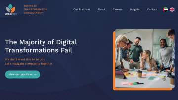
One of the many successful landing pages leveraging the AIDA model is LeanTree's landing page, which you can see in the example below. The headline grabs your attention by tapping into a common fear. The body copy sparks interest by offering a solution and builds desire, positioning the brand as a trusted guide. Finally, the simple CTA takes it home by encouraging action without being pushy. It flows naturally, leading the user from curiosity to trust and, ultimately, to engagement.
Design for the “Z” pattern to guide users towards CTAs
According to user behavior research, our eyes naturally move in a predictable “Z” pattern when scanning a page. Think of it like a path – our eyes start at the top left, move across to the top right, then diagonally down to the bottom left, and then across again to the bottom right. It’s a “Z”.
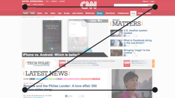
Use this knowledge to strategically place your most important elements (like CTAs) along this visual trail.
For example, you can keep your landing page headline on the top left, add a subheading or image across the top, and then lead the eyes down to your call-to-action button at the bottom right. You’re guiding users to where you want them to go, all while playing it cool. 😎
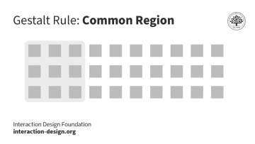
Leverage Gestalt principles for intuitive design
Gestalt principles suggest that people perceive visual elements as unified wholes, not individual components. In landing page design, you can use this idea to create a cohesive, seamless user experience by grouping related items together and keeping elements logically organized.
For instance, placing the CTA button near benefit-oriented copy makes it easy for users to understand the connection between the offer and the action you want them to take.
The key takeaway here? A clean, logical layout feels natural and intuitive for the user.
Minimize friction with microinteractions
Microinteractions are small, simple animations or effects that make your page feel more alive and responsive.
Friction is like a rock in the road; it slows things down and makes the journey feel longer. Microinteractions are the little things that smooth out that road, making everything feel more natural and fun.
For example, when a button changes color when you hover over it, or when a smooth scroll makes moving through the page feel effortless. These subtle touches make the whole experience feel polished and keep users engaged.
dslx’s website uses brand-relevant microinteractions to improve the user experience without being disruptive:
How could a landing page help you achieve your marketing goals?
Uff… all this effort, and for what? Is it even worth creating landing pages?
Absolutely! A great landing page can help you achieve marketing objectives like:
Support lead generation efforts: Companies with 31–40 landing pages get 7–12 times more leads than those with only 1–5 landing pages.
Increase conversions: A well-designed landing page can transform 10% of your visitors into paying customers.
Boost user engagement: By keeping your content clear, relevant, and emotionally compelling, your landing page will encourage visitors to stay longer and engage with your brand.
If your goal is to encourage visitors to interact with your brand – be it through conversation or a first purchase – a landing page is your best bet.
Unlock the full potential of your landing page with Heyflow
It’s true, it’s a lot of effort that goes into creating an LP that captures visitors' attention and yields the result your marketing team dreams of. But there’s also a shortcut to effortless landing page design: a template.
Below is a great example of a landing page template from Heyflow that only requires customization. Drag and drop your branding elements, copy-paste your text, add a few high-quality images, and you’re done. No fuss and no design masterclass needed.
With Heyflow’s landing page builder, you can easily create interactive, high-converting landing pages that are tailored to your goals–no coding required.
_____________________________________________
Create impactful interactive landing pages with Heyflow
Build custom forms, landing pages and lead funnels that captivate and convert – all without a single line of code.
Get started with Heyflow for free!
Recommended articles

What makes a great interactive landing page: 16 examples and a how-to guide
Explore 16 interactive landing pages packed with motion, quizzes, and smart UX — plus tips on what makes them convert.
Read more
Landing page design for higher conversion rates: Tips and best practices
Create landing pages that actually convert! From must-have design tips to real-life examples, get the steps you need to craft a page that clicks with visitors and drives results.
Read more
How Vertigo Media transformed their lead generation with Heyflow
Discover how the agency Vertigo Media enhanced their lead generation by leveraging dynamic landing pages and lead funnels with Heyflow.
Read more