Guides & best practices
View all articlesLanding page design for higher conversion rates: Tips and best practices

Many landing pages look great but fail at the one thing they’re supposed to do: convert. You’ve got traffic but clicks alone don’t pay the bills.
So, how do you turn a “just browsing” visitor into a “where do I sign?” customer? It’s all in the design – smart, strategic, and strongly steered with what makes users click.
In this guide, we dive into all the essentials of landing page design for higher conversions. From eye-grabbing visual elements to CTAs that practically beg to be clicked, you’ll learn exactly what it takes to create a page that performs.
Let’s give your page some serious click appeal!
Key elements for a high-converting landing page
Ready for landing page design tips that don’t mess around? Here’s what keeps visitors from bouncing and gets them clicking where it counts.
Craft an engaging hero image or video (above the fold): Your “hero” is the first thing visitors see when they land – make it count! Think bold visuals or a short video that captures your brand’s vibe. Keep it above the fold (aka visible without scrolling) so visitors are hooked immediately.
Use a clean and simple layout: Less is more. A clean layout keeps the focus on what matters: your message. Ditch the clutter, make things easy to find, and let your content shine. No one wants to play “Where’s Waldo?” on your landing page.
Focus on a single and clear Call-to-Action (CTA): Successful landing pages that convert have one, clearly defined goal. Don’t confuse visitors with options – give them one clear thing to do. Whether it’s “Get Started” or “Sign Up Now,” make sure your CTA is direct.
Mobile-first design: If your landing page only works on a desktop, you’re losing more than 50% of your audience. Start with mobile in mind: make buttons easy to tap, text readable, and images quick to load.
Simplify the user journey: Think of the path to conversion like a straight line. The fewer steps, the better. Eliminate distractions, keep the clicks minimal, and guide visitors straight to the action. Easy in, easy out.
Provide plenty of white space: White space (a.k.a. blank space) is your friend. It keeps things from looking cluttered, makes text easier to read, and helps important elements stand out. Give your content a little breathing room.
Use social proof and testimonials: Trust is key. Add real testimonials, recognizable logos, or trust badges to show visitors they’re not the first to give you a shot. If others love what you offer, new visitors are more likely to give it a go too.
Now that you’ve got the essentials down, let’s check out some landing pages that actually deliver the goods.
4 High conversion landing page examples
Get comfy – these examples might just make you rethink your own landing page setup! From saas landing page best practices to clever design tweaks, these high-converting pages show you exactly how it’s done.
1. Lemonade: Insurance renters
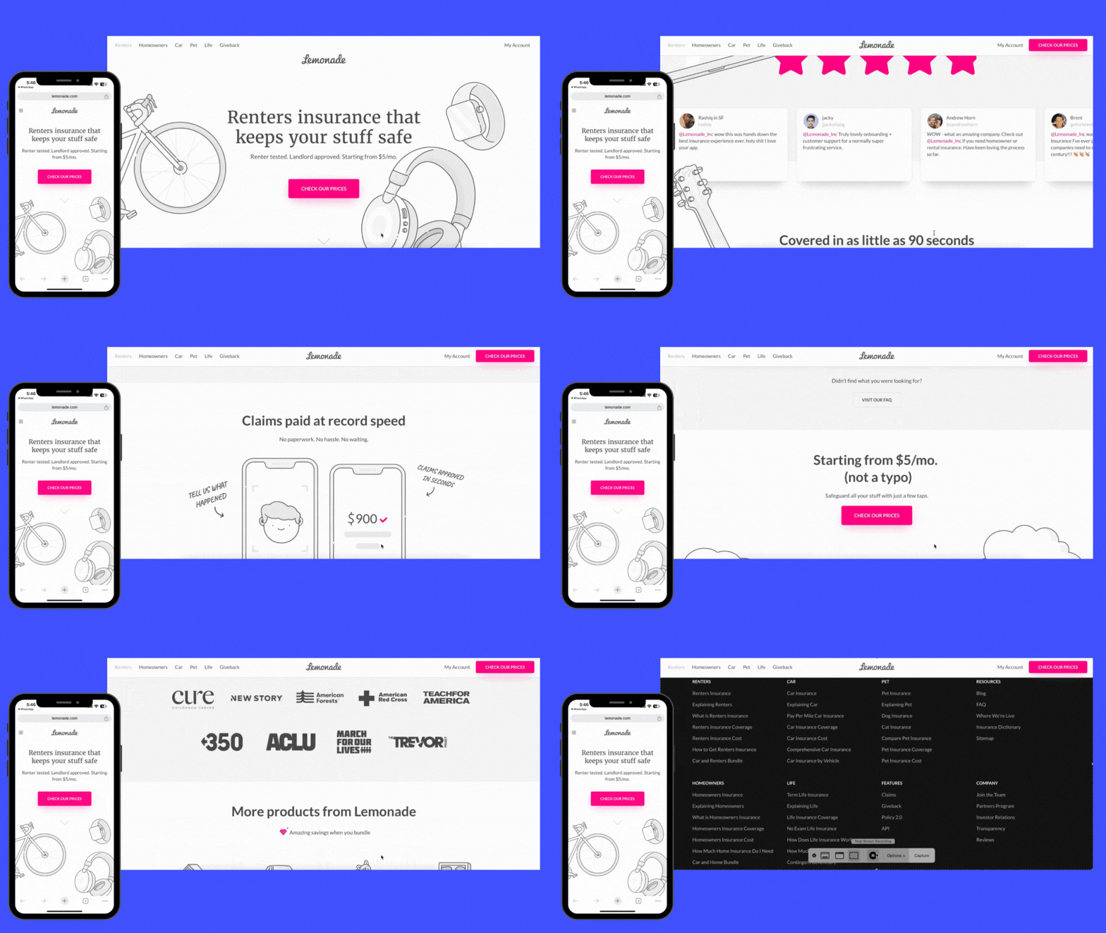
Lemonade’s renters insurance page grabs attention with a clear and compelling headline and a bright pink CTA that is hard to miss. The page layout is clean and lets visuals do the talking. As you scroll down, you’ll find customer reviews and a frequently asked questions (FAQs) section that build trust and educate potential clients.
These reviews add social proof, showing visitors that real people trust the product, while the FAQs address common questions upfront, easing concerns and helping readers feel informed before taking the next step.
📌 Key takeaways:
Include social proof to build trust
Let visuals explain complex information
Focus on one core benefit in the headline
Keep a sticky CTA button visible as visitors scroll to encourage easy conversion
2. Spotify: Recruiting
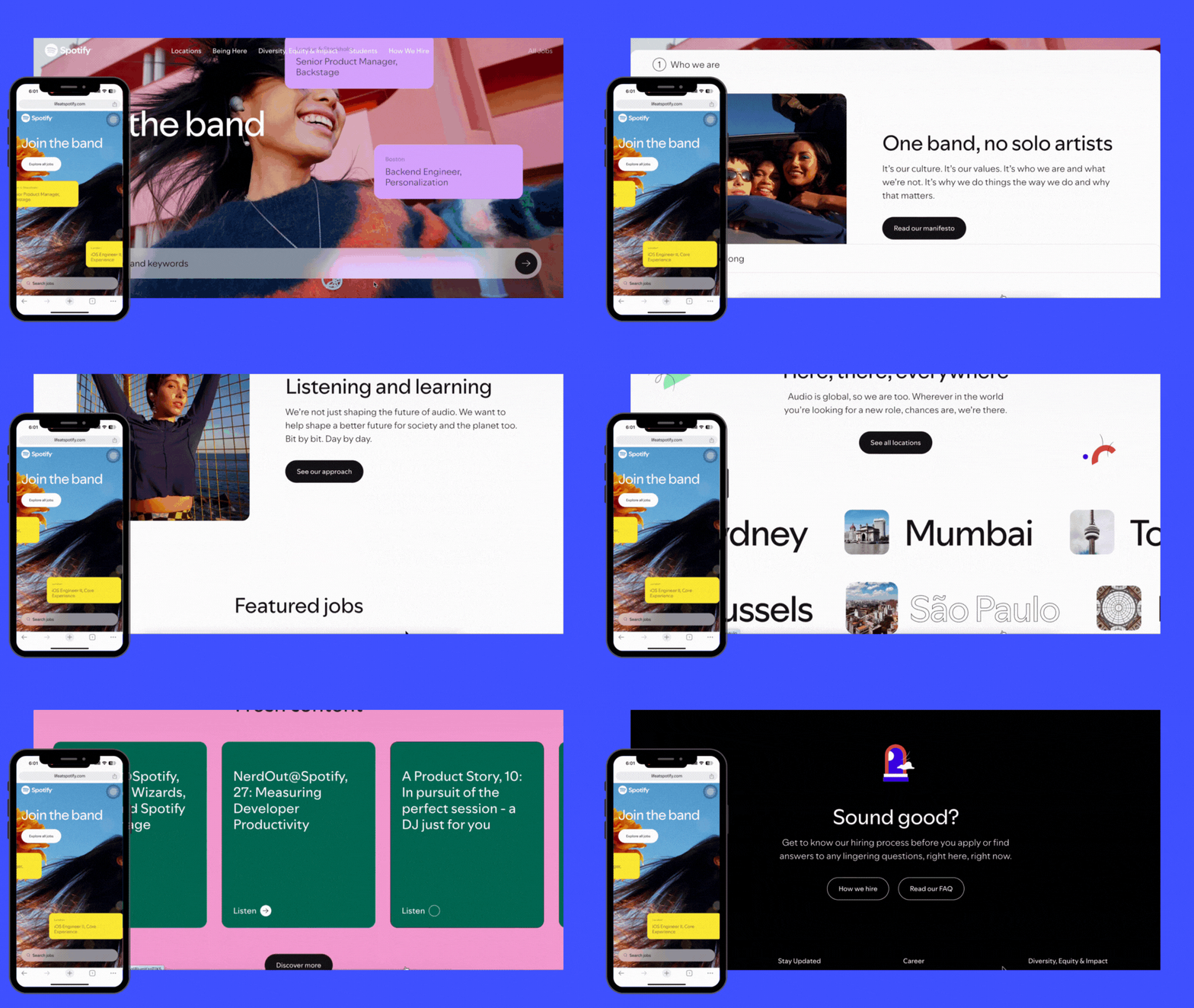
Spotify’s recruitment landing page is all about making a memorable first impression. The hero section is immersive, featuring dynamic job listings in eye-catching moving boxes that immediately grab attention. Right from the top, there’s a clear CTA inviting visitors to explore all jobs, alongside an intuitive search bar that lets them dive straight into finding their perfect role.
As you scroll, job listings are neatly categorized by department, and each listing provides detailed info on the role, location, and requirements.
📌 Key takeaways:
Design a visually dynamic hero section to create a solid first impression
Include a prominent CTA and search bar to make searching easy and intuitive
Organize information clearly, helping visitors navigate content easily and find what they want
3. Opendoor: Real estate
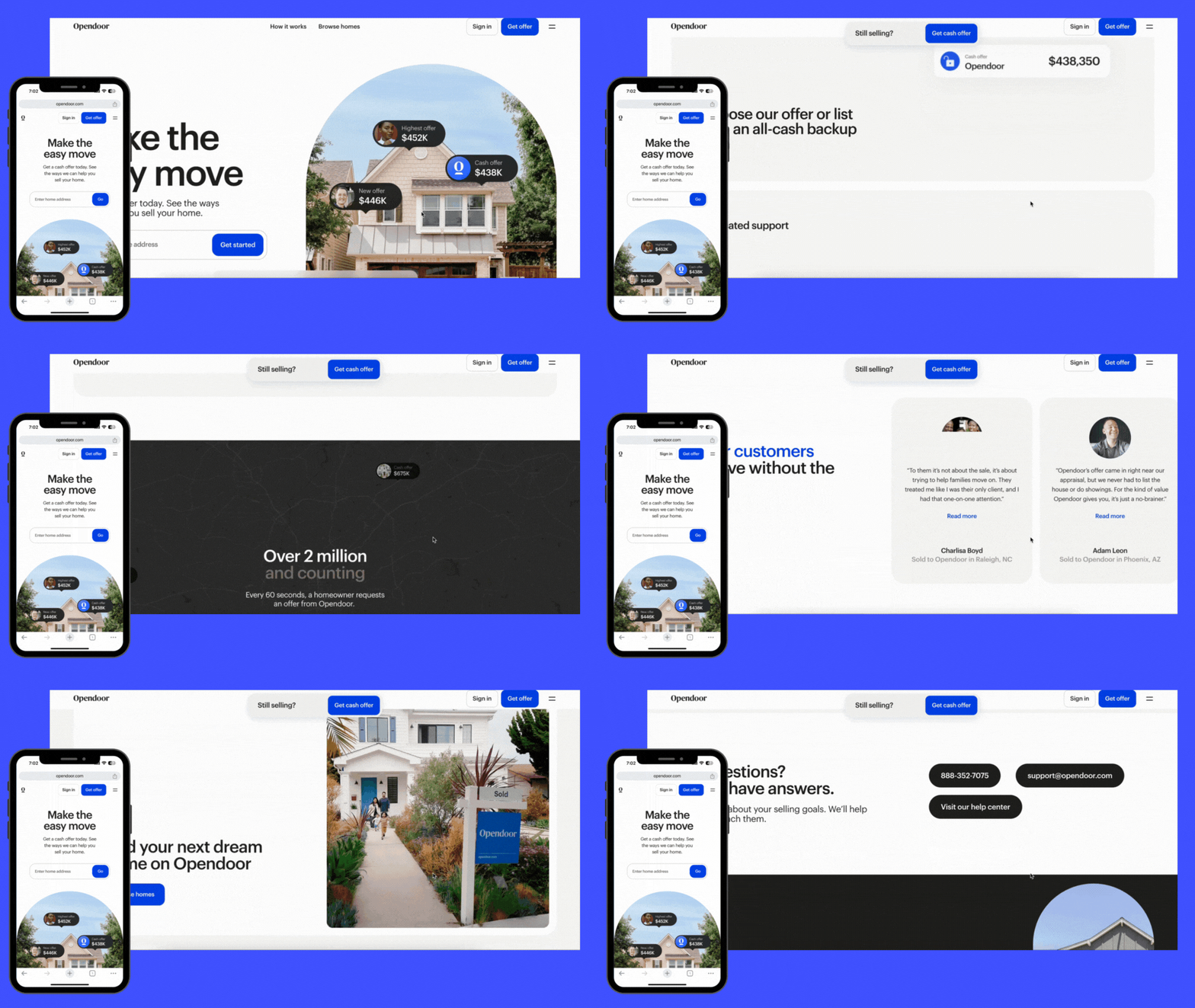
Opendoor’s landing page is a prime example of simplicity done right. The main CTA, inviting users to get an offer, is placed strategically throughout – visible up top, in a sticky bar, and right by trust-building sections.
The headline immediately captures attention with a clear value proposition. A “How it works” section breaks down the selling process in simple steps. Social proof, like customer testimonials and partnerships with reputable brands, adds that extra layer of trust.
📌 Key takeaways:
Keep design clean and visuals high-quality.
Reinforce a single, focused CTA throughout the page.
Break down your process with simple, visual steps.
Use customer reviews and partnerships to build trust.
Lead with a headline that clearly states your main value.
4. Empower Solar: Energy supply
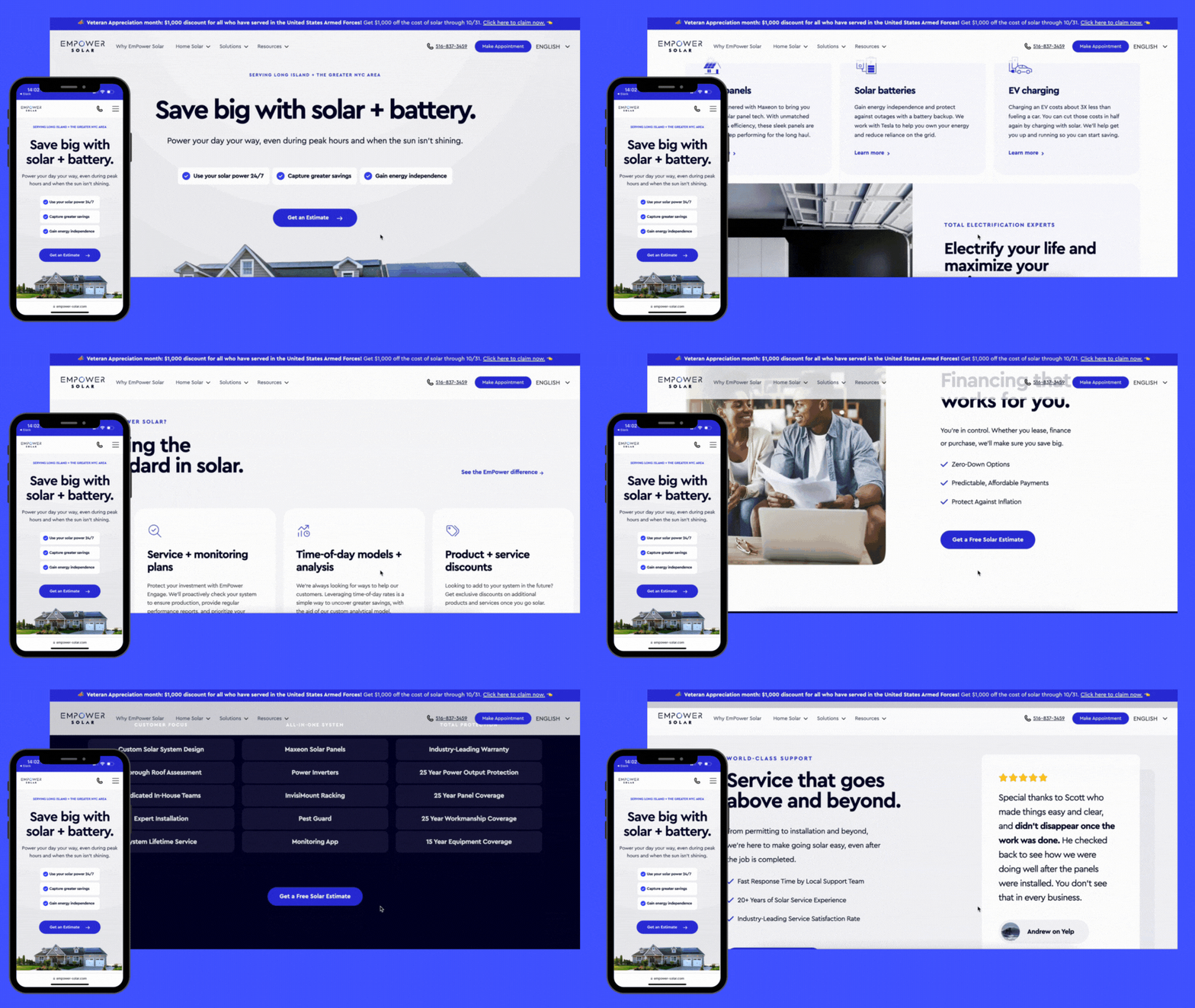
Empower Solar’s landing page does a great job of blending technical information with a user-friendly design. The headline and subheadline immediately emphasize both savings and sustainability – two big motivators for their audience. Strong visuals and data-driven statements, like savings stats and environmental impact make it a well-rounded page that balances information with motivation.
📌 Key takeaways:
Keep the CTA clear and action-driven
Include data points to support your value claims
Break down complex processes with clear, visual steps
Focus on benefits that resonate with your audience’s goals
How to design a high-converting landing page in 6 simple steps
Inspired by those high-converting examples? Let’s break down exactly how to get there.
Step 1: Define your goal and audience
Let’s keep it simple: what’s the one action you want from this page? Are you after sign-ups, demo bookings, or straight-up sales?
Lock in on a single goal – this way, every inch of the page is pulling in the same direction. For example, Heyflow’s landing page is all about turning visitors into sign-ups. Every element on that page is built to push users toward one thing: trying the product or getting started.
Now, think about your audience. Who’s landing here? Are they newbies just checking things out, or are they pros who need convincing?
Heyflow knows its visitors are likely marketers and website owners who are tired of low conversions, so we lead with a message that hits home for our audience.
Step 2: Start with a winning template
Don’t reinvent the wheel, start with a template. Look for landing page templates that guide visitors naturally to your call-to-action, with a clean design that’s easy on the eyes and works on any device.
Look for templates that guide visitors naturally to your call-to-action, with a clean design that’s easy on the eyes and works on any device.
For example, Heyflow’s landing page templates are designed for specific goals, like lead generation and registrations, so you can choose one that’s already geared toward your landing page's success Plus, you can design on-brand pages with over 40,000 icons, add emojis, and adjust colors and fonts. It’s about making your landing page feel uniquely yours without spending hours on design.
Want a quick sneak peek? Try Heyflow’s B2B lead gen marketing template:
Step 3: Optimize for mobile
With nearly +50% of visitors coming from mobile, your landing page has to look and work perfectly on every screen. A mobile-friendly page means easy-to-tap buttons, fast load times, and a layout that adjusts perfectly to fit small screens without awkward scrolling or zooming.
Heyflow takes mobile optimization seriously. It cuts loading times to deliver an experience that’s on average 25% faster for mobile users. Plus, your image sizes are automatically adjusted based on your visitor’s device. Large graphics are resized to fit screen dimensions without losing quality, so your page looks sharp, loads fast without extra effort on your part, and leads to a higher landing page conversion rate.
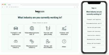
Step 4: Don’t tell, show with visuals that pop
People scroll fast – make your page worth slowing down for. Use bold visuals like high-quality images, short videos, and visual elements to show what you’re offering at a glance.
If you’re creating interactive landing pages, use animations or hover effects to keep visitors engaged and moving through each section. This isn’t just about looking good – it’s about helping visitors instantly “get it” without a ton of reading. Make your visuals count, and let them lead the way.
Step 5: Publish your page
The moment of truth! 🎉 You’ve designed, refined, and double-checked. Now it’s time to hit publish and let your page do its thing. Remember, you can always go back, tweak, and optimize later.
Step 6: Test, test, and test
Now, it’s time to see what’s working and what’s not. Dive into your analytics, track the clicks, and study how visitors interact with your page. Are they clicking on your CTA? Are they scrolling through all the sections? Or are they bouncing after a few seconds?
If you’ve used Heyflow, the built-in analytics lets you see where visitors drop off, track engagement by device, and monitor conversion rates over time. Use heat maps to find out when your audience is most active, and run A/B tests on layouts, CTAs, or even content flows.
With integrations to Google Analytics and Matomo, you can track specific actions like button clicks and map out the full user journey – all in one place.
Next, let’s look at some high-converting landing page design templates that put these principles into action.
4 High converting landing page design templates
Here, we break down what makes each landing page template effective and how you can tweak them to fit your brand with Heyflow. These designs are totally customizable, so you can make them your own – colors, fonts, layout, the works.
1. Marketfit survey landing page
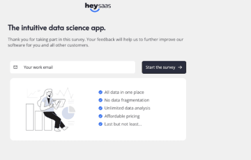
The Marketfit survey landing page template is designed to help you gauge market fit – essentially, how well your product or idea aligns with your audience’s needs. With a direct headline, a single email field, and a bold “Start the survey” button, it makes it easy for users to jump in. Perfect for validating ideas or getting user insights without overwhelming them.
Why this works:
✅ Simple and focused design
✅ Strong hero section above the fold
✅ Engaging interactive elements
✅ Clear and compelling call-to-action (CTA)
2. Recruiting - Supply engineering landing page
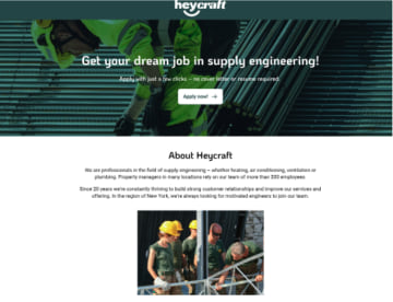
The recruiting landing page makes applying easy and inviting. With a bold headline and a simple CTA, it tells candidates exactly what to do. The “About” section below gives a quick peek into the company, showing candidates who they’d be working with. Ideal for companies that want to attract talent without the hassle of a drawn-out application process.
Why this works:
✅ Simple and focused layout
✅ Bold and action-driven CTA
✅ Effective use of visual hierarchy
✅ Mobile-optimized design
3. B2B Product recommendation landing page
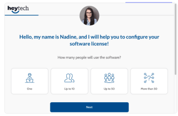
The B2B Product recommendation landing page template is like a personal assistant for your prospects. It greets visitors by name and walks them through a quick quiz to find their perfect product match. Ideal for B2B companies, it keeps things friendly and simple.
Why this works:
✅ Clean and minimalist design
✅ Clear and persuasive CTA
✅ Personalized user interaction
✅ Well-structured visual flow
4. B2C Dental insurance landing page
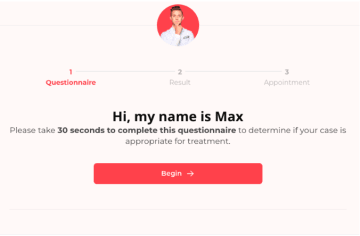
This template introduces “Max,” a virtual assistant who invites users to complete a quick, 30-second questionnaire. The layout breaks the process into steps, easing users into each stage. Perfect for B2C companies looking to personalize their user experience and guide potential customers toward a decision with minimal hassle.
Why this works:
✅ Bold and prominent CTA
✅ Engaging step-by-step flow
✅ Mobile-responsive design
✅ Use of trust elements and social proof
Ready to build a high-converting landing page?
You now have the roadmap to create a landing page that gets results. It’s all about designing with purpose, so every click brings visitors closer to converting. Every detail counts.
If you’re looking for a tool that makes it easy, try Heyflow. As a no-code lead generation platform, Heyflow gives you customizable templates, analytics to track performance, and A/B testing to see what works best – all in one place.
Because clicks are good, but conversions are better!
___________________________________
Ready to build high-converting landing pages?
With Heyflow’s easy-to-use drag-and-drop builder, you can design stunning, conversion-optimized landing pages in minutes. Create personalized user experiences and generate more leads effortlessly


