

A great landing page grabs attention, holds it, and drives action. If your landing page isn’t converting visitors into leads, it’s not pulling its weight.
The fix? Smart design choices. From bold headlines to can’t-miss CTAs, every element matters. And we’re here to show you how to get it right.
In this guide, you’ll find actionable landing page design tips backed by real examples from companies nailing their landing pages. We break down what works (and what doesn’t) so you can create a landing page that delivers.
Let’s turn those clicks into leads.
20 Best landing page design tips (with examples)
Whether you’re starting from scratch or giving your current landing page a makeover, these practical strategies and real-world examples will help you create interactive landing pages that work. Let’s dive in!
1. Ensure your page has essential elements
Every high-converting landing page shares a few non-negotiable elements:
Headline: Grab attention and communicate the main benefit
Value proposition: Explain what you’re offering and why it matters
Sign-up form: Keep it simple and only ask for necessary information
Strong call-to-action (CTA): Motivate visitors to take the next step
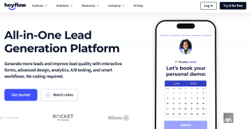
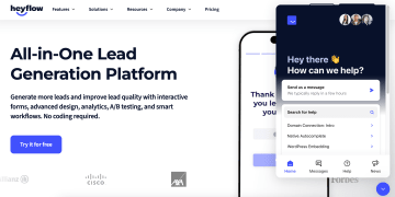
Heyflow’s landing page is a masterclass in making these elements work. The headline is clear and immediately grabs attention. The value proposition is concise, highlighting the platform’s ease of use and lead-generation benefits.
CTAs are strategically placed across the page – above the fold, mid-scroll, and near the end – so visitors always know how to take action. Combined with a simple sign-up form, Heyflow’s landing page ensures every visitor is guided toward conversion.
2. Include a strong hero image
Your hero image is the first thing visitors see on your landing page – it sets the tone, grabs attention, and communicates your product’s value at a glance.
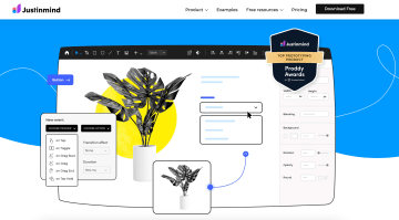
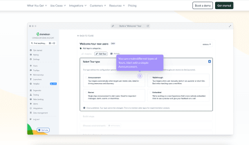
Justinmind’s landing page is a perfect example. The hero image shows their prototyping tool in action, featuring UI customization options and interactive elements. The bold blue background and bright yellow accents catch the eye immediately, while the visuals highlight the product’s features.
3. Use a simple and clean layout
Clutter is distracting; a well-structured design keeps visitors focused on what matters: your message. The trick? White space. It’s not empty space – it’s breathing room that guides visitors’ eyes to where you want them to go. It draws attention to key elements, reduces visual clutter, and creates a natural flow.
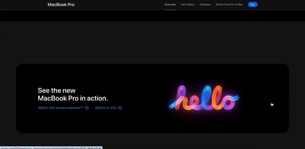
Apple’s landing pages are a perfect example. They combine bold, clear headlines with stunning visuals that communicate without extra words. Every section is spaced out intentionally, helping visitors process one idea at a time. Visual hierarchy is key – large images and headlines draw attention first, while smaller details fill the gaps. CTAs, product details, and supporting content all feel cohesive.
4. Use contrasting colors for CTAs
Your CTA button is the VIP section of your landing page – it needs to stand out, grab attention, and scream, “Click me!” The easiest way to do this? Use a color for your CTA that contrasts with your background. A bold, eye-catching button tells your visitors exactly where to go without them having to think twice.
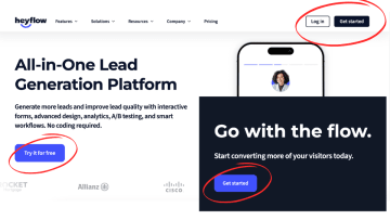
Take Heyflow’s landing page, for example. Their bright blue “Try it for free” button pops against the clean white background, immediately drawing your eye. The color ties perfectly into their brand palette, creating harmony while demanding attention.
The result? A button that’s bold, inviting, and perfectly in tune with the overall design. That’s how you combine contrast with cohesion to drive action.
5. Implement a sticky header with CTA
While we’re on the topic of CTAs, let’s talk about keeping them visible – always. A sticky header ensures your CTA stays visible no matter how far someone scrolls. Keep it sticky, and keep it simple.
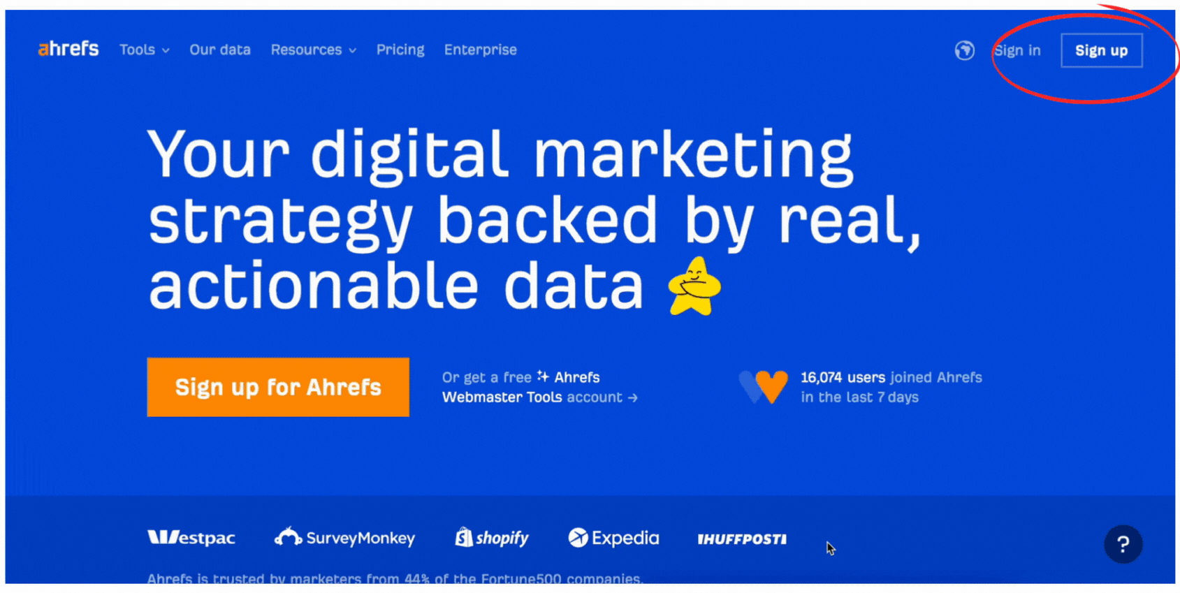
Ahrefs does this brilliantly. Their sticky header features a simple “Sign up” button that’s always there, ready to click. Whether someone’s exploring features, pricing, or even the Ahrefs blog, the CTA doesn’t budge. It’s a subtle nudge that says, “Whenever you’re ready, we’re here.”
6. Stick to a consistent color scheme
A consistent color scheme creates a polished, professional experience for your visitors. It ties all elements of your landing page together, reinforcing your brand identity and guiding users effortlessly through your website content.
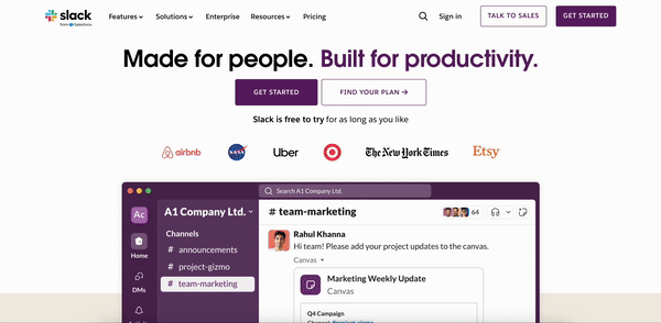
Slack’s landing page is a great example of this. Their design features:
Deep purple as the dominant brand color: Used prominently in headlines, buttons, and key visual elements to establish brand identity.
Clean white backgrounds: These create contrast and make the text and CTAs pop.
Vibrant purple for CTAs: The "Get Started" button stands out while blending harmoniously with the overall palette.
Subtle gray and black for supporting text: Ensures readability while letting more vibrant colors take the spotlight.
Pops of complementary colors: Bright, brand-aligned hues add visual interest without disrupting the overall harmony.
7. Micro-interactions
Micro-interactions are the tiny, subtle animations or feedback moments that breathe life into your landing page. They’re the quick button changes, hovering effects, or checkmarks that make your site feel interactive and polished.
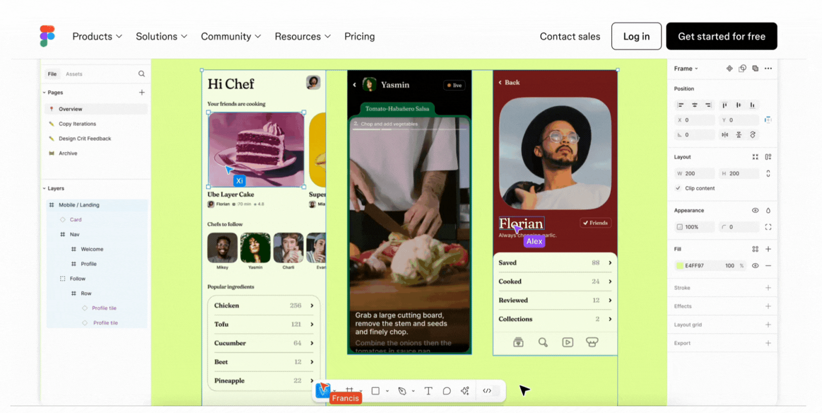
Figma sets a perfect example with its product animations. The landing page features a dynamic preview of how Figma works in real time – dragging elements, editing text, and navigating layers. It’s not just eye-catching; it’s educational.
8. Use email capture forms
Want more leads? Make it easy for visitors to share their email. Offer something they can’t resist – like free access, a helpful guide, or exclusive updates – and keep the signup form short and simple.
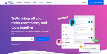
Trello knows exactly how to do this. The first thing visitors see is a clean email capture form with a bright blue “Sign up – it’s free!” button. One field, one click, and you’re in. No unnecessary questions, no distractions – just a clear reason to get started.
9. Include interactive elements
Interactive elements give visitors a hands-on way to engage with your product. They can click, explore, or test features, making the experience more dynamic and memorable. These could include product tours, real-time demos, or guided workflows.
Chameleon showcases this perfectly with dedicated landing pages for their interactive product tours. Visitors can explore features step by step, such as testing onboarding flows or trying customization options. These tours allow users to see exactly how the product works for them, making it easier to connect the dots and take action.
🎥 See how Heyflow makes it easy to add interactive elements to your landing page without writing a single line of code. 👇
10. Optimize for accessibility
Accessibility ensures that everyone, including users with disabilities, can fully use and interact with your landing page. This means designing with features that support different needs, such as clear navigation for keyboard users, readable text for those with visual impairments, and compatibility with assistive technologies like screen readers.
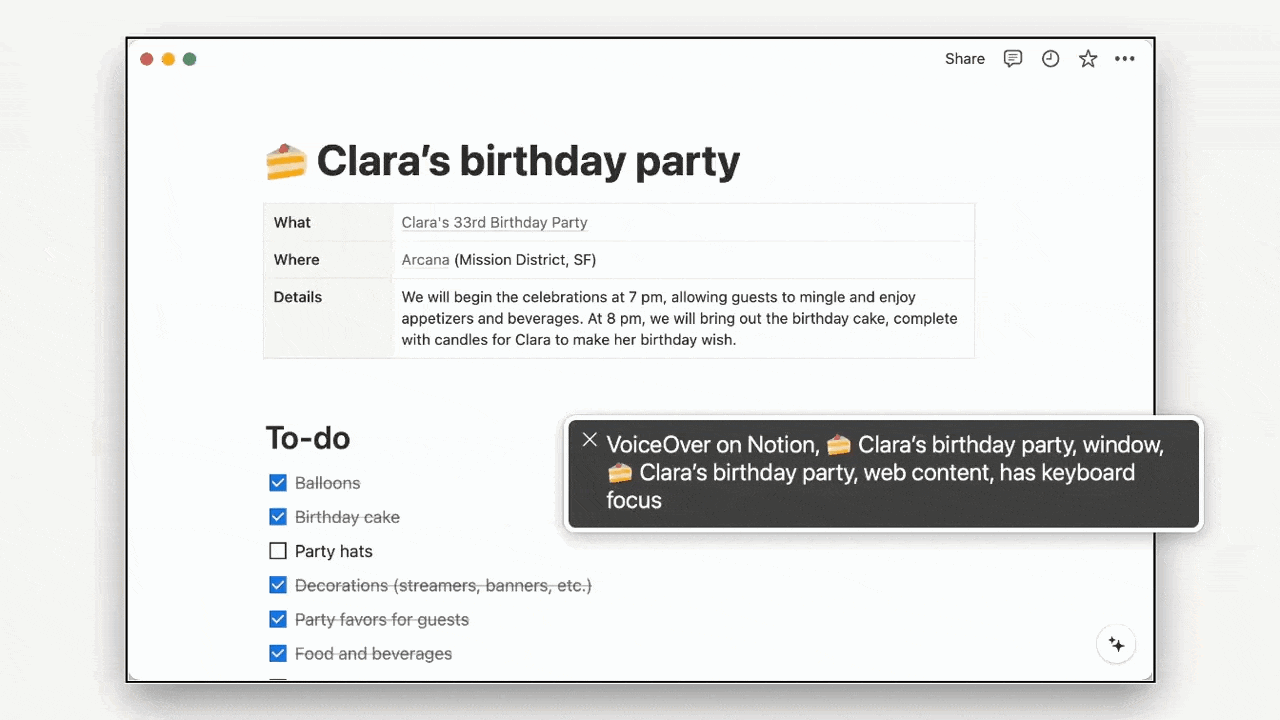
Notion sets a strong example of accessibility in action:
Color and contrast: Notion redesigned its color palette to meet WCAG (Web Content Accessibility Guidelines) standards, ensuring text is easy to read. Their dark mode isn’t just aesthetic – it reduces eye strain and makes the platform more accessible to users sensitive to bright screens.
Keyboard navigation: Users can navigate Notion with a keyboard alone, a critical feature for those with motor disabilities. Notion continues to improve this functionality to make the experience smoother and more intuitive.
Screen reader compatibility: Notion is working to enhance compatibility with screen readers, helping visually impaired users interact with the platform. While not fully optimized yet, their transparency and commitment to continuous improvement stand out.
Transparency and progress: Notion openly communicates its accessibility efforts, acknowledging areas for improvement and showing a clear commitment to inclusivity.
11. Exit intent pop-ups
Not every visitor converts on their first visit. An exit intent pop-up gives you another chance to offer value – like discounts, free resources, or exclusive access – just before they leave your page. It’s saying, “Wait! Here’s something you might need.”
When to use them?
To collect email addresses
To highlight free trials or demos
To offer discounts or promotions
To remind visitors of abandoned carts
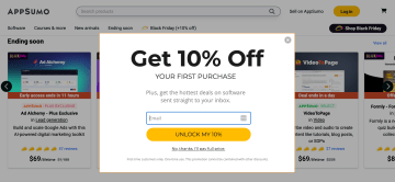
AppSumo uses exit intent pop-ups to grab users’ attention with irresistible offers. For example, their pop-up offers “10% off your first purchase” in exchange for an email address. The design is clean and bold, with a clear headline, an email capture field, and a bright yellow button. Plus, they offer an option to decline. This makes the pop-up feel less pushy and respects the visitor’s choice.
12. Build trust with authentic social proof
Trust is everything on a landing page, and social proof is one of the best ways to build it. Social proof shows visitors that your product or service is credible and valued by others, whether it’s through awards, industry endorsements, or recognizable logos of trusted partners.
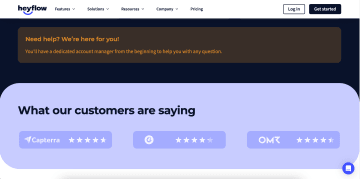
Heyflow does this brilliantly. Their landing page highlights trust signals like badges from platforms such as Capterra, G2, and OMR. These logos and ratings show visitors that Heyflow is recognized and respected in its industry.
13. Include customer testimonials
Another key part of social proof is showcasing what your customers are saying. Testimonials give your product a human voice, showing potential users how it has solved real problems or delivered real value for others.
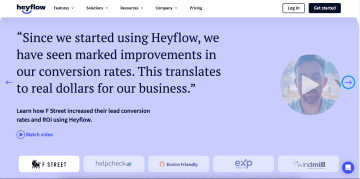
Heyflow nails this with a dedicated section featuring customer testimonials. Instead of generic praise, their testimonials highlight specific benefits, such as ease of use and the ability to create interactive landing pages quickly.
When using testimonials, go beyond generic praise. Focus on specific results or benefits. See how Heyflow does it below:
14. Make your landing page mobile-friendly
With more users browsing and converting on their phones, your page needs to look great and function seamlessly on smaller screens. A clunky design or slow load time could cost you leads.
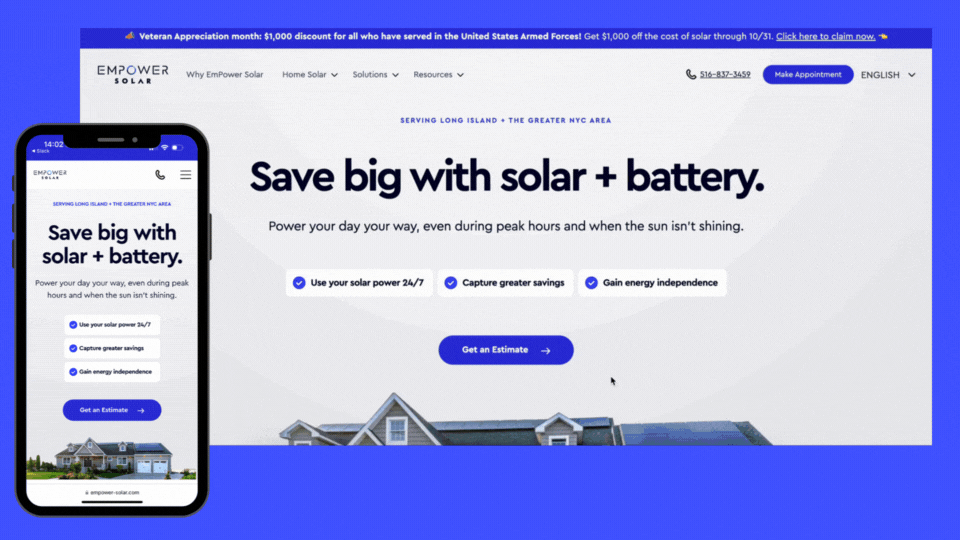
Empower Solar exemplifies mobile optimization. Their landing page features a clean layout, large buttons, and easy-to-read text, all of which adapt seamlessly to small screens. Key elements like the call-to-action and navigation are prominently placed, ensuring users can easily find what they need without scrolling or zooming. The page loads quickly, providing a smooth experience that keeps visitors engaged.
15. Create urgency with limited-time offers
Urgency is a powerful motivator. A limited-time offer nudges visitors to act quickly by reminding them that the clock is ticking. It should give them a reason to prioritize your offer now.
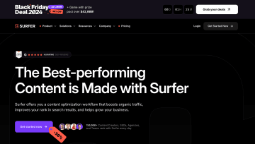
Surfer demonstrates this beautifully with its Black Friday campaign. The top of the landing page features a bold countdown timer, showing exactly how much time is left to grab the deal. Alongside the timer, Surfer highlights an enticing discount paired with a prize pool to sweeten the deal.
16. Offer a free trial or demo
Sometimes, the best way to convince visitors is to let them try your product themselves. A free trial or demo helps remove hesitation by showing exactly how your product delivers value.
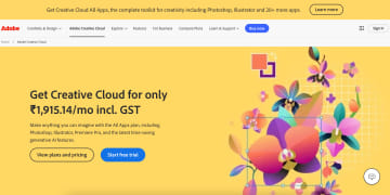
Adobe Creative Cloud makes their free trial offer impossible to miss. Their landing page clearly highlights the "Start free trial" button alongside pricing details, giving visitors two immediate options: explore the plans or try the product. A well-presented free trial can be the deciding factor that turns curious visitors into paying customers.
17. Use persuasive landing page copy
The little details matter – especially when it comes to microcopy. These are the small bits of text that guide users through your landing page, like button labels, tooltips, and form instructions. It reassures, motivates, and nudges visitors toward the desired action.

Grammarly’s landing page is an excellent example. Their microcopy on buttons is simple yet action-oriented. The instructional tooltips subtly showcase Grammarly’s functionality while reassuring users that the tool is professional and effective. Every word is intentional, removing doubt and making the experience feel seamless.
18. Implement a chatbot or live chat
Visitors have questions, and if they don’t find answers quickly, they might leave. A chatbot or live chat solves this by offering real-time help.
Heyflow’s landing page example demonstrates this perfectly. Their chatbot is always visible in the corner of the screen, offering help whenever users need it. What’s even better? Once the user starts a conversation, they can minimize the chat window, so it doesn’t disrupt their browsing. This subtle design ensures the chatbot is helpful but never intrusive.
19. Use trust badges and security icons
Think beyond aesthetics. Highlight certifications, awards, or partnerships that resonate with your target audience. The goal? Show you’re the real deal, without saying a word.
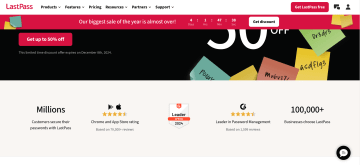
LastPass gets it. Their landing page features G2 Leader badges, glowing app store ratings, and a bold “100,000+ businesses” statistic. Each badge whispers (okay, maybe confidently announces), “We’ve earned this trust.” It’s visual proof that their service is both secure and widely endorsed.
20. Use directional cues
Directional cues – like arrows or highlights – help visitors navigate effortlessly, showing them exactly where to click, read, or explore next.
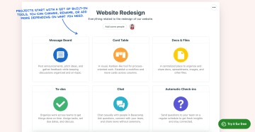
Basecamp gets this just right. Their landing page uses hand-drawn arrows and annotated notes to highlight key features, like the message board or chat tool. It’s clever, clear, and user-friendly. These visual nudges feel personal, almost like a team member saying, “Here’s what you need to know first.”
By now, you’ve got a ton of good landing page tips on your plate. But implementing all these lead generation landing page best practices can feel like a full-time job. Want an easier way to get it all done without breaking a sweat?
Your customized landing page templates
Why start from scratch? Our Heyflow templates are pre-designed, optimized frameworks to help you hit the ground running.
1. B2B Lead generation landing page template
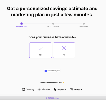
Lead generation landing pages are built to do one thing – convert visitors into leads. With a clean, focused layout and strategically placed CTAs, these lead gen landing page templates ensure your page is optimized for capturing user information efficiently. The goal? Make it simple for visitors to say “yes” and provide their details.
✅ Landing page design tips included:
A clear CTA
Simple, user-friendly forms for lead capture
Minimal distractions for a focused experience
2. Recruiting landing page template
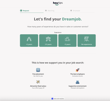
Looking for top-tier talent? This interactive recruiting landing page template gets the job done (pun intended). With engaging visuals and progressive steps, it keeps potential candidates hooked while guiding them toward the finish line.
✅Landing page design tips included:
Visual icons for easy understanding
Interactive elements to capture attention
Progressive disclosure to avoid overwhelming users
3. B2C lead generation landing page template
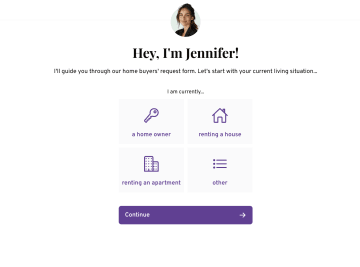
Designed for businesses that mean business. This B2C lead generation landing page template combines personalization with a clean, modern layout to create a professional yet approachable experience.
✅Landing page best practices included:
Personalized approach with user-centric content
Simple, clear options for quick decision-making
Sleek design that feels trustworthy and professional
4. Solar landing page
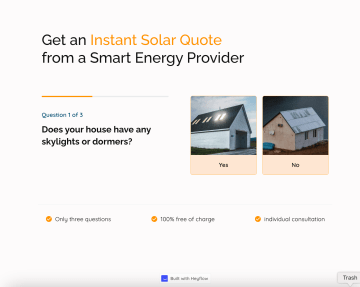
Shine a light on your brand with this solar landing page template. It’s built to deliver a compelling value proposition upfront, inspiring action with a clear message about sustainability and savings. The bold, contrasting CTA button grabs attention immediately, while illustrative visuals reinforce the eco-friendly message, making it easy for visitors to connect with your mission.
✅Landing page best practices included:
Eye-catching CTA for immediate engagement
Visual elements that tell your sustainability story
Strong, inspiring value proposition that resonates
Put landing page design tips into action
At the end of the day, your landing page isn’t about you. It’s about your users – their needs, their questions, their journey. Get that right, and you’re already ahead of the game.
If you want to skip the trial and error, Heyflow’s no-code landing page builder makes it easy to design and optimize landing pages that convert. With customizable templates, interactive tools, and analytics baked right in, Heyflow empowers you to build landing pages that do the heavy lifting for you.
Now go on – build a good landing page, captivate your audience, and watch the results roll in. You’ve got this!
___________________
Ready to create a high-converting landing page?
With Heyflow’s intuitive drag-and-drop builder, you can design stunning, interactive landing pages in minutes – no coding needed. Start creating custom pages that boost your lead generation and engage your audience effortlessly.
Recommended articles

7 Typeform alternatives to help you build better B2C funnels
The most popular alternatives for Typeform specifically built for B2C marketing include Heyflow, Involve.me, Jotform, Paperform, and more.
Read more
The Best Funnel Builder for Real Estate in 2026
Transform your real estate lead generation with Heyflow's funnel builder. Double your conversion rate with interactive funnels. Free trial available.
Read more
How to Capture the Meta Click ID (fbclid) With Your Funnel
Learn how to capture the fbclid (Meta Click ID) through your funnel for precise ad attribution and offline conversion tracking. Step-by-step guide with best practices and common mistakes to avoid.
Read more