
Lead Generation Landing Page Best Practices 2026


Trusted by 3,000+ marketers

Most lead generation landing pages lose visitors in the first seconds, not because the offer is weak, but because the page fails basic optimization principles. Optimizing your landing page for lead generation is the difference between campaigns that pay off and ad spend that disappears. This guide covers 13 proven best practices, from copy and form design to A/B testing, so you can build pages that consistently convert.
Key takeaways
Message match is one of the most overlooked conversion killers. When your landing page doesn't mirror the ad that drove the click, visitors register a disconnect and bounce before they ever see your CTA.
Multi-step forms consistently outperform single-page forms for lead generation. Starting with a low-friction question gets visitors mentally committed before you ask for their contact details, measurably reducing form abandonment.
Page speed is a non-negotiable lead gen factor. Google's Core Web Vitals directly measure how fast and stable your page feels to visitors, and slower pages lose leads before they convert
Heyflow gives you the full lead gen performance stack natively. Server-side ad tracking, built-in A/B testing, drop-off analytics, phone + SMS OTP validation, and 50+ integrations. No Zapier, GTM, or Stape required.
Lead generation landing page best practices
"A user interface is like a joke. If you have to explain it, it's not that good."
– Martin LeBlanc, Designer and Entrepreneur
Though the goal of your landing page may not be laughter, high-converting landing pages still follow essential design best practices that resonate with Martin's quote. From navigation to copy, if you need to over-explain anything, your landing page isn't doing its job.
With that on the table, let's serve 13 proven best practices for optimizing the landing page for lead generation — derived from success (or horror!) stories.
1. Use clear, concise, and consistent language (the three Cs)
Clear, concise, and consistent landing page copy turns visitors into paying customers. The three Cs behind great copywriting for lead generation landing pages are:
Clear: Draw attention to where you focus. Minimize complicated jargon, and demonstrate a clear value proposition.
Concise: Concise and persuasive copy go hand-in-hand. Utilize bullet points, simple sentences, and only include what's important.
Consistent: Reassure visitors they're in the right place by creating a message match between what you offer and what you say. Successful landing pages use consistent language when talking about what they offer, and keep in mind the language the visitor has seen before they reached your landing page.
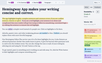
A great copywriting tool to help you navigate the three Cs is the Hemingway Editor (free web version) or Hemingway Editor Plus (the paid tier, which now includes AI-powered sentence rewrites, grammar checking, and tone adjustment). Both versions help you clean and condense your copy so it's easier to digest. It's up to you to ensure what you're saying remains consistent.
2. Match your landing page messaging to your ads
Message match is one of the most overlooked conversion killers. When a visitor clicks your ad and lands on a page that looks or reads differently from what they just saw, the brain registers a disconnect — and they bounce.
Every element of your landing page should mirror the ad that drove the click:
Headline: Use the same core language and promise as your ad headline.
Visuals: Match the imagery or color palette a visitor saw in the ad creative.
Offer: If the ad promises a free trial, the landing page should lead with a free trial — not a demo request.
This goes beyond just the three Cs. Message match is about continuity of intent. If someone clicked a Google Ad for "solar panel quotes in under 2 minutes," your landing page headline should echo exactly that promise — not a generic "Get a free quote today." The closer the match, the higher your landing page conversion rate.
3. Know your audience
Lead capture landing pages speak to their target audience, but you'll need to know who you're speaking to if you want to do this successfully. To craft an effective lead gen landing page, ask yourself the following questions:
What pain points do my customers have?
How does my product or service help them solve that pain?
How do my customers talk about their problems and potential solutions?
These three questions are the core of your lead gen landing page copy. Answering them will help you push pain points and focus on benefits in a language that feels familiar to your visitor. Answers to these questions will enable you to communicate more empathetically and have landing page visitors feel understood.
⚠️ Note: Knowing your audience is not segmentation. Landing page segmentation tactics are another layer to your lead generation efforts that we'll save for another blog!
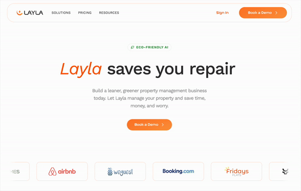
Layla Eco — the AI-powered smart sensor platform for property managers — does this exceptionally well. The team at Layla knows their target audience, real estate managers, have varying pain points when managing their properties, so they've designed a landing page that addresses them all.
"We wanted our lead generation landing page to speak to multiple pain points, but without taking up too much scroll time. With our landing page, we manage to address our wider audience within one line of text."
– Guy Nachum, CEO
4. Use direct CTAs (calls-to-action)
CTAs (calls to action) are potentially the most important part of any landing page. CTAs are your proposal in a sentence (or less!). They're the final nudge someone needs to sign up or buy.
How do you turn interest into action? Here's how we do CTAs at Heyflow:
Use the imperative. Verbs with directions, like "download," "try now," and "sign up" are great for inspiring action.
Utilize a button. Make it easy for the user to complete your desired action by creating a stand-out button.
Follow the three Cs. Align your CTA with the rest of your content, keep it consistent, clear, and concise.
Pick a color: We've found an increase in CTA clicks by sticking to a consistent color palette for our CTAs. We have a bold purple that we save for the most important things on the page.
5. Keep the action above the fold
Though this saying has transformed from its newspaper origins, the message remains of equal value. What once was the fold on the newspaper is now the scroll of a landing page. Yet, the recipe remains — put the cherry on top.
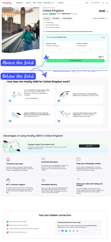
What's known as information hierarchy draws users naturally through your landing page content, giving them what they need first, and what they didn't know they needed further down. Holafly does a great job of putting the important information and opportunity to convert above the fold.
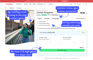
Above-the-fold content on a London eSIM landing page with Holafly.
They then proceed to deliver the extra reading for those who need a little more reassurance, below the fold.
6. Offer something relevant
Everything's better with an incentive. Consider offering a lead magnet like a free download, subscription trial, or newsletter with your lead capture form.
Through the foot-in-the-door method, your visitor will have more contact and content to get to know you, appreciate your value, and convert further down the line if they're not ready to do so right now.
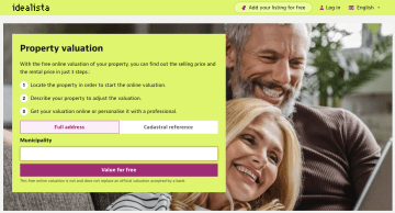
Real estate industries are great for taking this approach. For example, Idealista, a popular home buying and selling website in southern Europe, offers free property evaluations in exchange for a page visitor's email address. In helping people get a foot in the door, they get a foot in the inbox.
7. Optimize your lead capture form for conversions
Lead generation is just the beginning of a long, healthy client relationship. To begin with, collect only the information you need.
Initial lead capture information to gather:
Email
First and last name
That's it! You can get to know each other more later on. Use form fields that are easy to find, fill out, and submit. A good option to embed into your forms is autocomplete — for example, "Sign up with Google." This gives visitors fewer clicks to submit, securing the information you need faster.
But form optimization doesn't stop at field count. Multi-step forms — where you break a longer form into a sequence of simple steps — consistently outperform single-page forms for lead generation. The reason: starting with a low-friction question (like "What type of property are you looking for?") gets users invested before you ask for their contact details. By the time they reach the email field, they've already committed mentally.
Additional form best practices:
Progressive profiling: Collect basic info on first contact, then gather richer data in follow-up interactions rather than overwhelming visitors upfront.
Strategic placement: Test placing your form above the fold versus after a value statement — the right answer depends on your audience and offer.
Privacy and compliance: Always include a link to your privacy policy directly next to the form submission button. For European audiences, GDPR compliance isn't optional — it's a trust signal. For any market, a simple "We respect your privacy. No spam, ever." line reduces form abandonment.
Lead validation: Features like phone number validation and SMS OTP verification ensure the leads you capture are real and active — protecting your sales team's time and improving downstream conversion rates.
8. Ease navigation and remove distractions
When you minimize distraction, you optimize conversion. While it's cool to be catchy, it's effective to be clear, and you'll need to find the middle ground of drawing a visitor in as well as converting them.
Armin Tanovic, Senior Writer at dslx, specializes in UX writing. These are his three best practices for landing page UX/UI design:
Use directional cues: like arrows or animation to guide users to a desired action
Optimize CTA buttons: with placement, size, and colors that stand out
Minimize:
External linking: Links whisk visitors down alternative information paths and away from your CTA.
Excessive photos: These clutter the UI and distract visitors from your message. Once you've lost their attention, it can be difficult to gain it back.
Upselling or cross-selling information: Adding multiple offers and suggestions dilutes focus and can even overwhelm your visitors. Settle on one desired action and ensure all your copy points toward it.
Armin goes on to explain that "exceptional landing page design is characterized by its orderliness and complete lack of clutter. Negative space can also make your copy more readable, accentuate important sections, and enhance the overall visual appeal." Each design choice should pass a two-question litmus test:
Is this choice reducing the cognitive load for my visitors?
Does this choice bring visitors closer to clicking my CTA? Or, does it lead them away?
9. A/B test your landing page elements
A good landing page never sits still. A/B testing allows you to compare two versions or elements of the same page — and in an ideal world, there's always a new version worth testing. This is the engine of ongoing conversion rate optimization: systematic, data-driven improvement over time.
A/B testing pits one version against another to see which gets the most clicks, engagement, or results in higher conversion rates. A few landing page elements to consider A/B testing:
Ad copy
Headlines
CTA button copy
CTA button placement
Testimonial placements
Hero images
Form length and field order
Entire funnel paths (e.g., multi-step vs. single-step)
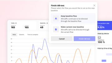
If using Heyflow to run your A/B tests, you'll be able to discover optimal landing page structure, layout, and content directly within the tool — no third-party app required. Heyflow's built-in A/B testing includes custom traffic split percentages, built-in statistical significance indicators, and visual logic mapping so you can model complex logic branches before testing them.
🤫 It doesn't stop there. You'll also be able to learn from step-by-step drop-off analytics (filtered by device type), build UTM parameters, and access 50+ native integrations including Google Analytics, Google Tag Manager, Meta Pixel, Matomo, HubSpot, Salesforce, and more.
Learn more on how you can analyze and optimize your lead generation with Heyflow.
10. Track performance with analytics and key metrics
Optimizing a landing page for lead generation is an ongoing process, not a one-time setup. To improve, you need to know what's actually happening on your page.
Key metrics to monitor:
Conversion rate: The percentage of visitors who complete your desired action. The median landing page conversion rate across industries sits around 4–5% — if you're below that, there's significant room to improve.
Bounce rate: Visitors who leave without interacting. A high bounce rate often signals a message match problem or slow load time.
Form abandonment rate: How many users start your form but don't finish? This is where multi-step forms and progressive profiling make a measurable difference.
Scroll depth: Are visitors reaching your social proof and CTA sections, or leaving before they get there?
Time on page: Useful context alongside bounce rate — a short session with a conversion is great; a long session without one signals friction.
Beyond standard analytics, heatmaps (tools like Hotjar or Microsoft Clarity) reveal exactly where users click, scroll, and drop off — giving you visual evidence to prioritize your next A/B test. Combine this with UTM parameter tracking to understand which traffic sources convert best, and you have a complete picture of your landing page's performance.
💡 The most overlooked layer of performance tracking for paid campaigns is server-side conversion tracking. iOS privacy changes, ad blockers, and cookie restrictions mean that browser pixels alone routinely undercount a meaningful share of your conversions — which directly distorts your CPL, ROAS, and the signal your ad platform uses to optimize. If you're running paid traffic, sending conversions back via Meta's Conversions API and TikTok's Events API isn't optional anymore; it's how your campaigns stay smart. Heyflow handles both natively, server-side — along with Bing, Taboola, and Outbrain conversion APIs — no Zapier, GTM, or Stape middleware required, and includes hashed field mapping (EMQ) to improve match rates out of the box.
Optimize your lead generation landing pages with Heyflow! Heyflow offers built-in A/B testing, 50+ native integrations, and advanced analytics to help you design, track, and optimize your landing pages for better conversions.
Try Heyflow for free11. Optimize for mobile responsiveness
Grab leads wherever they may be by creating landing pages optimized for mobile devices: mobile phones, tablets, and everything in between.
With mobile now driving the majority of landing page visits, a page that looks great on desktop but breaks on a smartphone is actively losing you leads. Mobile optimization isn't just about responsive layouts — it means rethinking tap target sizes, form field usability, font legibility, and above-the-fold content for a smaller screen.
If your ICP is extra curious, or what you're selling is a high-ticket item or service, they'll likely do their homework and visit your landing page from multiple devices before converting. Optimizing your landing page for mobile responsiveness makes your user experience seamless, builds trust, and drives an uptick in conversions.

If you're using a tool like Heyflow, your landing pages automatically adjust for every screen size — with each block independently optimizable per device — without you needing to do a thing.
12. Use social proof and trust signals for credibility
It's an informed market out there. Even grandmothers google. So how do you stand out as tried and true? Social proof.
Testimonials allow potential leads to see that other real people are users, satisfied customers, and were once peers with similar pain points. Consider highlighting reviews, featuring influencers, or including videos of what you offer in action on your lead generation page.
Beyond testimonials, trust signals on your lead capture form itself matter enormously. A privacy policy link, a security badge, or a simple GDPR compliance note directly next to your submit button reduces the psychological friction of handing over personal data. For industries handling sensitive information — healthcare, legal, financial services — these signals can be the difference between a conversion and an abandoned form.
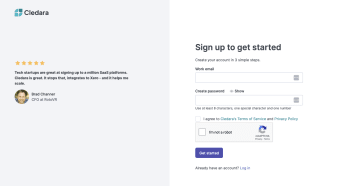
Cledara, the all-in-one SaaS management platform for spend and risk, takes a bold approach to social proof and it works wonders. The team at Cledara focuses on only social proof on their sign-up page to help nudge users into their product.
💡 For industries where data minimization is part of the trust equation — like healthcare, legal, financial services or insurance — look for a platform that lets you mark fields as sensitive so PII is auto-deleted from the form provider's servers after it's passed to your CRM. This shrinks your data footprint, simplifies your DPA conversations, and is a quiet but powerful trust signal: you're collecting only what you need, and keeping it only where it needs to live. Heyflow's Sensitive Tag does this natively — it's one of the few features no other lead funnel builder offers.
13. Maximize page speed
Even if you're selling meditation, if your landing page doesn't load properly within the first few seconds, you can lose the lead. Google measures real-world page experience through Core Web Vitals: Largest Contentful Paint (LCP), Interaction to Next Paint (INP), and Cumulative Layout Shift (CLS). These aren't just SEO signals — they directly reflect how fast and stable your page feels to a visitor.
How can you combat the dreaded load wheel?
Skip extra redirects.
Bundle up files where you can.
Compress images so they look great, but don't take forever to load.
Turn on browser caching so people can load saved parts of your site the next time they visit.
Move or delay JavaScript that isn't urgent so the important stuff loads first.
Limit the number of add-ons or plugins that may slow things down.
Clean up CSS and JavaScript files by removing anything unnecessary.
Go with a solid landing page provider that prioritizes load speed.
In short: Though you want to build landing pages that are dynamic, interactive, and good-looking, it's important not to overwhelm your page to the point that it will compromise performance. Heyflow landing pages are built to achieve a page speed score above 90 — so performance is baked in from the start.
Try Heyflow for freeConclusion: landing page optimization for lead generation
There you have it – 13 proven best practices for optimizing your lead generation landing page, ready to help you turn needs into leads. If you've made it here and are still wondering where to start, try starting with Heyflow.
Heyflow offers templates for high-converting lead generation landing pages with the following features:
Minimalistic designs to ease user experience
Visual storytelling for higher engagement
Interactive multi-step forms to qualify and capture leads
Built-in A/B testing and analytics to continuously optimize conversion rates
50+ native integrations with CRMs, ad platforms, and analytics tools
Native server-side tracking for Meta (Conversions API) and TikTok (Events API)
Native phone network validation + SMS OTP verification to improve lead quality
GDPR, SOC 2 Type II, ISO 27001, and HIPAA-compliant forms across all plans to build trust with every submission
Customizability to create content for your company — pixel-perfect, no developer needed
Native speed-to-lead stack: WhatsApp, custom SMTP, email autoresponder, and Slack notifications
— reach the lead within seconds of submission, from your own domain, without wiring up Zapier
Sensitive Tag: auto-delete PII from Heyflow servers after it's passed to your CRM, for the strictest GDPR and industry-compliance use cases
With industry-specific templates, sleek and interactive designs, and seamless integration with your existing marketing stack, Heyflow makes lead capture landing pages easy.
Build your first interactive funnel with Heyflow for freeFAQs
What is landing page optimization for lead generation?
Landing page optimization for lead generation is the process of systematically improving every element of a landing page — copy, design, form structure, CTA placement, and page speed — to increase the percentage of visitors who submit their contact information. It combines conversion rate optimization (CRO) principles with lead-specific tactics like form length reduction, trust signals, and message match between your ads and landing page.
What is a good conversion rate for a lead generation landing page?
The median landing page conversion rate across industries sits around 4–5%, but top-performing pages regularly achieve 10–15% or higher. What counts as "good" depends heavily on your industry, traffic source, and offer. Paid traffic typically converts lower than email traffic. The most useful benchmark is your own historical data — focus on improving your current rate rather than chasing an industry average.
How long should a lead generation landing page be?
There's no universal answer, but the guiding principle is this: your page should be exactly as long as it needs to be to overcome your visitor's objections and motivate action. For simple, low-commitment offers (a free download, a newsletter sign-up), a short page with a clear headline, one or two benefit statements, and a form is usually sufficient. For high-ticket or complex offers, longer pages with detailed social proof, FAQs, and trust signals tend to convert better. Always test.
Should I use the same landing page for paid and organic traffic?
Not always. Paid traffic arrives with specific intent shaped by the ad they just saw — message match between the ad and landing page is critical. Organic traffic may arrive with broader intent and benefit from more educational content. If your budget allows, create dedicated landing pages for each major traffic source and tailor the headline and offer accordingly. At minimum, use UTM parameters to track which version performs better for each channel.
How often should I A/B test my landing page?
A/B testing should be continuous — there's always a hypothesis worth testing. In practice, run one test at a time to isolate variables, and wait until you have statistical significance (typically 95% confidence) before declaring a winner. For high-traffic pages, this might take days; for lower-traffic pages, weeks. Prioritize testing the highest-impact elements first: headline, CTA copy, hero image, and form structure tend to produce the largest conversion lifts.
Recommended articles

What makes a great interactive landing page: 16 examples and a how-to guide
Explore 16 interactive landing pages packed with motion, quizzes, and smart UX — plus tips on what makes them convert.
Read more
How to build successful lead generation campaigns: A complete guide
Master lead generation campaigns with proven strategies and actionable tips to capture leads, boost conversions, and grow your business.
Read more
Landing page design for higher conversion rates: Tips and best practices
Create landing pages that actually convert! From must-have design tips to real-life examples, get the steps you need to craft a page that clicks with visitors and drives results.
Read more