Guides & best practices
View all articlesMobile Forms: A Way To Keep More Customers Engaged

People expect to get things done anytime, and anywhere. With smartphones practically glued to everyone’s hands, desktop-only forms aren’t enough anymore.
Mobile forms? Now, you’re in someone’s pocket, ready to catch that “I need this NOW!” moment.
Not only do they help you capture leads, but these types of forms also make the rest of your customer’s journey smoother. Whether it's setting up an account, sending in a support request, or sharing feedback, mobile forms get the job done – whenever, wherever.
In this blog post, we’re diving into everything you need to know about mobile forms. From their importance to their implementation, we show you how to keep your customers' lives easier, and their loyalty stronger.
What are mobile forms?
Mobile forms are a type of digital form that automatically adapts to smaller screen sizes, allowing website visitors and app users to navigate them using mobile devices, like smartphones and tablets.
Making your online forms accessible to screens of all sizes opens up opportunities for your brand to reach those busy people who are always on the go.
Let’s get a use case going. Imagine a potential customer scrolling through Instagram when they see your company’s ad. They’re interested and ready to sign up on the spot, but all you’ve got are clunky desktop forms that take ages to load on mobile devices or load poorly and out-of-screen. Instead of struggling to fill in the form on their phone, they postpone it for when they arrive at the office… (Can you see where this is going? 🫣)
By the time they’re back at their computer, that spark is gone. They’ve forgotten all about your brand, and instead crack on with scrolling LinkedIn.
Mobile forms help you capitalize on momentary interest and meet your potential customers where they’re at.
Why are mobile forms important?
Customers use multiple channels to research and buy products or services. A year-round survey by McKinsey and Harvard Business Review found that 65% of buyers start their journey on smartphones. Chances are, the first time someone interacts with your business, it's on their phone.
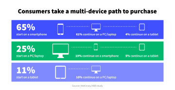
With nearly 60% of global website traffic originating from mobile devices, the importance of mobile forms is self-explanatory – they can really kick your business into gear by capturing mobile traffic.
When done right, you can use mobile forms to:
Convert high-quality leads into customers
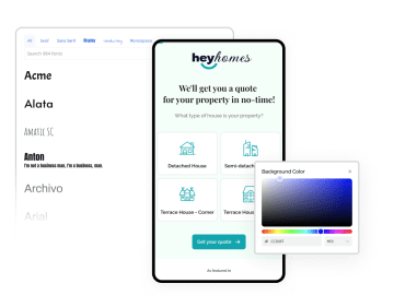
Suppose you’re a real estate agency looking to boost your lead conversion process.
Since mobile forms have an average conversion rate of 84%, you decide to add a simple, responsive form that pops up when users check out property listings.
You keep the form basic, neat, and even add autofill features for an extra push. Once a potential homebuyer hits Submit, your agency’s sales team gets notified in real time and can quickly follow up while the home is still fresh in the buyer’s mind.
This quick response, thanks to the mobile form’s convenience, increases your chances of turning that lead into a client. Before you know it, you’ve got more happy homeowners and higher revenue – all because you added a smart mobile form.
Create a smooth user experience
Filling out forms isn’t usually the most thrilling task. But, that doesn’t mean you can’t make it a one-of-a-kind experience for your users.
To create a smooth mobile experience, focus on making your forms interactive and engaging. This will make your brand stand out, keep your customers happy, and increase your revenue by 4-8% compared to businesses that don’t prioritize user experience.
Here are some ways you can make your forms user-friendly and more enjoyable:
Easy-to-tap fields: make sure form fields are spacious enough to be filled in on small screens
Auto-adjust layout: make your forms responsive so they work properly on any device
Autofill features: save time and cut down on mistakes by using pre-saved phone data
Conditional logic: change the form flow based on user answers
Personal touches: include details that let your brand's voice and personality shine through
Save customer data: to make it easier for them to connect with you next time
Quickly collect accurate data
When mobile users try to fill out forms designed for desktop use only, they’ll experience difficulties like having to constantly zoom in and out, scroll excessively, and struggle to navigate fields. It gets frustrating very quickly!
When faced with such a poor experience, a good percentage of users will most likely abandon your form. The ones that push through the inconveniences of the whole process have a high chance of missing entire sections and filling in information in the wrong fields. The result? Poor data quality that you can't put to good use.
If you use a mobile-friendly form instead, you make it easy for your potential customers to complete your form accurately, without losing interest due to non-responsive design.
So, it’s settled: every business wanting to improve lead generation initiatives needs mobile forms. Now, how do you actually implement them?
4 Strategies to create high-converting mobile forms
There’s no magic formula for creating the perfect mobile form. However, there are a few best practices we learned at Heyflow that can help you offer a streamlined brand interaction.
1. Keep your mobile form short
Reading and filling out forms on small mobile screens can be hard. Endless scrolling and typing out long answers is frustrating – even for those with the utmost patience among us.
To avoid this, keep the number of fields to a minimum and only ask the must-have questions. If your form is for a new visitor, the most important item you need is contact information. Once you’ve captured that, you can always follow up with more questions later on.
2. Make form fields thumb-friendly
Think about how someone holds a phone while texting. We interact with phones very differently than with a computer (hello, texting thumbs!), so make sure you avoid clutter, have big, easy-to-hit buttons, and place them where they make sense.
This means don’t hide buttons in zones where someone’s thumb is likely to be hovering. At the same time, buttons in the top corners of a mobile screen can be a reach for those with larger mobile screens.
3. Ensure mobile forms load fast
Nobody has time to sit around waiting for a form to load, especially on mobile. Slow load times can cause users to bounce before they even get started. Keep things lightweight and simple.
Cut down unnecessary graphics or code that could slow things down. Always test your page speed on different devices to make sure it’s fast across the board. The quicker your form loads, the better your chances of keeping people engaged and getting those valuable submissions.
In short, fast form = happy users.
4. Use form creation software for faster form-building
Sure, you could create mobile forms from scratch – but why spend hours when you can do it in minutes?
Most mobile-friendly forms are built using modern form-building software. A great mobile form builder will let you create forms that meet user needs while staying true to your brand. Plus, it can help you track submissions and tweak your data collection for better results over time.
With so many options available, how do you know which form builder is best suited for creating mobile-friendly forms? It’s tough to know where to begin your search, but we’ve got a firm recommendation. 🥁🥁
Meet Heyflow – the form-building software optimized for mobile
Once you decide a mobile form builder software is a must-have for your business, you’ll need to pick one that thrives in a mobile environment: Heyflow! Here’s why Heyflow is just what you need to build your mobile forms:
1. High page load speed
Known for blazing-fast load times with a page speed of over 90, Heyflow ensures that your forms pop up quickly, even on older devices or with spotty internet connections. With Heyflow, you provide a smooth experience that keeps users engaged and conversations flowing, no matter where they’re connecting from.
2. Customizable forms that adapt to your screen size
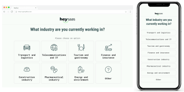
Every Heyflow form automatically adjusts the display and works on any screen size of any device. What looks great on a desktop will likely need tweaking on mobile, and Heyflow enables you to do this seamlessly.
Whether your users are on a phone, tablet, or computer, Heyflow forms are designed to work on any kind of device. Be it compatibility issues or outdated technology, as long as your users have access to the internet, your forms will look great and the system will function smoothly without slowing down.
3. Mobile form templates on tap
Mobile forms are a key part of your lead generation strategy, so they should reflect your brand’s identity.
With Heyflow, you’ve got all the tools you need to make your forms fit your brand perfectly. If you're short on time, just pick one of our customizable, pre-made form templates. They’re crafted by experts to help boost your conversion rates and can be set up in minutes.

Whether you need forms for lead generation, recruiting, quotes, registration, research, or feedback, you can grab one from the template gallery and start making it your own.
4. Embed forms without a glitch

Before you start building your form, you need to decide how you want to use it. You can either display the form as a single page with its own domain or embed it right into your existing website.
But will Heyflow be compatible with my website builder?
Yep!
Be it Wix, Webflow, Instapage, Unbounce, WordPress, or Squarespace, Heyflow works seamlessly with any website builder.
Create an unforgettable mobile form experience with Heyflow
With 4.4 billion smartphone users worldwide, mobile forms are the perfect way for businesses to connect with people on the go. They’re quick, convenient, and always at our fingertips.
Mobile forms aren’t going anywhere, so a great form builder should be a must-have in your marketing toolkit. A platform that helps you create forms you’d actually enjoy using yourself.
Heyflow’s drag-and-drop interface makes it super easy to create interactive forms (or “flows”) without writing a single line of code.
Ready to give it a shot? Try Heyflow for free with a 14-day trial!


