
What is a multi-step form? Benefits, best practices, and how to build one


Trusted by 3,000+ marketers

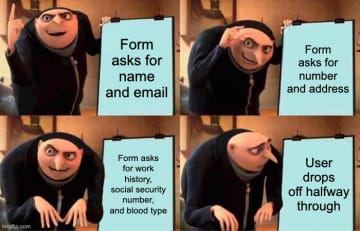
Asking for name, email, phone number, address, work history, blood type, emergency contact, three childhood fears, and your top 5 Spotify Wrapped tracks — all on one page? That’s not a form. That’s an interrogation.
Multi-step forms split your form into smaller, logical steps to reduce friction, keep users engaged, and boost conversion rates without changing a single question. It guides people through the process in a way that makes sense.
In this article, we explore multi-step forms, why they boost conversion rates, and how you can build one yourself!
What is a multi-step form?
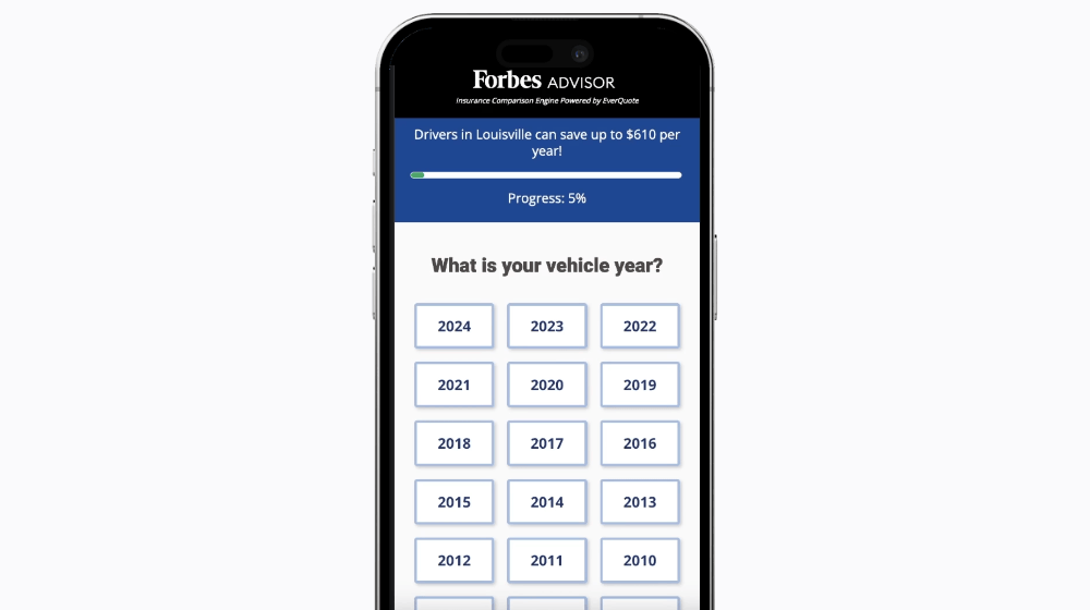
A multi-step form is just what it sounds like: a long form, broken into smaller, digestible chunks. Instead of hitting your users with 15 questions in one go, you walk them through it step by step.
It doesn’t mean you collect less data. In fact, it usually means you get more, because you’re not scaring users off in the first three seconds. You start small, build momentum, and ask for the heavy stuff (like phone numbers or email addresses) later on, once there’s trust and a little commitment.
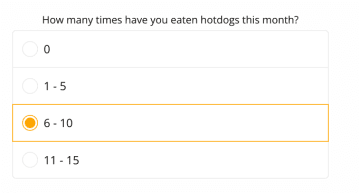
Here’s what it looks like:
This approach is based on the good old foot-in-the-door technique: if someone says yes to something small, they’re more likely to say yes to the next ask, and the next one. Ask an easy question up front, and boom—they’re already invested in finishing.
Multi-step vs. single-step forms
No, not every form needs to be multi-step. If your form is just asking for an email and a password, dragging someone through five beautifully designed screens is… a bit much.
But when you’re collecting more detailed info—qualifying leads, building quotes, running intake forms, or filtering applicants—multi-step is your new best friend.
Here’s how the two stack up:
Single-step form | Multi-step form | |
Input load | Everything, all at once | Spread across multiple steps |
Design flexibility | Limited layout options | Fully customizable with visuals, icons, and backgrounds |
User experience | Overwhelmingly fast | Smoother, easier to complete |
Interactivity | Static fields | Dynamic logic, conditional flows |
Personalization | One-size-fits-all | Tailored questions based on user input |
Conversion rates | Lower (more drop-offs) | Higher (especially for longer forms) |
Bottom line? Use single-step forms for short, functional tasks like logins or newsletter signups. But if your goal is to collect more data without scaring people off, boost lead quality, and make your form feel like a flow, a multi-step form is the move.
6 Benefits of using multi-step forms
At Heyflow, our customers, from lead gen pros to social recruiting wizards, use multi-step forms to boost engagement, qualify leads, and make their marketing work harder.
Here’s how they pull it off:
Less overwhelm = more completions: When users see 15 fields staring back at them, it’s fight or flight—and most choose “close tab.” Multi-step forms break things into small, manageable chunks. You lower the cognitive load, and suddenly that “too much” form feels doable.
Higher conversion rates: It’s psychology. When you ease people in, you increase the chance they’ll finish what they started. At Heyflow, we’ve seen clients double their conversion rates just by switching to multi-step, with no layout redesign needed.
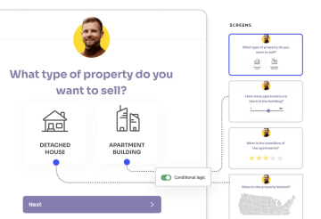
Personalized journeys: Multi-step forms let you use conditional logic to react to what users say. If someone says they’re a freelancer, you show one set of questions. Big enterprise? Totally different path.
Better lead quality, straight from the source: When someone finishes a multi-step form, you already know they’re engaged. You can ask the high-intent questions later (like phone numbers or budgets), and weed out the tire-kickers before they clog your pipeline.
More room to be you: Want to add a GIF? A branded background? A calming progress bar? Go for it. Multi-step layouts give you way more design control, and the result looks better.
Built-in testing superpowers: Because multi-step forms are modular, it’s easier to see what’s working (and what’s not). Where are users dropping off? Should you swap steps 2 and 3?
7 Best practices for designing a multi-step form
These are the practices we’ve seen work best, based on what Heyflow users build, test, and optimize every day.
1. Define what you actually need to ask
Every form starts with good intentions—and ends up with someone asking for your dog’s name and favorite pizza topping.
Before you build a single step, get ruthless about your goals. Ask yourself:
What do we need to qualify this lead?
What will we actually use from the data we collect?
What could we ask later, after they’ve converted?
Just because your CRM has 24 fields doesn’t mean your form should too. Multi-step or not, more questions = more chances for users to drop off. So work backwards from your outcome: whether it’s booking a demo, generating a quote, or filtering candidates, identify the minimum info you need to get there.
2. Group related questions together
Once you’ve decided what to ask, the next step is deciding how to ask it.
That means grouping related questions into clear, logical sections—so every step of your form makes sense on its own and builds naturally into the next.
❌ Here’s what not to do:
Step 1: What's your budget?
Step 2: First name
Step 3: How many employees do you have?
Step 4: What problem are you trying to solve?
Step 5: Email address
Feels messy, right? The user is bouncing between personal info, business context, and sales qualifiers with no clear thread.
✅ Now here’s a smoother version:
Step 1: Who are you? (name, email, role)
Step 2: What’s your company like? (industry, size, location)
Step 3: Why are you here? (pain points, goals, budget)
Much cleaner. Each step has a theme, which makes it feel easier, faster, and more like a conversation, not a scavenger hunt.
Bonus: When questions are grouped logically, it's easier to trigger follow-ups using conditional logic. Want to show different questions to marketing folks vs. HR? You’ll need to collect that info at the right point in the flow.
3. Start with an easy win
Start with something simple. A friendly first name field. A “What are you looking for?” dropdown. A quick “Which of these applies to you?” button group. This warms users up and builds momentum without making them feel like they’re handing over their soul.
It's exactly what happened at Jacobs Douwe Egberts.
When Marin Wrede, Performance Marketing Manager at Jacobs, started optimizing B2B lead gen campaigns with Heyflow, he and his team ran A/B tests to figure out what actually got users to complete their forms.
One of the biggest wins? Starting with an intent-based question instead of jumping straight to pricing or contact details.
“We used to give prices as a guide,” Marin explains. “But we found out through testing that more users complete the purchase if the price is only displayed at the very end.”
With Heyflow, his team could easily rearrange steps and test which first-step questions kept users engaged. By swapping out high-friction openers like “Enter your phone number” for simpler, product-focused questions like “What type of coffee machine are you looking for?”, they saw a measurable increase in completion rates.
Not sure which elements you should test? Here are 7 ideas for your A/B testing in Heyflow.
4. Set expectations clearly
No one enjoys filling out a step form when they have no idea how long it’ll last. It’s like walking into a meeting with no end time, hoping it wraps before your next snack break.
Whether your multi-step form has 3 questions or 10, the user experience hinges on clarity. If people don’t know how many steps there are, how far they’ve gotten, or what’s next, they’ll likely bail—even if they were interested.
That’s why it’s crucial to show them where they are and what’s ahead. You can do this in a few simple (but powerful) ways:
Add a progress bar that updates with each step
Use step counters (e.g. “Step 2 of 5”)
Give an estimate up front (“Takes less than 2 minutes”)
These tiny elements help visitors feel in control, reduce perceived effort, and make your form feel more like a guided experience than a guessing game.
And if you’re building a form that spans multiple pages or uses conditional logic to unlock additional steps, setting expectations is even more important. You don’t want your users to feel like they’re stuck in an infinite loop of input fields.
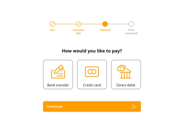
5. Use simple, low-effort inputs
Typing slows people down. It increases the chance of mistakes (hello, error messages) and adds unnecessary friction—especially on mobile. That’s why the best mobile forms rely on tap-friendly input fields: radio buttons, dropdowns, sliders, yes/no toggles, and auto-fill where it makes sense.
These elements are faster, more accurate, and look better across devices without you fiddling with custom CSS for every viewport.
Let’s say you’re collecting budget ranges. You could use an open text field and pray for clean data… or you could display:
💰 “Under $1,000”
💰 “$1,000–$5,000”
💰 “$5,000+”
The second approach helps users fill out your form with minimal friction, while giving you clean, segmentable data in the backend.
Another bonus: simple inputs make your form validation smoother. You can avoid that dreaded red text saying “Please enter a valid phone number” when your default could’ve just been a masked input with formatting baked in.
The rule? Make it as easy as possible to move to the next form step—especially when your goal is to capture leads, not scare them off.
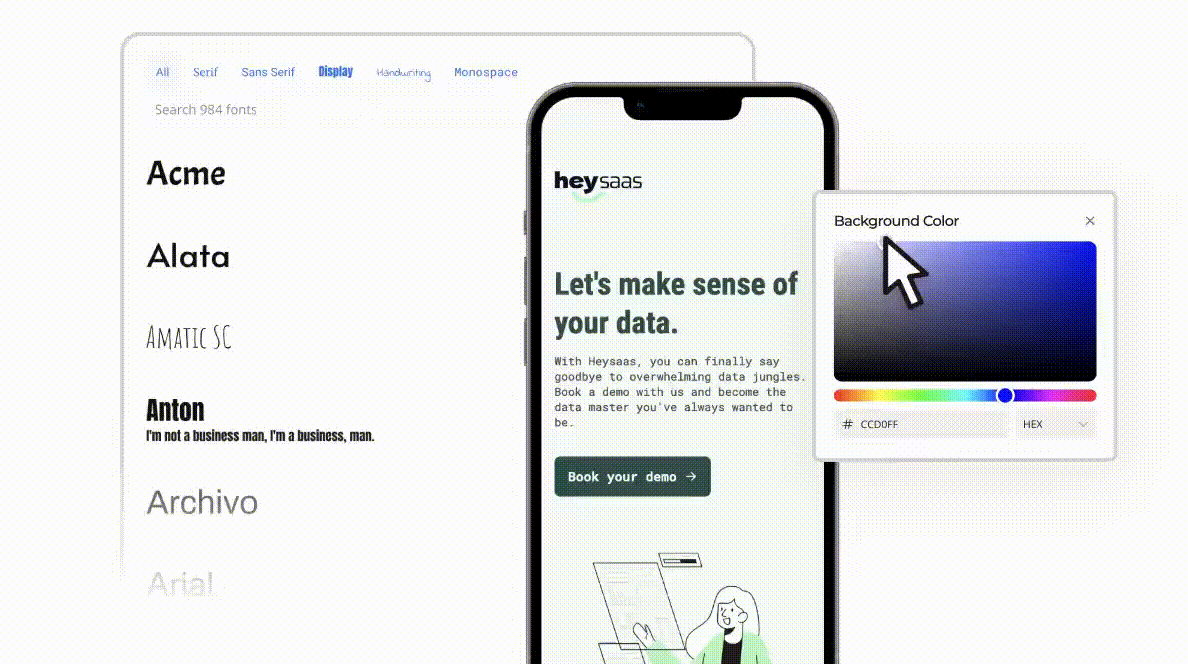
6. Design with your brand in mind
When your form feels like a random add-on, it breaks the user’s flow. But when it matches your brand’s tone, colors, fonts, and style? It builds trust, consistency, and clicks. That visual cohesion makes people more likely to submit, because it feels like part of a polished, thoughtful experience.
With Heyflow, you can fully customize every design element (without any coding). You can:
Use your brand’s exact fonts (or import them from Google Fonts)
Set up reusable style libraries with consistent spacing, padding, colors, and typography
Switch between Simple and Expert Design Modes, depending on how hands-on you want to be
Add custom CSS, upload assets, and even drop in HTML blocks when needed
Create on-brand loader screens to elevate the perceived value of the experience
And for teams short on time? Heyflow’s pre-designed templates cover use cases like recruiting, lead gen, registration, and quote builders—so you can launch faster without compromising style.
7. Test it like a human
Built the form? Great. Now forget you built it—and go use it like someone who’s never seen it before.
Because testing your multi-step form can help you catch the stuff robots and preview modes won’t: awkward validation errors, clunky input fields, unclear error messages, or that one weird step that feels like it came out of nowhere.
Here’s how to test like a real human:
Fill it out on your phone, with one hand.
Miss a required field on purpose. What happens?
Use dummy data and submit something invalid.
Try it with a weak Wi-Fi signal or dark mode on.
Ask someone from a different team (or your grandma) to try it cold.
The goal? Make sure nothing in your form feels confusing, frustrating, or unnecessarily slow. Heyflow makes it easy to preview and test forms in real time, but you still have to do the empathy check. Step into your user’s shoes, squint at your form, and ask: “Would I actually finish this?”
How to build a multi-step form with Heyflow
Heyflow is a no-code platform for building interactive forms, landing pages, and lead funnels—without touching a single line of code.
It’s built for marketers, designers, and agencies that care about performance and presentation. With Heyflow, you can create multi-step forms that turn visitors into leads, guide them through custom paths, and feel 100% on-brand the whole way through.
Here’s how to build your own multi-step form using Heyflow.
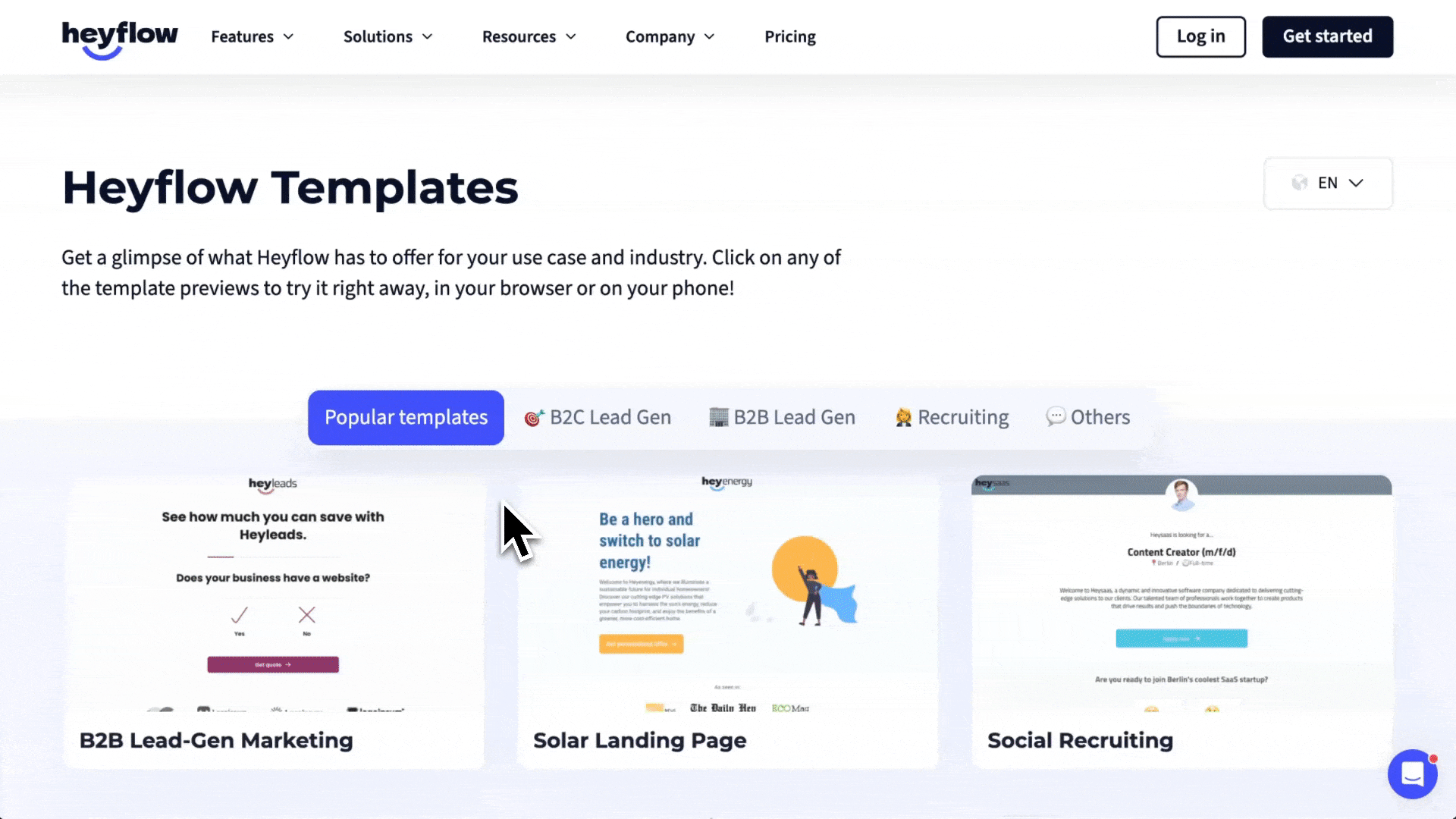
Step 1: Choose a template or start from scratch
Jump into the Heyflow builder. You can start with a blank canvas or pick a pre-built template for your use case—like recruiting, B2B lead generation, or event signups. Templates come with smart defaults (design, layout, logic), so you’re not starting from scratch.
Step 2: Make it yours
Customize the look and feel of your flow to reflect your brand.
Set fonts, colors, and button styles
Add your logo, backgrounds, or even video
Choose between Simple or Expert Design Mode
Use drag-and-drop to add or reorder blocks across multiple pages
You can even go further with custom CSS, HTML blocks, and advanced layout options. Your form should feel like your product.
Step 3: Add steps and input fields
Break your form into clean, logical steps. For each one, drag in the input fields you need:
Radio buttons, checkboxes, short text, number, phone, email
Sliders, dropdowns, calendar pickers, file upload
Dynamic logic to show/hide questions based on previous answers
Use field validation to ensure clean data, and make sure error messages are clear and human.
Step 4: Connect your tools
Heyflow lets you connect your form directly to your stack:
Sync leads with your CRM (like Salesforce, HubSpot)
Send alerts to email or Slack
Push data to Google Sheets or external APIs via webhook
Trigger automations instantly with native integrations
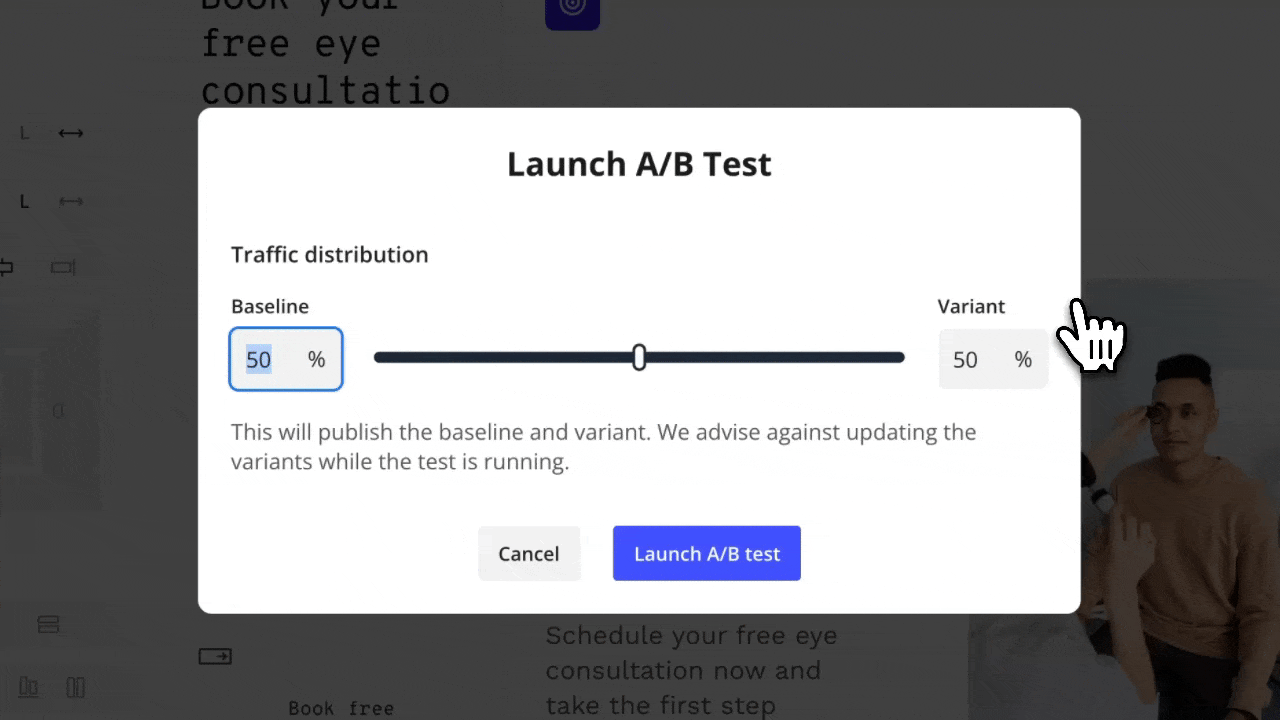
Step 5: Preview and test
Use the built-in preview to test your flow:
Try it on desktop and mobile
Enter test data and simulate errors
Check how the progress bar and logic flows behave
Fine-tune for drop-offs and conversion rates with A/B testing
Step 6: Publish and embed
Once you’re ready, publish your flow and:
Share it as a standalone link
Use your custom domain
Or embed it into any site with a simple embed snippet
That’s it. You’ve built a conversion-ready, brand-perfect multi-step form in less time than it takes to fill out one of those old-school, 20-field monstrosities.
Step 7: Track, analyze, and optimize
Building your form is only the beginning. The real wins come from tracking how it performs and making small tweaks that drive big impact.
In Heyflow, you can:
See where users drop off in the flow (step-by-step breakdown)
Track conversion rates for each version of your form
View response data directly in-platform or sync it with your CRM
Run A/B tests on different step orders, questions, or layouts
Monitor clicks, completions, and user behavior over time
You can even use external tools like Google Analytics or Microsoft Clarity to dig deeper with heatmaps and session replays.
Want to see Heyflow in action? Watch the video 👇
Turn better forms into better results
Multi-step forms are smarter ways to drive action. When designed well, they reduce friction, guide your users, and generate more qualified leads with less effort.
But “well” is the keyword here.
That means:
✅ Asking only what’s necessary
✅ Structuring each step with care
✅ Keeping the design tight and on-brand
✅ Testing everything like a real person
✅ And using tools that make the whole process easier
That’s what Heyflow is built for.
With a visual builder, full design flexibility, smart logic, and powerful analytics baked in, you can create multi-step forms (and entire landing pages) that feel good to fill out and even better to optimize.
Just better forms, built faster.
-------------------
Launch your next form in minutes
Choose a template, drag in your questions, customize the design—and go live. It’s that simple.
Recommended articles

How to Build a Multi-Step Qualification Quiz for B2B SaaS
Learn how to build a multi-step qualification quiz for B2B SaaS with Heyflow. Score, route, and pass qualified leads straight into your CRM.
Read moreHow to Build a Solar Installation Price Calculator for Leads
Build a solar installation price calculator with Heyflow to boost lead conversion. Step-by-step guide covers calculation logic, TCPA compliance, CRM integration, and lead scoring.
Read moreHow To Build An Interactive High-Ticket Product Finder
Learn how to build an interactive product finder for high-ticket ecommerce with Heyflow, guiding shoppers from questions to personalized results that convert.
Read more