Guides & best practices
View all articlesMaximize conversions with these SaaS landing page best practices


Your landing page is often the first place potential customers interact directly with your company. Whether they’ve arrived through the fine work of your marketing teams via ads, social media posts, or email links, this is your moment to grab visitor’s attention and distinguish yourself from other landing pages.
How do you do that? Follow these SaaS landing page best practices to boost conversions and increase engagement.
Best practices for SaaS landing pages
If you don’t know where you’re going, you probably won’t get there. Great SaaS landing pages follow the same principle, they’re made of specific goals, intentions, and out of the following best practices.
1. Focus on one conversion goal
One of the main objectives of a SaaS landing page is to convert visitors into users. That can happen through sign-ups, demo requests, and free trials. With all of the tools and strategies out there, it’s easy to get lost in the noise.
So, let’s focus. To create a high-converting landing page you need to:
Decide your main goal
Define your target audience
Design for higher conversions accordingly
Once you have a conversion goal on paper, you can refine your strategy to drive that conversion rate higher. The secret is to select one metric as your North Star. For example, demo bookings.
All other metrics come second place to that. And, when in a strategy-refining pickle, your next step comes down to what will bring you closer to your North Star metric.
2. Communicate a clear value proposition
Everybody’s talking about a clear value proposition for SaaS landing page best practices, but what does that actually mean? A value proposition explains how your product solves a problem.
If the mother of invention is necessity, then what brought your service to be? There’s a high chance your SaaS product offers a ton of different solutions, and it’s easy to get muddled in communicating them - your value proposition helps you communicate one message outlining the job your product helps users to get done. Your value proposition leverages pain points and highlights benefits, it should:
Speak directly to your target audience.
Use clear, concise, and compelling copy.
Offer an understanding of their pain points and the benefits of your solution.
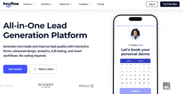
A good place to start is your SaaS product home page. It should communicate a clear value proposition from hello. Within the first five seconds of viewing any landing page, visitors should be able to know what you have to offer, and (most importantly) how you can help them.
Check out how we do this at Heyflow.
3. Use an effective call to action (CTA)
A CTA is the main purpose of your landing page, and everything on your page should be ‘lean’ towards it. Of course, everything around your CTA button aids the click, and it wouldn’t be much standing on its own. However, there are a few best practices to keep in mind for your CTA button itself.
An effective call to action:
Uses the imperative, phrases like “sign up now” and “get started today”
Is set inside a button that leads the user to the desired action
Utilizes consistent company branding like color and copy
Is quick and easy to find on your landing page
Manages expectations
Take a look at how Figma shares CTAs. ⤵️
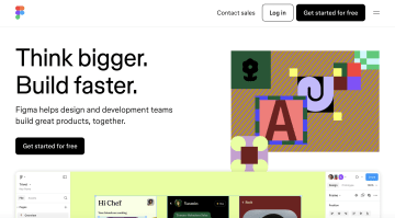
There are a few reasons why this CTA example works:
It stands out in color and placement: nothing else on the page is the same color and it’s surrounded by negative space.
It clearly manages expectations: a user can click with confidence on what’s going to happen next.
It’s surrounded by Figma’s value proposition.
4. Share social proof
Social proof is a great way to build trust. For all of the fantastic work your marketing team has done up front, it won’t speak louder than an endorsement from a peer.
Prospective customers want to hear from already paying customers on why your SaaS products work, and social proof creates positive peer pressure to get on your bandwagon.
Examples of social proof on a SaaS landing page include:
Logo reels
Customer testimonials
Ratings from third-party platforms: G2, Trustpilot, etc.
Take a look at how Slack builds trust with social proof:
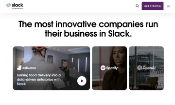
Slack does a great job of sharing social proof because:
They integrate video.
They share well-known brands.
They rely on storytelling tactics, focusing on the people behind the brands.
Their messaging of “innovative companies” builds a bandwagon that other businesses want to jump on.
5. Optimize your landing page for mobile
A list of SaaS landing page best practices wouldn’t be complete without mobile optimization.
To keep up with the large percentage of users who access landing pages via mobile devices, utilize an adaptive landing page that fits to screen - no matter its size!
Here are some SaaS landing page best practices for better mobile compatibility:
Prioritize readability: Avoid pop-ups, adjust font size, and include healthy line spacing.
Focus on touch-friendly navigation: Use simple, logical forms and CTA buttons built for thumbs!
Optimize for page speed: A landing page won’t work if it doesn’t load, minimize anything that will slow your load down: heavy images, unnecessary code, complicated plug-ins. People visiting from mobile are less likely to have a solid internet connection.
Forget about the hover: You won’t be able to provide hover pop-ups that you can on a desktop (when someone hovers over something with their cursor) everything needs to be on the page, or a tap away. Adapt your UI to reflect this.
Elements of great SaaS landing pages
Take lead generation landing page best practices and put them into action for your software buying cycle- which is notoriously much longer and more complicated - with multiple buying stakeholders at the table.
By prioritizing a seamless user experience, demonstrating clear value propositions, and utilizing key design elements, you can create an effective, high-converting landing page that gets shared (and loved) by all buying stakeholders from a company.
Let’s look at what goes into that equation.
6. Focus on an engaging hero section
In storytelling, there are two methods for building a character. Those are: show, and tell. Your hero image or video can show support for the telling copy around it.
For some SaaS landing page inspiration, consider the following hero sections:
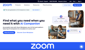
Zoom is showing and telling through:
A clear and straightforward headline.
Visuals showcasing humans using their product, and their UI in action.
An eye-catching CTA, and option to explore more if they haven’t convinced a visitor already.
Heavy branding: someone may not be ready to buy now, but brand well and they’ll remember your SaaS when they are ready.
Or, how about this example from Canva:
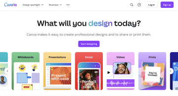
Canva’s landing page hero section uses both concise copy and visual language to demonstrate its ease of use and creative flexibility. You can see a clear value proposition, allusions to social endorsements through photos, and a stand-out CTA.
Are these examples resonating with some of the other SaaS landing page best practices we mentioned earlier? Yes, there will be a quiz at the end of the article! 😝
In the meantime, here’s your great SaaS landing page hero section cheat sheet:
State your value proposition.
Stay sticky with strong branding and visuals.
Give an easy opportunity to convert, or read on.
Highlight product benefits while giving an insight into your UI.
Speak to your target audience: address pain points while using their lingo.
7. Showcase features and benefits
It’s best to create landing pages that showcase your SaaS software features, and the benefits they provide. A good SaaS landing page names the features and highlights benefits. This is where the combination of knowing your audience and using clear, concise copy comes in.
For example, though you may know that automated reports save hours of manual work, this may not be obvious to your landing page visitor.
Whereas before we had the SaaS landing page best practice of show and tell, here we have: say, and explain. Let’s take a look at how HubSpot is doing it.
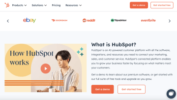
HubSpot’s landing page is visually attractive, organized, and uses this particular section to say the features and explain the benefits of the product. Here, the feature is the AI-powered customer platform and the benefit is that it grows businesses through customer focus. It’s building a business case to buy.
8. Introduce minimal navigation
Let labyrinths and landing pages be different. 👏 Landing page optimization relies on simplicity. Make it easy for your visitor to find and complete forms, and your conversion rates will soar. 🦅
Airtable does this well.
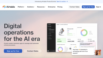
Why is this such a great example of minimal navigation? Airtable manages to:
Give a visual insight into their UI: preparing the visitor for life inside their SaaS
Share a clear value prop
Entice a reader with a free trial
Best of all, there hasn’t been a scroll or click in sight for a visitor to get all of this information. When you click the “sign up for free” button you’re taken here:
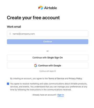
That’s one click, and a visitor is creating their account. Plus, with the option for signing up with Google available, and the marketing and sales comms box auto-checked, the visitor needs to do even less to convert to a user.
📚 Looking for more learning? Check out how to create an interactive website to keep your page visitors happy, engaged, and sticking around.
9. Share interactive elements
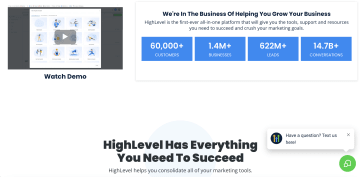
Relative and useful interactive elements like interactive demos, chatbots, and niche-specific calculators make for a SaaS landing page dream. For instance, HighLevel’s SaaS landing page utilizes a chatbot that’s on hand to help a page visitor answer questions, find what they came for, or just have a good time.
If you’re looking to build a landing page for your own SaaS and don’t know where to start, watch this webinar in which Heyflow’s marketing experts break down how to create compelling landing pages.
Top examples of successful SaaS landing pages
We know you’re quick to catch on. By this point, you know how to point out a successful SaaS landing page by its use of key elements and best practices, right? Don’t worry, it’s not the quiz moment. Yet. 🧑🏫
Let’s take a look at a few SaaS landing page templates that follow top landing page design tips for optimized conversion rates.
B2B SaaS demo landing page example
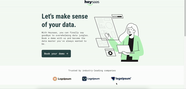
Get demo bookings with this B2B SaaS landing page. This user-friendly design is built to optimize conversion rates. You’ll find navigation buttons that drive users to explore your product, customizable landing page features like text and colors, and automatic mobile optimization to convert visitors on the go.
SaaS landing page best practices included:
✅ Interactive tools
✅ Space for a strong call to action (CTA)
✅ Simple and intuitive design for easy navigation
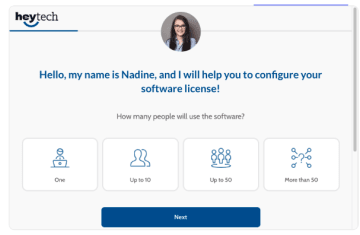
B2B Lead-gen marketing example
This SaaS landing page design uses clear and simple forms to convert visitors into customers in a pinch. With a clear value proposition, pain point, and solution offered upon the first visit, this landing page is built to convert.
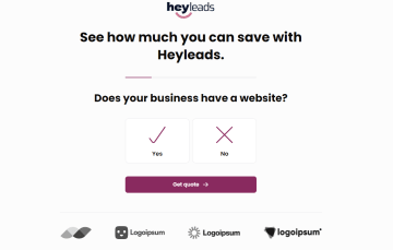
Return on investment calculator example

This SaaS landing page design utilizes integrative industry tools to engage visitors, provide something useful, and build trust. Elements like these add value to both your landing page and your SaaS company.
This SaaS landing page best practice in action gets visitors to engage, increasing the chance they’ll stick around having already invested time into getting to know your SaaS. Plus, everybody loves a freebie.
B2B product recommendation
As we’ve covered, a clear and simple SaaS landing page design is successful. This Heyflow landing page form example puts the user in direct ‘contact’ with a sales representative. The navigation is clear and leads the customer to instant support.
B2B webinar landing page example

Successful SaaS landing page design builds the environment for a specific behavior. Here we have a clear navigation platform for a desired action. There’s no question. The user is given who, what, when, where, why, and how.
SaaS landing page best practices in action:
✅ Minimal distractions
✅ User-friendly forms
✅ Call to action
Wrapping up your guide to SaaS landing page best practices
We hope this article has left you with key SaaS landing page best practices to implement, with some inspiration to get you on your way. Ideally, you now know how to structure pages for better engagement, build trust, and utilize effective CTAs.
Everything comes second to your potential user. Your landing page isn’t about you, it’s about them. So, when defining that North Star metric for your landing page, don’t think about what your marketing team, or even your product team wants to see on the page. Think about what your ideal customer needs to see. Everything starts there. And, well, here. Go get ‘em! 🏁
_________________
Try a landing page template of your own!
Psst. All of these examples were built with Heyflow. If you’re looking for a drag-and-drop solution to building your first landing page, look right here. 📬