
Your landing pages are live, your social media game is strong, and those ad campaigns are finally bringing people to your site. The clicks are rolling in, and it feels like you’re about to make it big.
But then, reality hits: nobody’s signing up. Despite all that traffic, your website is a leaky bucket; and leads are slipping away like sticks down a river.
Well, you’re not alone. A lot of businesses are in a similar boat. They’ll invest all their cash pre-site and then forget to look after what’s right in front of them. Oftentimes, the culprit is your signup forms.
Maybe they’re not optimized, or worse, maybe they’re missing. Either way, ineffective signup forms can be detrimental to even the healthiest of advertising budgets. They’re supposed to guide curious visitors into becoming valuable leads. However, if that path is leaking, your conversion rates will take a nosedive.
In this blog post, you’ll learn all about signup forms and how to turn them from conversion killers into lead-generating converters. Plus, we’ve added some of our favorite templates to help inspire your journey.
Let’s fix those leaks and start turning your traffic into a steady stream of quality leads. Read on!
What are signup forms?

Signup forms are sections on websites or apps where users provide personal details, such as their name, email, or sometimes a phone number, to create an account, subscribe, or join a service.
When users fill out these forms, they’re permitting the business to process and use their data – to send updates, offers, notifications, or grant them access to a platform or service.
These forms can appear in different formats – sometimes as pop-ups, other times embedded right into the webpage. You can even find them in emails, usually as part of a mass mailing campaign or a newsletter.
Signup forms are a digital way of staying in touch with your visitors. Depending on your type of business, you can use these forms to:
Collect potential leads for your sales team to nurture
Set up user accounts faster than typing "password123"
Build email lists quickly from an already-engaged audience
Give visitors VIP access to exclusive content or special offers
Register people for events, webinars, or that big product launch you’ve been planning
All in all, a signup form is the gateway to ramp up lead conversions. But, only if you know which type to use where… and when.
3 Types of signup forms you need to know
If you run a Google search for ‘signup form templates,’ you’ll likely be overwhelmed by what’s out there. Let’s zero in on the top three forms that really matter: emails, opt-ins, and registrations.
Email signup forms

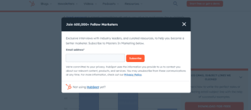
Email signup forms ask for users’ email addresses so they can join your mailing list and stay updated with content from your business. They help you stay in touch with people who are interested in what you’re offering, but not quite ready to put their cash on the table.
You’ll often see these forms on blogs, online stores, or other websites. Usually, they’re in the form of a box with a field where users can input their email address and a call to action (CTA) button. You don’t need much else other than an email.
To motivate your visitors to sign up, you can offer them something in return, like a regular newsletter or exclusive content.
Opt-in forms
Opt-in forms explicitly ask for users’ consent to receive updates or offers. It’s a website politely asking, "Would you like to hear from us?" If users do, they enter their details, understand what type of communications they’ll receive, and confirm that they really want to stay in touch with your brand.
Most opt-in forms include a checkbox that website visitors must deliberately check to confirm consent, ensuring they’re opting in voluntarily. This helps websites follow privacy rules and comply with legal standards like GDPR or CAN-SPAM.
What’s the difference between the two forms so far? While all opt-in forms can be email signup forms, not all email signup forms are true opt-in forms unless they clearly ask for consent.
Registration signup forms
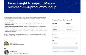
Suppose you’ve got an event coming up or an online community that’s buzzing with excitement. You can’t just let anyone stroll in, right? That’s where registration signup forms come in.
Whether it's a mind-blowing webinar or an exclusive online forum, these forms act as entry tickets: users don’t get access unless they’ve registered!
Your online registration form is your first chance to welcome new members or event guests. Which is why it needs to be fast, clean, and responsive on all devices. When you use the right type of online forms at the right moment, they can help you generate 40% more leads and grow up to 4x faster.
The power of signup forms done right
Your signup form isn’t just another box to check. It’s the VIP pass to your brand’s inner circle, the golden key that nearly half of marketers say is their top lead-generating tool.
Signup forms are how companies start building relationships with potential customers.
For service companies, forms create leads.
For e-commerce, forms generate sales.
For SaaS, forms bring in users.
Get them wrong, and it might cost you serious money. Just ask Expedia – they lost over $12 million a year because of a single extra field in their online registration form.
Signup forms stand between random visitors and true leads, turning curious browsers into loyal customers. You can harness their lead-generating power only when they’re done right. Lucky for you, we’re about to explain exactly that.
7 Strategies to maximize your signup forms
Here are the seven most effective strategies that can help your signup forms capture more leads.
1. Use multi-step forms when necessary
Single-step forms put all the questions on one page, which can feel overwhelming for first-time visitors. When customers see a long list of things to fill out, they’re more likely to give up before they even start.
The solution? Multi-step forms.
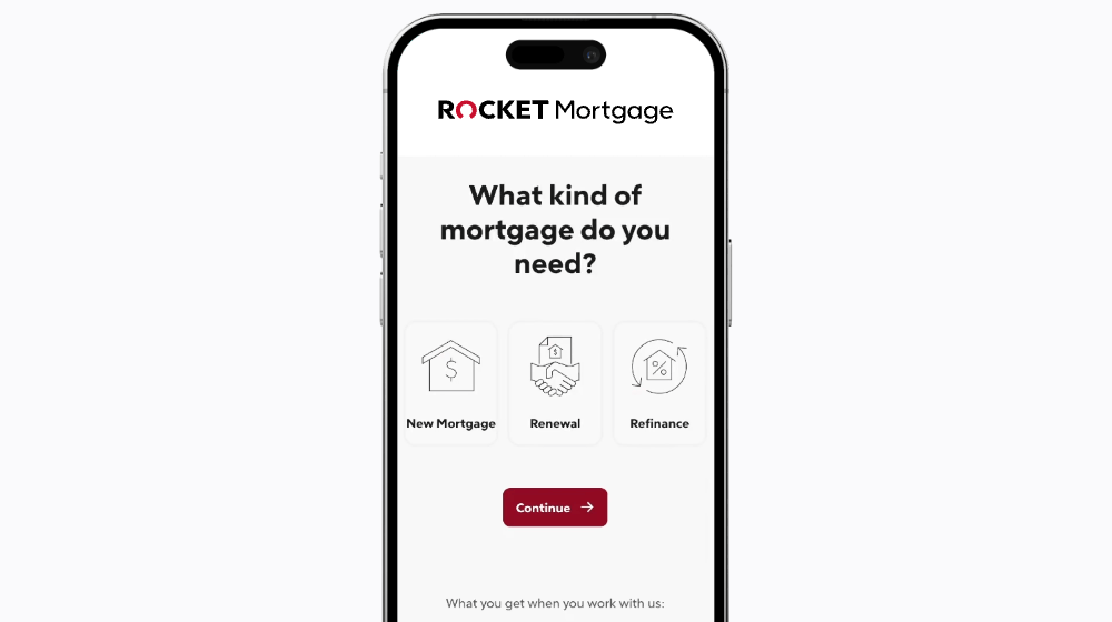
Instead of cramming all of your questions into one view, multi-step forms spread them out, making your form a lot less intimidating. They start with the basic things, like name and email, and gradually ask for more detailed info, as a user is more invested in completing the form. Each step keeps users going, encouraging them to push through to the end—which should never be too far away!
This multi-step approach actively reduces question load, improves customer engagement, and increases lead conversions by 86%.
Multi-step forms require a bit more setup. With Heyflow you can easily create them without writing a single line of code. Keep things fun, fast, and developer-free.
2. Invest in a high-quality signup form creation tool
Building signup forms manually requires a lot of effort, as you need to:
Have coding experience
Make sure forms are responsive on all devices
Know how to integrate forms into your website
Understand features like conditional logic and field validation
On top of that, you have to continue to update and maintain them. Even if you are a master coder, marketer, and have access to Hermoine Granger’s Time-Turner, you may just not want to do all of the manual leg work. And, rightly so!
Why do all that when you can save time and resources by investing in a dedicated form builder?

A top-tier form creation tool takes care of all the tough work while you focus on your lead-gen strategies. To step up your lead generation game, look for a tool that:
Is quick to learn and adjust
Doesn’t require coding knowledge
Comes with several templates to choose from
Has flexible design elements to suit your branding
And Heyflow fits the bill to a T. 👋
An advocate of the multi-step approach, Heyflow gives you everything you need to create forms that get results. Drag-and-drop builder makes it easy for anyone to create interactive, engaging flows – no coding skills required. Plus, we’ve got plenty of form templates to get started with and a 14-day free trial period to see if you like it!
3. Stay on brand
Your signup form is often the first real connection a potential lead has with you, ensure they remember it for all of the right reasons.
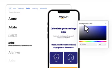
Your form needs to be consistent with your brand guidelines. Build brand-specific forms using custom fonts, color palettes, accurate TOV copy, HTML blocks, and more.
When your signup form feels like a natural part of your website and overall brand, it creates a smooth experience that builds trust. And people are more likely to become customers when they trust a brand.
4. Make your signup forms interactive
When someone hits your page, they're most likely ready to engage. You need to give your visitors forms that grab their attention and pull them in. Build interactive forms by using conditional logic that adapts to your visitor’s answers.

Set up different paths based on responses, so people only see questions relevant to them. If a question doesn’t apply, your form can skip it altogether. If it does apply, they’ll be redirected to more questions designed to understand their first answer even better.
You can also go the extra mile and add animations, dynamic fields, and progress bars to improve user experience.
5. Prioritize easy navigation
Your potential leads are probably juggling a lot already. They don’t need a clunky, confusing signup process to add to their task list. The fix? KISS your visitors! We’re borrowing from the UX design principle KISS: Keep it Simple, Stupid. Build forms that your grandma can navigate and make everyone’s day that little bit easier.
Shorter forms with fewer fields can definitely help you align with the KISS principle, and HubSpot backs this up: conversion rates jump by nearly 50% when you use three fields instead of four. However, it also comes down to clarity in navigation copy too. Kill some darlings and go for simple over sassy or smart.
Remember, your form navigation needs to be universally smooth. Your forms need to work just as well on smartphones and tablets as they do on a desktop. If they don’t, you might lose those on-the-go leads.
6. Maximize speed
Let’s be real: online attention spans are short, and our patience is even shorter. No one likes waiting for their favorite Netflix show to buffer, let alone dealing with a slow signup form.
Think about it – your potential leads are hit with endless digital noise every time they go online. If your page takes too long to load or your form stutters, they’ll bail in a heartbeat. Well, two of them. Over half of website visitors will ditch as website if it takes over three seconds to load.
How do you make them stay? You give them a lightning-fast, seamless form experience. It should load quickly and transition smoothly, no matter what device they’re on. From the moment they hit your page to the second they press “Submit,” leave the delays to the budget airlines.
You can also add autofill and field validation features to make the process even faster.
Google says “Speed is revenue,” and Heyflow couldn’t agree more. That’s why every form you build with Heyflow has a mobile page speed >90 irrespective of a browser’s device or internet connection.

7. Ensure proper data management & segmentation
When someone fills out your form, they’re not just handing over a name and email. They're giving you access to their digital identity, and they expect you to take care of it.
Handling all that sensitive information manually is not an easy task. And, not all leads are equal. You've got the curious browsers, the "just looking" types, and then the goldmine leads: “take my card details right now!” A good data management system sorts this pile out into categories like hot leads, cold leads, and everything in between.
With smart solutions like Heyflow, you can reach out to every potential lead at the perfect time and shower them with the content they’re looking for.
Don’t just gather data – use it to create a personalized experience for your customers further down the line. According to Accenture, 91% of consumers are more likely to shop with brands that recognize them, remember what they like, and offer tailored deals or recommendations.
But what does a personalized form experience look like? Let’s take a closer look.
Effective signup form examples to inspire you
Forms generate the most leads when they’re interactive, easy to use, and personalized. Sounds simple, right? It's easier said than done.
We’ve done the legwork and put together a list of top-performing signup form examples to inspire your journey. Let’s get into them.
Sign-up form from Wise
Wise is a global payment platform that sticks to the idea of a clean and simple design.
Their registration form opens with a single field that asks only for your email and waits until your verification before continuing with the rest of the process.

Points to note from this example:
This form keeps it simple with just one email field, making it less overwhelming and easier to navigate.
Studies show that passwords often have the highest abandonment rates. So instead, Wise focuses on your email verification before moving on.
Using words like "First..." and "Next" hints at more to come and better manages expectations.
Multi-step form from UberSuggest
Neil Patel is a renowned SEO expert and he’s ready to end your SEO traffic struggles with this multi-step form. It clearly states your problem, comes with instructions, and promises a free solution by the end of it.
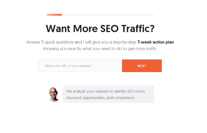
Points to note from this example:
If you put all five questions in a single form, it’ll inevitably become intimidating and seem a lot longer. A multi-step form keeps things more manageable. It gives people the time to explore each question and smoothly move to the next when they’re done.
Multiple choices allow users to select pre-determined answers, resulting in excellent data quality.
Straightforward, no-nonsense questions with short options reduce the chances of confusion.
Pro tip: If you want to recreate this signup form, try out the B2B Lead-Gen Marketing template from Heyflow.
It’s super easy to use, well-organized and has a style similar to UberSuggest. The questions are already set up in order, contact details are neatly separated, and it includes a bit of social proof for that extra push.
This form template works great on all devices and can be used as an embed or a standalone landing page. Just customize it however you like and go live when you're ready!
Sign-up form from Nationwide Pet Insurance
As America’s top pet insurance company, Nationwide understands how much your pets mean to you. They also recognize that a signup form needs to be friendly and welcoming.
Sure, it’s not a multi-step form and has more than a few fields to fill out. But, it’s not overwhelming. It only asks for essential info about your pet, so you can get started in just a few minutes.
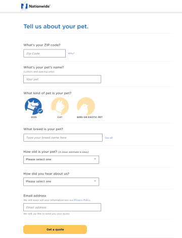
Points to note from this example:
The form has simple questions with drop-down fields to make the process easier.
It includes a testimonial from a customer to establish a sense of trust.
It has a good understanding of how invested someone is in completing the form.
Pro tip: Want to build something like this? Check out Heyflow’s B2C Pet Insurance template.

This template covers all the lead-gen basics and gets you up and running in a flash. It includes built-in conditional logic and personalization, works perfectly on both desktops and mobiles, and is designed for easy embedding or pop-ups.
If you're looking for more inspiration, simply browse Heyflow’s template library and pick the one that best fits your style.
Turn your signup forms into lead magnets with Heyflow today
With the right signup form, your visitors can turn into loyal, long-term customers, and enjoy the process along the way. With Heyflow, you can build personalized, responsive forms (aka interactive flows) without a single line of code!
You can fully customize everything, from colors to spacing, and even add your own custom code if your dev has the time. Once your flows are ready, easily connect them to your preferred CRM, marketing platforms, and other tools.
Heyflow also has everything you need to track flow performance with built-in analytics, see where users drop off, and run A/B tests to compare different flow versions. All that’s left for you to do is go and fix that leaky bucket!
Try Heyflow today with our 14-day free trial to see it in action.